Table of Contents
Overview
The Table from API type of section provides the possibility to receive the data from different AppMill services and represent the received data in a table view on the screens in the Render application.
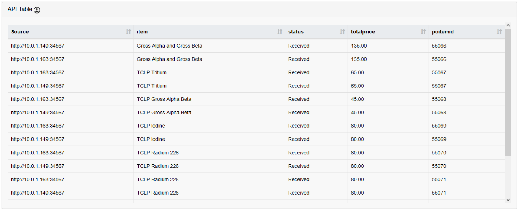
For example, the section of the Table from API may look in the Render as follows:
Section Settings
Before setting up the API in the screen sections, ensure the "Pass Thru" check box is checked on the first screen builder page. This will make the screen accessible via the API.
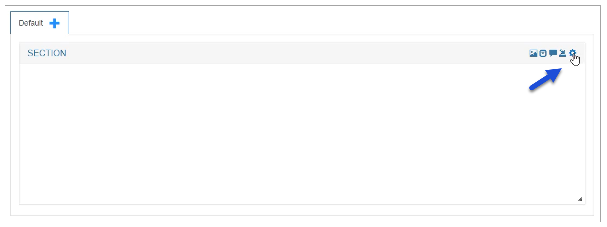
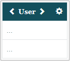
To open and configure the section settings as well as table with the data from API , click the gear icon in the right upper corner of the section:
The Section Settings pop-up window opens. Here you can configure the general settings connected to the section and the settings related to the API table displayed on the screen further.
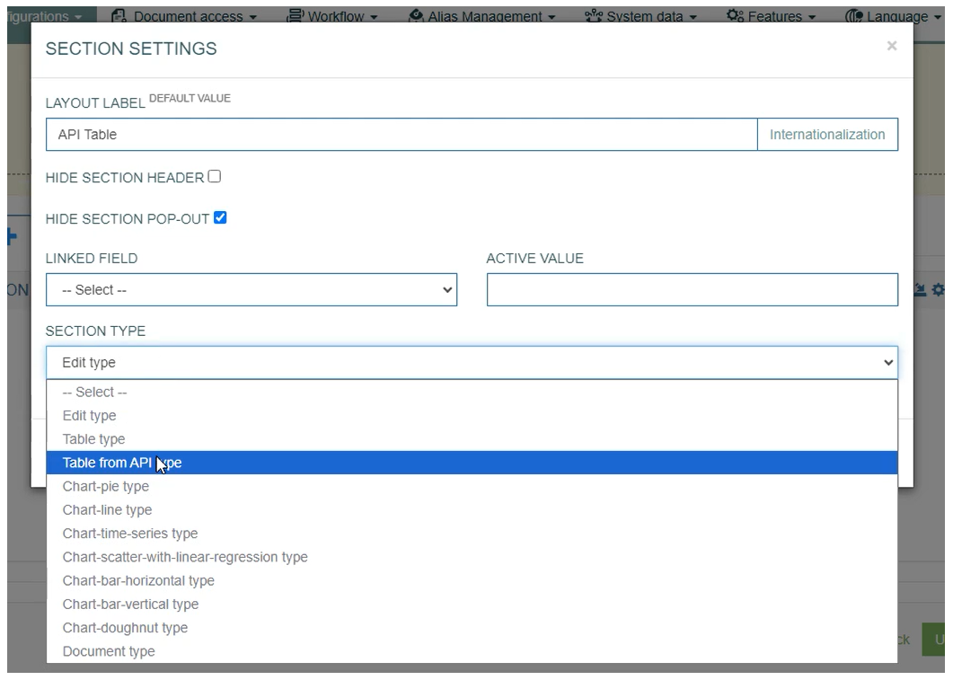
First, define the Section title and select the type:
Layout Label - enter the text to be displayed as a Section name.
Section Type - to open the Table from API configuration, select the Table from API type option from the Section Type drop-down list. The whole set of settings appears in the current pop-up window:
The general section settings are described in detail on the Screens page of the User Manual. The table settings are the same as for the Section Type: Table Type.
Table Configuration
Below you can explore the instructions on how to set up the section parameters exactly for the Table from API type of section:
Section Setting
CSV Download - select the check box to enable the possibility to download the table in CSV format from the Render screen.
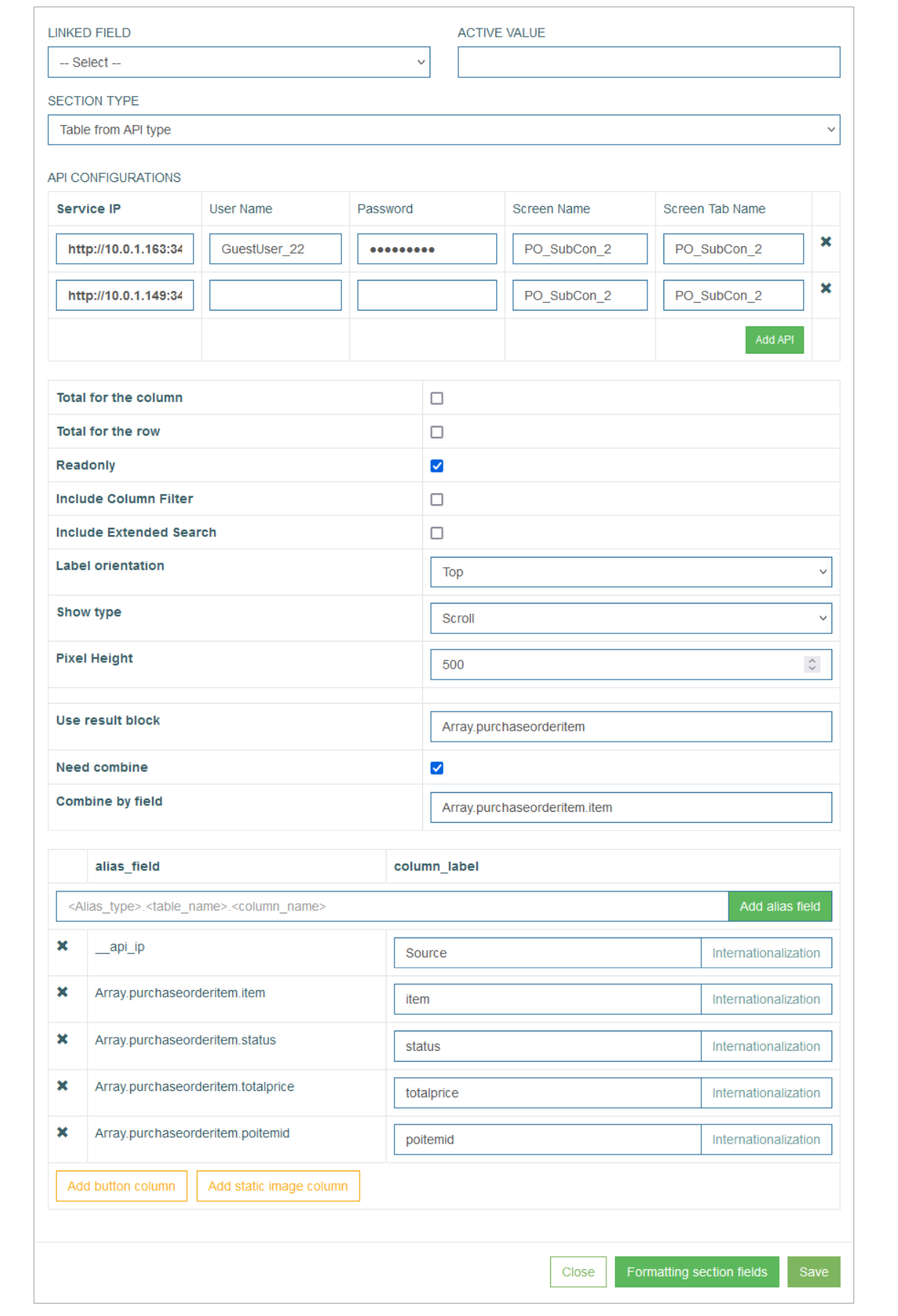
API Configuration
The API Configuration part contains the parameters for the APIs that will provide the data for filling in the table on the Render screen. Fill in the following parameters for each API entry:
Service IP – define the API of the AppMill service that you will use to request the data.
User Name – enter the Username that is defined for the Service.
Password – enter the Password that is defined for the Service.
Screen Name – enter the value of the Select existing screen or Add new screen fields from the first Screen Builder page.
Screen Tab Name – enter here the value of the Tab Name field from the first Screen Builder page.
When all parameters are specified for, click the Add API button to add a new row below.
Column Settings
The next part of the parameters that can be set up in the Section Settings pop-up window is connected to the general table settings.
Total for the column - select the check box to enable the additional row displaying the Total count for the whole column.
Total for the row - select the check box to enable the additional column showing the Total count for the whole row.
Readonly - select the check box to make the table read-only. This option is used for the tables that should be displayed in View mode only. In case this check box is selected, the table will not be editable even in the Edit and Insert modes on the screen in the Render application.
Include Column Filter - select this check box to use Filters in the columns for filtering values. The added filters will automatically contain the list of possible values. Filters can be applied to the column with the data of Field type.
Include Extended Search - select this check box to add a separate search field that allows searching for any value of the table fields.
Label orientation - this option defines the layout of the table header. Select the available options:
Top - to display the table header at the top row.
Left - to display the table header as the first left column of the table.
Show type - this option defines how to display the table content on the page - using pagination or infinite scroll.
Scroll - select this option to scroll on the page.
Without scroll - select this option to use pagination.
Count - defines the number of table rows on the page in case of pagination.
Pixel Height - define the size of the window in case of scroll usage. The default value is 580px.
Result Block – specify the alias for the block of data that will be used in the Response.
Need Combine – define if the results of several APIs should be combined and sorted by the field entered in the Combine by Field value in one table
Combine by Field – specify the field by which the table will be sorted.
Next, you can configure the columns of the table, their labels and the aliases that should be used to receive the values from AppMill:
Alias Field (alias_field) - in the input field, start typing the alias that should be used to retrieve the field values. The autocomplete feature helps you to find the needed alias.
Click the Add alias field button to add the selected alias to the table as a column field.
Column Label (column_label) - enter a label text that will be displayed as a column title for the corresponding alias entry.
Internationalization - click the button to add translations for other supported languages, if needed.
Add button column - click this button to add a column that will contain the buttons. The behavior of the added buttons will be set up directly in the table column.
Add static image column - click this button to add a column with the static images.
Common Operation
Save
Click the Save button to confirm and save the entered data. After saving the table configuration, a newly created table appears in the section area.
Formatting Section Fields
In sections with Table Type, the Formatting functionality is used to customize the column header and cells formatting:
the Label parameters are set for a column header.
the Field parameters are set for the column cells.
Note that the Field parameters can only be used if the Always show field border parameter has been selected in the Config Column pop-up window.
Click the Formatting Section Fields button to customize the “look and feel” of the column fields and labels in the table. The formatting customized here will be applied primarily.
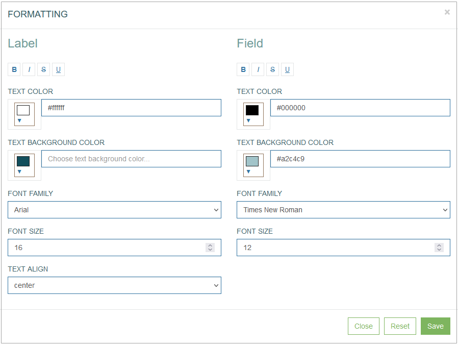
In the opened Formatting pop-up window users can define the Label (column header) and Field (column cells) style and format parameters such as:
Font style:
bold
italic
crossed out
underlined
Text color
Text background color
Font family
Font size
Text align - cannot be used for the table column formatting.
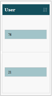
For example, the formatted column can be displayed as follows:
In the Render application, the formatted column can be displayed as follows:
Click the Save button to confirm column formatting changes.
Click the Reset button to clear column parameters.
Click the Close button to cancel the formatting changes without saving and return to the Config Column pop-up window.
Close
Click the Close button to close the pop-up window without saving the data.