Table of Contents
Overview
The Edit type of the Section provides the possibility to add and manage buttons that will be displayed and used on the screen in the Render application.
The option to configure buttons as well as images, labels and fields is displayed next to the Settings icon in the upper right corner of the section.
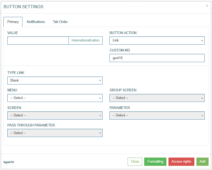
To add a button and configure its display on the screen in the Render application, click the Button icon in the right corner of the Header section. The Button Settings pop-up opens to configure the button:
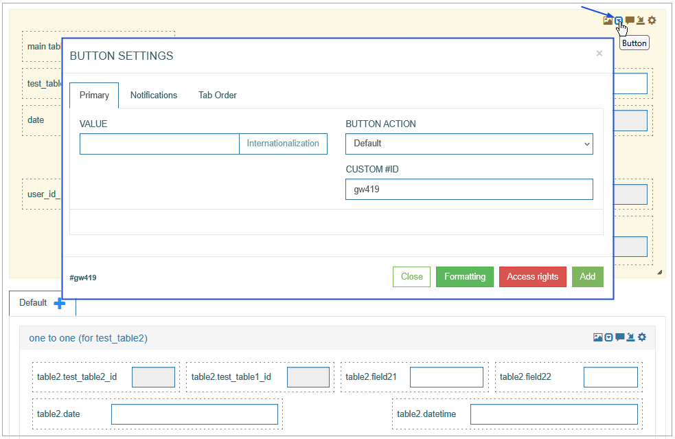
Find and edit the required parameters by switching across the following available tabs:
Primary
Notifications
Tab Order
See the Common Operations section for the description of the buttons available at the bottom of the pop-up window.
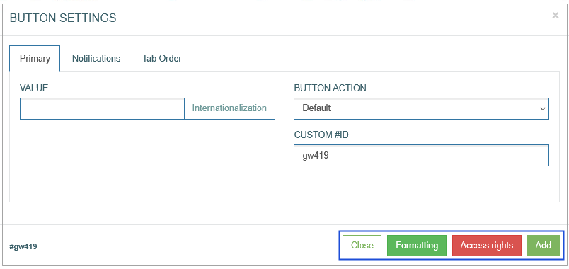
Primary
On the Primary tab, configure the main parameters, such as:
Value
Enter a values that will be used as a button name label.
To add the translations for new buttons perform the following operations:
Click the Internationalization button next to the Value field. The Internationalization pop-up window will be opened.
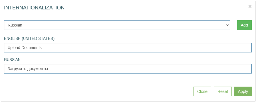
In the opened pop-up window, select the language from the drop-down list and click the Add button. The field with added language will be displayed.
Enter the translation for the selected language.
Click the Apply button to save the changes.
Click the Reset button to delete all changes without closing the pop-up window.
Click the Close button to return to the Image Settings pop-up window without saving changes.
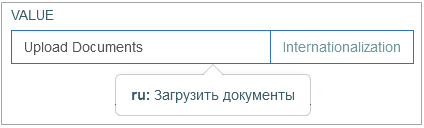
In case there is the translation for the value, move the cursor over a field and the translation will be displayed.
In case the user changes the display language in the Render application, the translated image title will be shown. For more details about language changing, refer to the Language page of the User Manual.
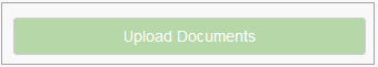
In the Render application, the button name can be displayed as follows:
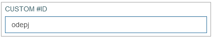
Custom #ID
This is ID of UI element. It can be used in the scripts, to adjust UI element style. The value is generated automatically when you open the button configuration pop-up.
Button Action
Click the Button Action drop-down list to apply the corresponding actions to the screen when the button is activated (clicked on). Depending on the selected action type, you need to fill in the additional parameters related to the selected action.
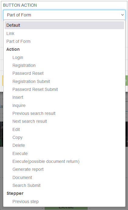
Currently, the following actions are available:
Default
Select the Default value to leave the button just as a button without any linked action. No action will be applied in case the Default value is selected.
Link
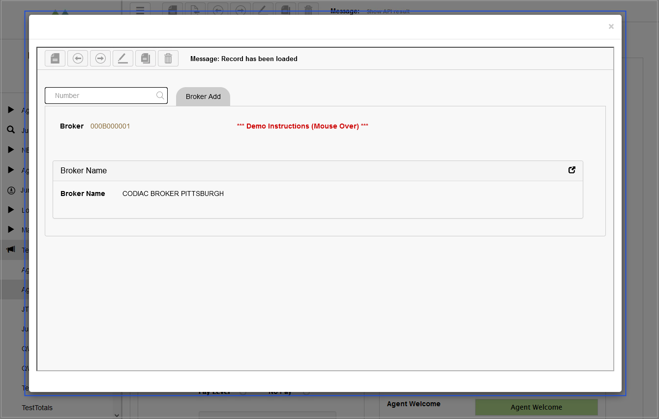
Select the Link value to add a link to the button. In this case, clicking the button on the screen will redirect user to a new tab, screen or a modal window on the same screen.
When you select the Link action for the button, the additional parameters appear in the Button Settings pop-up window:
Define the following parameters for the link:
Type link
Blank - to open link in a new browser tab.
Self - to open link in the current tab.
Modal - to open link in a modal window.
Blank Bypass - to open link in a new tab and to pass the additional parameter specified in the Pass Through Parameter field.
Modal Bypass - to open link in a modal window and to pass the additional parameter specified in the Pass Through Parameter field.
Menu - to select the menu that the required screen assigned to.
Group screen - to select the group screen that the required screen assigned to.
Screen - to select the required screen that will be opened by link.
Parameter - to specify the required parameter that will be used for searching on the screen.
Pass Through Parameter - this parameter will be passed by link to the defined screen.
Clicking the button on the screen in the Render application will redirect user to another tab, screen or modal window on the same screen. For example, clicking the button with modal link type opens the link in a modal window, and it is displayed as follows:
Part of Form
The Part of Form action is used for opening a section of the screen as a modal pop-up window.
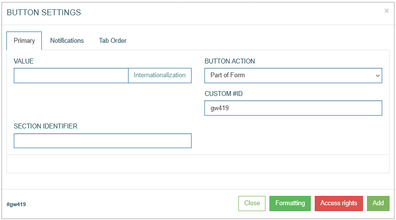
To define what section should be opened upon clicking the button, enter the Section Identifier into the corresponding field. Note that the section to be opened is a part of the existing screen. The feature will be valid for the Edit section type of the Screen only.
Login
The Registration action is used for the Login action on the Login screen. Clicking this button validates the entered login data (user name and password).
Registration
The Registration action is used for opening the Self-Registration form with the possibility for users to self-register.
Password Reset
The Password Reset action is used for opening the Password Reset form, where user can enter login name and email address. A new password will be sent to the email address entered on the form.
Registration Submit
The Registration Submit action is used to submit the Self-Registration form and complete the registration process.
Password Reset Submit
The Password Reset Submit action is used to submit the Reset Password form and complete the reset password process.
The Login, Registration, Password Reset, Registration Submit, Password Reset Submit button actions are valid for the Login screen and Login screen variations: SMS Verification, Email Verification, Secret Question Authorization, Registration, Password Reset. Open the Login Screen Configuration page of the User Manual for more details and explanations. They have the special logic that is already set up on the background.
Please use the actions mentioned above on the Login screen only.
Insert
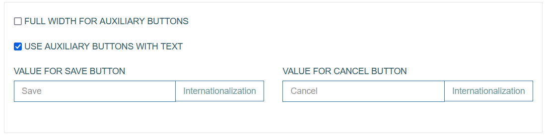
The Insert action replicates the Insert action that is available in the main menu actions in the Render. When you select the Insert action for the button, the additional parameters appear in the Button Settings pop-up window:

You can select the following options:
Full width for auxiliary buttons - select this option to display the Save and Cancel buttons in full width.
Use auxiliary buttons with text - select this option to add specific text instead of the standard Save and Cancel labels.
Value for Save button - enter the text that will be displayed as Save button label.
Value for Cancel button - enter the text that will be displayed as Cancel button label.
To add the translations for new labels, click the Internationalization button. In the opened pop-up window, select and add the language, enter the translation for the selected language. Click the Apply button to save the changes.
Inquire
The Inquire action serves as a Search action. Clicking the UI element representing the Inquire action will initiate the search on the screen. In this case the search will be performed exactly according to the entered search parameter without taking the autocomplete option into account.
The Inquire functionality can work without the Search functionality configured on the first page of the Screen Builder. For more details about the Search functionality, refer to the Search Configuration section on the Screen Master Data Settings page of the User Manual.
Previous search result
The Previous search result action will show the previous search result if any available.
Next search result
The Next search result action will show the next search result if any available.
Edit
The Edit action gives the possibility to update the parameters and values on the screen. When you select the Edit action for the button, the additional parameters appear in the Button Settings pop-up window:
You can select the following options:
Full width for auxiliary buttons - select this option to display the Save and Cancel buttons in full width.
Use auxiliary buttons with text - select this option to add specific text instead of the standard Save and Cancel labels.
Value for Save button - enter the text that will be displayed as Save button label.
Value for Cancel button - enter the text that will be displayed as Cancel button label.
To add the translations for new labels, click the Internationalization button.
In the opened pop-up window, select and add the language, enter the translation for the selected language.
Click the Apply button to save the changes.
Copy
The Copy action will copy all the content from the current screen except the Primary key field.
Delete
The Delete action will delete all the content on the current screen.
In other words, the database table row will be deleted with the primary key and the whole information.
Execute
The Execute action allows you to apply the extension function to the screen field.
In contrast to the Extension function configured on the previous step with Basic Data, this extension function operates with the definite parameter and apply to the specific value on the screen.
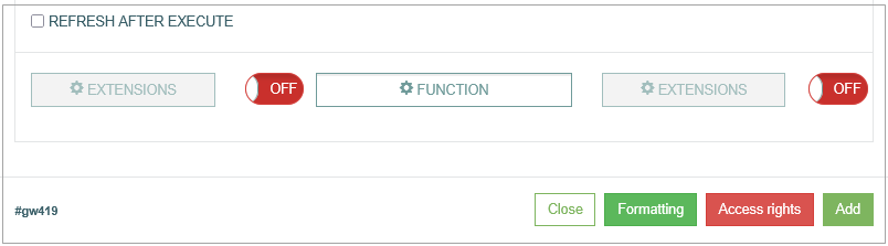
Refresh after execute - When the check box is selected, that means that in case the extension function has been successfully executed, the whole screen will be refreshed to display the actual data.
Use the Pre and Post Functions to configure the Extension function for the needed fields and values. They are optional and can be switched on/off.
Note that the extension function is available only if the Search functionality was set up on the first page of the Screen Builder. In case the Search functionality was not configured and the Inquire functionality is used instead of it, the Execute action will not work correctly as for the buttons with extension functions the work is based on the data found from the database.
Please consider this information and use the buttons with extension functions with the set Search functionality only.
Execute (possible document return)
The Execute (possible document return) action represents the combination of the previous Execute functionality and the additional possibility for the case when the special command is used in the function for creating or copying the files/documents.
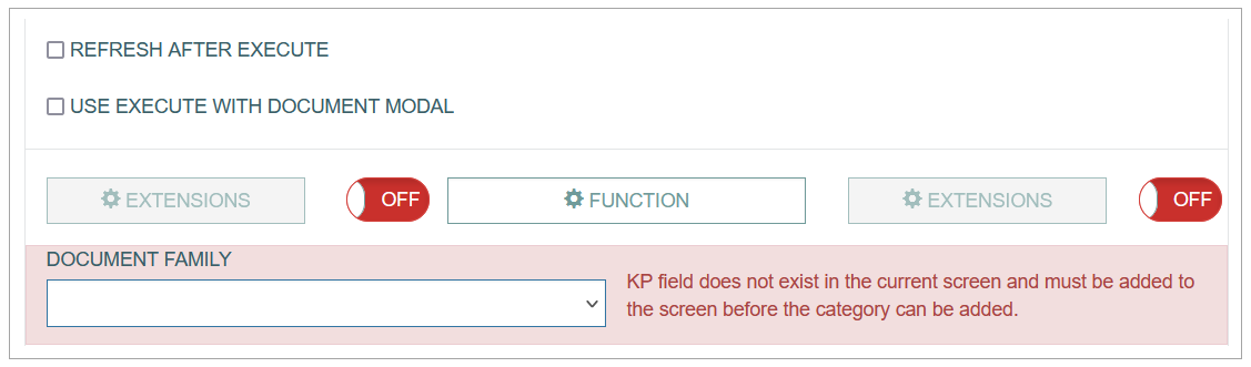
In this case after successful function execution, the modal window with the list of documents available for download will appear:
Refresh after execute - When the check box is selected, that means that in case the extension function has been successfully executed, the whole screen will be refreshed to display the actual data.
Use execute with document modal - select the check box to open the list of files/documents in a modal window where you can select the files and download them. In case the check box is not activated, the files/documents will be downloaded automatically.
Extension Function - select the extension function that should be executed for the action.
Document Family - select the Document Family and the Document Category.
Make sure that the Primary Key is added to the Document Category.
In other case the feature will not work properly.
Generate report
The Generate report action provides the possibility to build the report based on the Report Template and the report data. The templates are configured to use the linked aliases.
When executing the Generate Report action in the Render, the data is evaluated, the report is filled in by the values, and the report will be available for download.
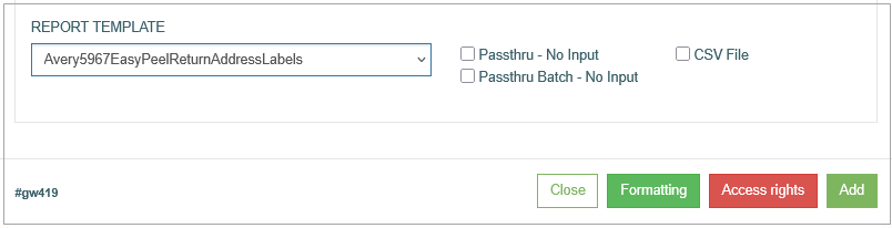
Fill in the following fields:
Report Template - select the Template of the report that should be used.
Passthru - No Input - select this check box to use the search data from the Render screen to generate a report. In this case, the search data will be passed onto the Reports functionality to be evaluated in the report.
Passthrou Batch - No Input - select this check box to use the search data from the Render screen to generate a report. In this case, the batch of data will be passed onto the Reports functionality to be evaluated in the report.
For the correct work of the Passthru - No Input and Passthrou Batch - No Input report options, the search on the screen must be configured correctly.
CSV File - select the check box to allow users downloading the report file in the CSV format.
Document
The Document action allows users to open the pop-up window with the list of available documents.
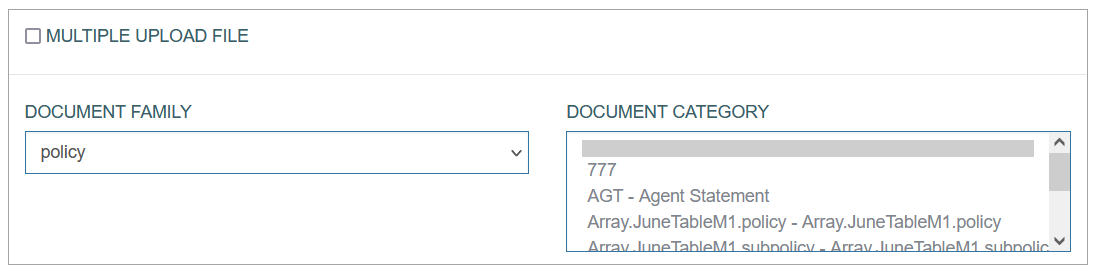
Multiple upload file - select the check box to allow the upload of several files at the same time.
Document Family - select the Document Family, to which the uploaded documents will be added.
Document Category - select the Document Category, to which the uploaded documents will be assigned.
Clicking the button with the Document action type on the screen in the Render application opens the View Document pop-up window.
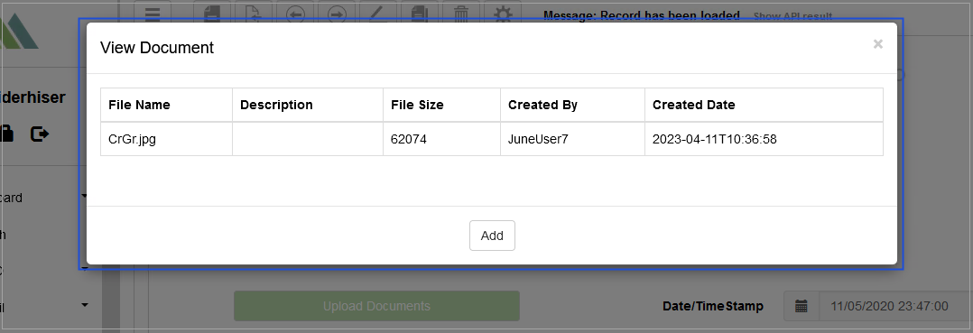
In the Render application in the opened View Document pop-up window, users can view the list with previously uploaded documents and add a new one. The following operations can be performed in the opened pop-up window:
View - to view the document details click the file name. The document will be opened in a pop-up window.
Add - to add a new document, click the Add button. The Edit Documents pop-up will be opened and displayed as follows:
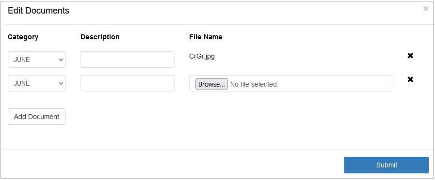
Here users can:
Click the Add Documents button to add a new row and upload a new document from the local computer.
Click the close icon next to the file name to delete the added document. Confirm the deletion or click the Cancel button.
Select the document category from the Category drop-down list and enter the document description to the Description field.
Click the Submit button to finish the document uploading.
Search Submit
The Search Submit action allows users to submit the search process in the Render application.
The Search Submit button action type can be activated and selected for the Header section only if the Search Screen check box is selected on the first page of the Screen Builder. For more details on how to set up the Search Screen, refer to the Search Screen section on the Screen Master Data Settings page and to the Search Screen Configuration page of the User Manual.
In case the Search Submit is activated, the rest button action types in the list will be disabled.
Previous step
Select the Previous step option to allow users to return to the previous workflow step.
Notifications
On the Notifications tab, configure the conditions when users should be notified.
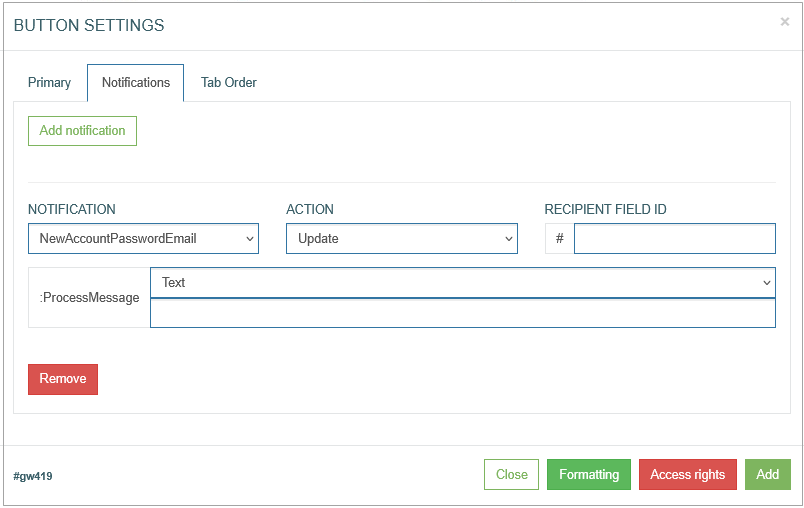
To create a new notification action, click the Add Notification button.
After clicking the Add Notification button, an entry for configuring the notification conditions appears.
Fill in the required fields:
Notification - select the notification template from the drop-down list of the templates existing in the system. To create a new template or manage existing ones, open the Notifications page (System Data > Notifications). For more details about notification creation and managing, refer to the Create Notification section on the Notifications page of the User Manual.
Currently you can set up the Email and SMS notifications. The email address and the phone number for notifications can be set on the Users page. For more details on how to add the email address and the phone number for notifications, refer to the Create User section on the Users page of the user Manual.
Action - select the action that specifies the state of UI element (button) when notification should be sent. There are 2 states of UI elements:
Update - the field value is edited.
Insert - the value is added.
Recipient field ID - add an ID of the field with an Email field format type. The notification will be sent to the email address entered in such a field in the Render application. The field ID can be found at the bottom left corner of the Field Settings pop-up window. The Recipient field ID field is available only for the notification templates with Custom recipient type. For more details about the recipient type, refer to the Create Notification section on the Notifications page (System Data > Notifications) of the User Manual.
In case the notification template contains the variable parameters, the value of these variables can be defined here in the input fields.
Tab Order
On the Tab Order tab, you can set whether the Tab key can be used to move the cursor on the current UI element. Additionally, you can define the order in which the UI element is selected and allocated with the cursor when using the Tab key.
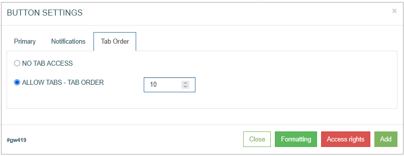
The following options are available:
No Tab access - select this radio button to restrict the possibility use the Tab key on the keyboard for the current UI element.
Allow Tabs - Tab Order - select this radio button to allow the usage of the Tab key to navigate to the current UI element. Define the Tab order by filling in the input field next to the Tab Order option.
Common Operations
At the bottom of the Button Settings pop-up window, there is a block with common operations displayed and available on any tab of the pop-up window.
The following operations can be performed while updating information in the pop-up window on the tabs mentioned above:
Add
Click the Add button to confirm and add a button to the screen.
Note that in case of the Edit mode, the Add button is changed to the Update button.
Update
Click the Update button to confirm and save the changes made for the button.
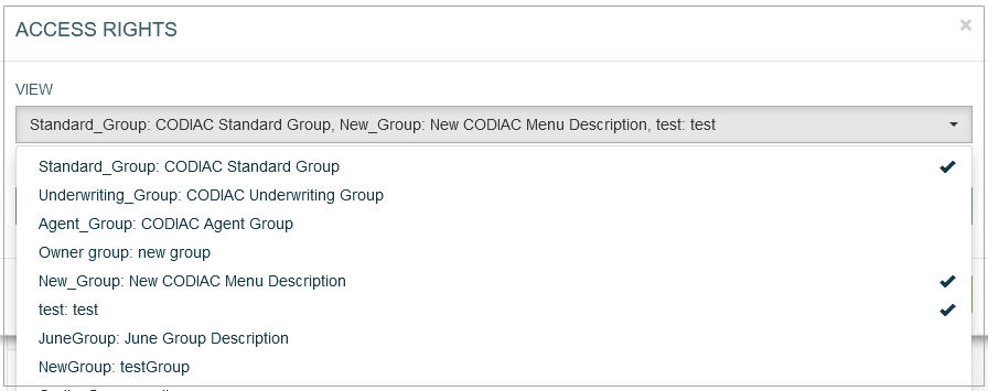
Access Rights
Click the Access Rights button to open the corresponding pop-up window. Here, users can select user groups to set the access right for the View and Update actions for the selected groups:
View - select one or multiple user groups from the drop-down list to provide them with View access rights. The selected user groups will be marked with the check mark to the right from the user group name. In the Render application, the users from the selected user groups can view the button display.
Update - as the buttons cannot be updated in the Render application, the selected user groups will not be able to update the buttons there.
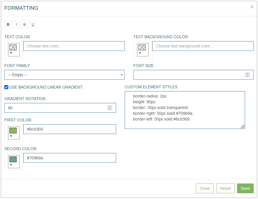
Formatting
The Formatting functionality is available only for the button, label and field configurations.
Click Formatting to customize the “look and feel” of the button.
In the opened Formatting pop-up window users can define the following format parameters for the button:
Font style:
bold
italic
crossed out
underlined
Text color
Text background color
Font family
Font size
Use background linear gradient
Gradient rotation
Custom element styles
First color
Second color
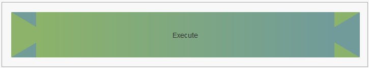
For example, in the Render application the formatted button can be displayed as follows:
Click the Save button to confirm button formatting changes.
Click the Reset button to clear the button parameters.
Click the Close button to cancel the button formatting changes without saving and return to the Button Settings pop-up window.
Close
Click the Close button at the bottom of the Button Settings pop-up window to close the pop-up window.