Table of Contents
Field Type
The Field Type specifies the data allowed for the field. The layout of the field in the Render application, validation of the entered data, supported data format will differ depending on the selected Field Type. When you select a field type value, additional field type-specific parameters appear.
The description of the supported Field types, related Format types as well their additional specific parameters is provided below:
Text
Allows users to enter a single line of text on the screen in the Render.
Format type:
Email – to add the email address, e.g., name@domain.com.
In the Render application, the field with email format can be displayed as follows: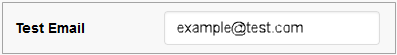
Date – to add the information about date in the Date format.
In the Render application, the field with data format can be displayed as follows: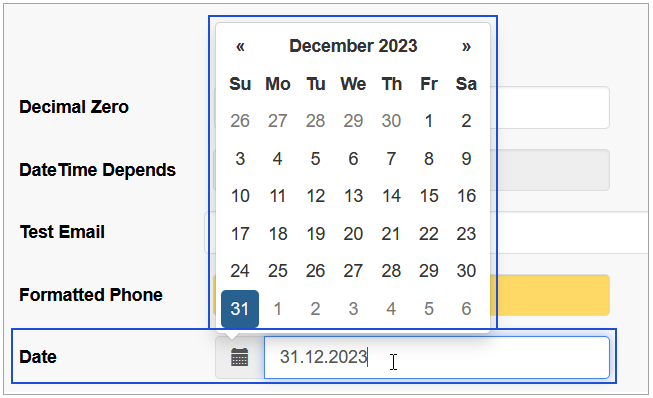
Date/Time – to add the information about date and time in the format of Date and Time.
You should select the Date/Time field format type if you need to display the date and time according to your timezone. The date and time in the field will be recalculated using the Date/Time field format type in accordance with the specified timezone. The data will be shown incorrectly if you choose the Date field format type because the timezone will not be considered and will not be adjusted according to standard or daylight-saving time.
In the Render application, the field with data/time format can be displayed as follows: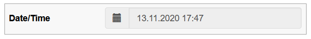
Phone – to add the phone number.
In the Render application, the field with phone format can be displayed as follows: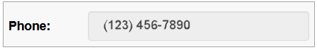
Custom – to add the information in the custom format. In case of selecting the custom format field type, the additional Format Template field will appear. Set the custom field format in the appeared Format Template field, using the x, n, -, + characters, where:
x – any English text and numeric character can be added,
n – numeric character input only,
- / + – separator types. The separators will be added automatically on the screen in the Render.
For example:in case of the xxx--nnn++xn-n template, the entered data might be abc--123++q2-1, or
in case of the nn-xx+xn-nx template, the entered data might be 35-pt+a3-4t, etc.
The field format will be shown as a placeholder of the field on the screen in the Render application. In case users enter the data in the format that does not meet the format template set, the warning tip will appear.
In the Render application, such field can be displayed as follows:Specific parameters:
Default Field Value - a predefined text string can be set as the default input when the screen loads in Render.
In the Render application, the Text type field whose Default Field Value set as “test text“ can be displayed as follows: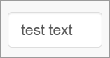
Custom Query - select the query from the drop-down list. This feature helps users to get the values from the database table. As a rule, the custom query is used in the main search field, but it can be additionally used for other fields on the screens. For more details about the Custom Query functionality, refer to the Custom Query page (Features > Custom Query) of the User Manual.
Numeric
Allows users to enter numeric values in the fields.
Format type:
Decimal - Static
Decimal - Dynamic
In the Render application, the fields with the decimal static or dynamic numeric format types can be displayed as follows:
Currency - Static
Currency - Dynamic
In the Render application, the fields with the currency static or dynamic numeric format types can be displayed as follows: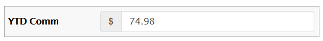
Static fields do not allow fractional symbols. For the entered number, the fractional part is always filled in. For example, for currency you need to type "150" to get "1.50" in the field.
Dynamic fields allow you to use fractional symbols. If the fractional part is missing, it will be automatically filled with zeros. For example, for currency you need to type "1.5" to get "1.50" in the field.
Specific parameters:
Default Field Value - if configured, the field will be pre-filled with the defined numeric value upon screen load in Render.
In the Render application, the Numeric type field whose Default Field Value set as 2.33 can be displayed as follows: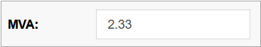
Allow Negative - select the check box to use negative numbers in formatted fields.
In the Render application, it can be displayed as follows: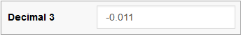
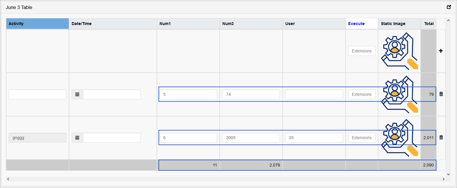
Use to calculate totals - this option is available for the Numeric field type that is selected for Tables.
In the table settings, you can choose whether the amount will be calculated by columns or by rows, or by both. When calculating the amount, the number of decimal places will be taken as the largest value of the summed ones (for currencies - 2 decimal places).
In the Render application, the amount, that was calculated by columns, can be displayed as follows: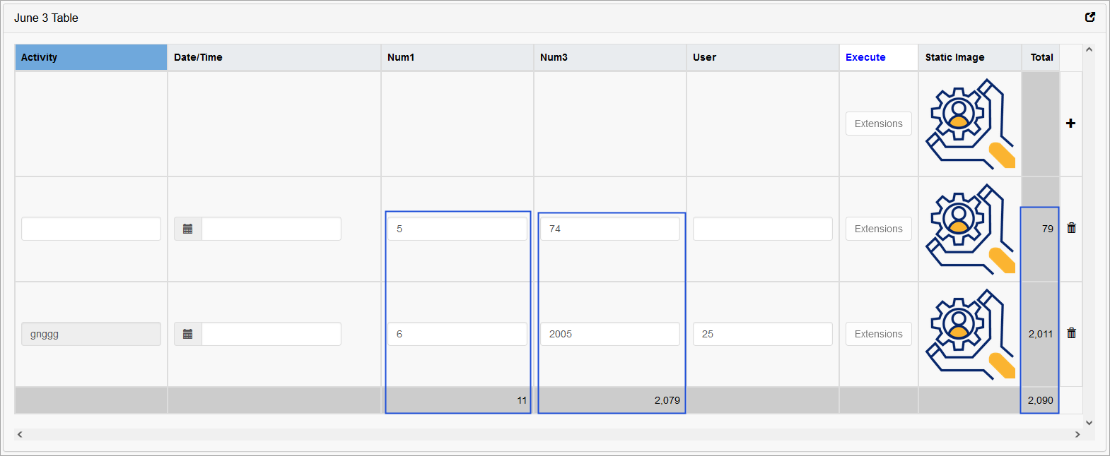
In the Render application the amount, that was calculated by rows, can be displayed as follows:
Precision - for the Decimal format type, this parameter is required and means the number of decimal characters. For the Currency format type, it is not editable and the value “2” is used by default.
In the Render application, it can be displayed as follows: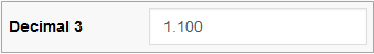
By default, when the Format type is not selected, the whole number (Integer, not a fractional number) is used.
Note that the currency format defined in the User Account settings will be used all over the Render application for a particular user.
List
Allows users to select values from a drop-down list.
The values used for this type are defined via the Lists functionality (System Data > Lists).
Specific parameters:
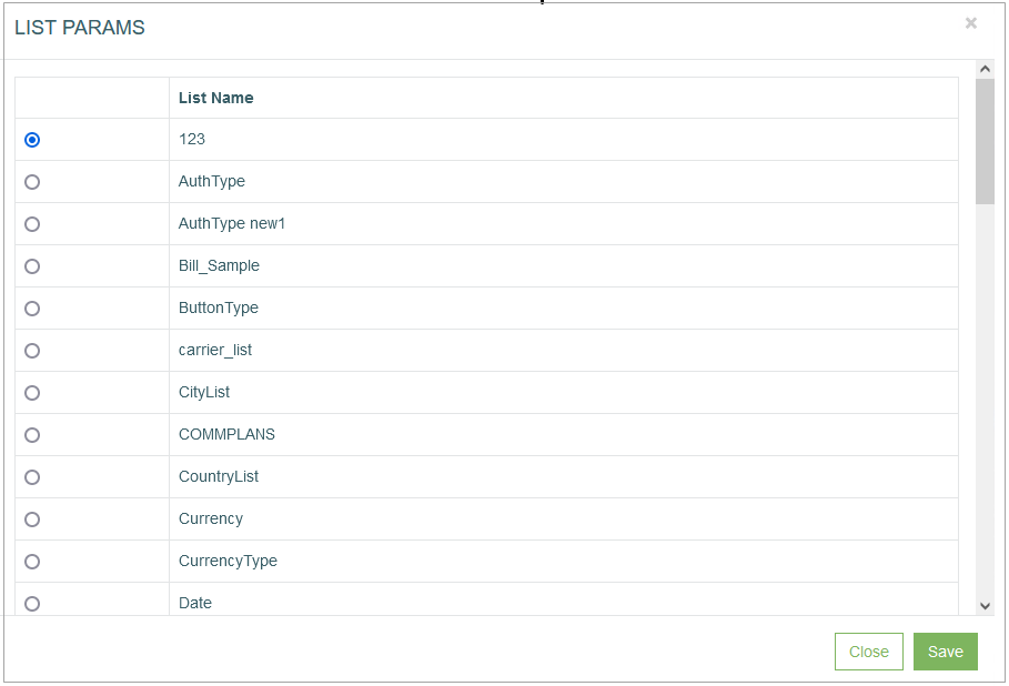
Pull up - click the button to open the list of available lists for selection.
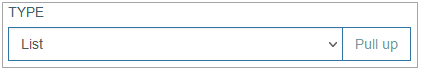
In the opened List Params pop-up select the list name by clicking the radio button. Click the Save button, to save changes, or click the Close button, to close the pop-up and return to the Field Settings.
Default Field Value - a specific option can be preselected upon screen load.
In the Render application, the List type field whose Default Field Value set as “L” (value of option) can be displayed as follows:
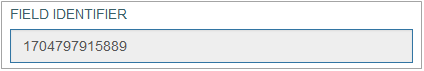
Field Identifier - the automatically generated ID of a UI element. It is used further in the formatting scripts.
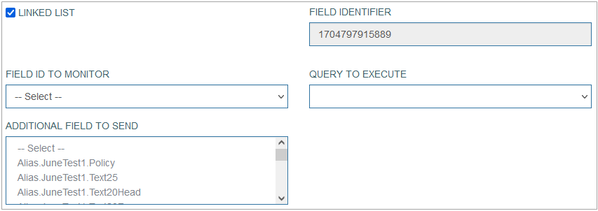
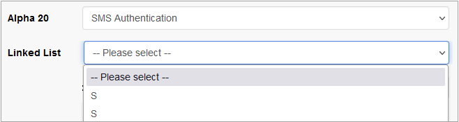
Linked List - allows to set the relation between field options and other fields. The activated Linked List option specifies that the values of the current List field will trigger the filling in the related field. E.g., after selection of the user category, the predefined list of options will be retrieved and displayed in the related field options.
In the Render application, the linked list can be displayed as follows:
When the Linked List option is activated, the additional parameters to set up are displayed:
Field ID to monitor - this is the field, the value of which will be taken into account and be changed depending on the Data field value.
Query to execute - select the query that will be taken in prior when executing the query on the screen.
Additional field to send - define additional field that can be sent together with the main data field value.
Section Refresh - selecting this check box in the Architect application provides the possibility to switch the section display in the Render application when selecting the section name from the list. After selecting the check box, the Section to Refresh field appears. Select the section from the Section to Refresh drop-down list to be refreshed in the Render application.
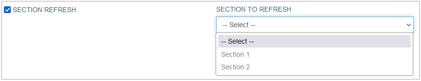
Note that if there are more than two sections in the Section to Refresh list, the Section Refresh check box must be selected to switch among sections from the list. If the Section Refresh check box was not selected, the sections switching in the Render application will be disabled and the default section will be displayed.
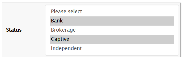
Multi select - activating the check box allows users to select multiple values from the field options in the Render.
In the Render application, the list with the activated Multi select check box can be displayed as follows: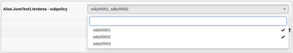
Default Field Value - multiple values can be preselected using a semicolon (;) separator.
In the Render application, the List type with Multi select check box enabled field whose Default Field Value set as “L;S“ can be displayed as follows:
In the Render application, the drop-down list can be displayed as follows:
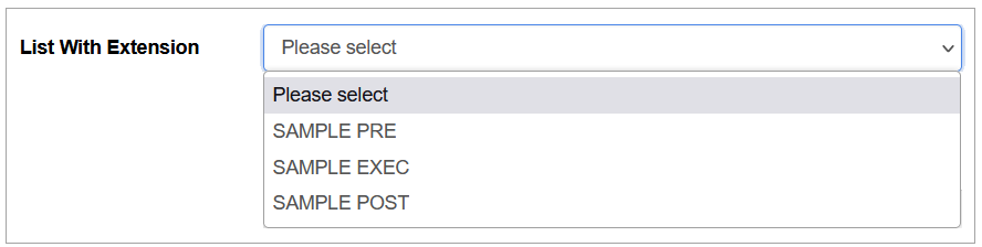
List With Extension Function
Allows users to select values containing the extension functions from the drop-down list. In case the value with the extension function is selected, the specified function will be executed when the user clicks on the Execute button in the main actions' menu on the screen in the Render.
Note that the multi-selection is not allowed for the list with extension function.
The list with extension function in the Render application can be displayed as follows:
Textarea
Allows users to enter multiple lines of text on the screen in the Render application.
Specific parameters:
Default Field Value - a predefined block of text can be set as the default input when the screen loads in Render.
In the Render application, the Text type field whose Default Field Value set as “test textarea text“ can be displayed as follows: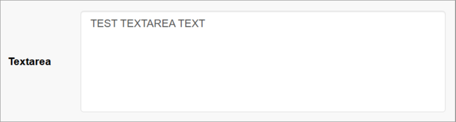
Custom Query - select the query from the drop-down list. This feature helps users to get the values from the database table. As a rule, the custom query is used in the main search field, but it can be additionally used for other fields on the screens. For more details about the Custom Query functionality, refer to the Custom Query page (Features > Custom Query) of the User Manual.
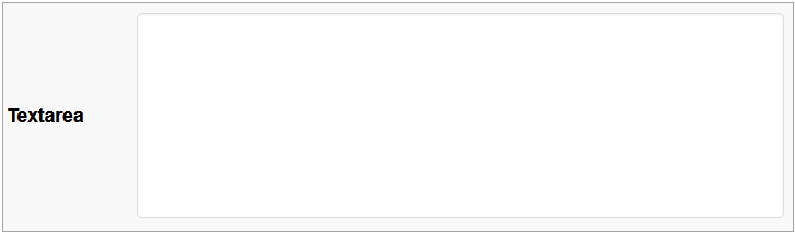
In the Render application, the textarea field can be displayed as follows:
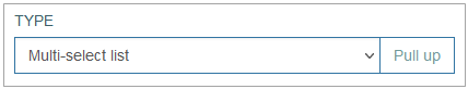
Multi-select list
Allows users to select multiple values from a drop-down list of field options in the Render. Use the Ctrl + Click combination to select values.
Specific parameters:
Pull up - click the button to open the list of available lists for selection.
In the opened List Params pop-up select the list name by clicking the radio button. Click the Save button, to save changes, or click the Close button, to close the pop-up and return to the Field Settings.
Field Identifier - the automatically generated ID of a UI element. It is used further in the formatting scripts.
Linked List - allows to set the relation between field options and other fields. The activated Linked List option specifies that the values of the current List field will trigger the filling in the related field. E.g. After selection of the user category, the predefined list of options will be retrieved and displayed in the related field options.
In the Render application, the linked list can be displayed as follows:
When the Linked List option is activated, the additional parameters to set up are displayed:
Field ID to monitor - this is the field, the value of which will be taken into account and be changed depending on the Data field value.
Query to execute - select the query that will be taken in prior when executing the query on the screen.
Additional field to send - define additional field that can be sent together with the main data field value.
Default Field Value - multiple values can be preselected using a semicolon (;) separator.
In the Render application, the List type with Multi select check box enabled field whose Default Field Value set as “L;S“ can be displayed as follows: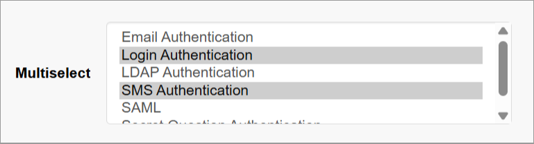
In the Render application, the multi-select list can be displayed as follows:
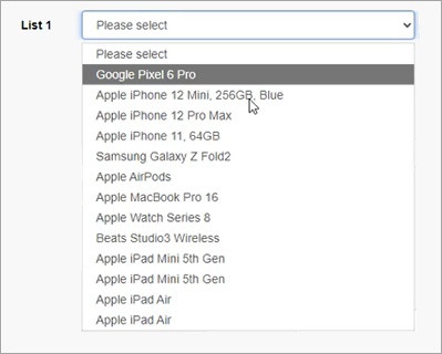
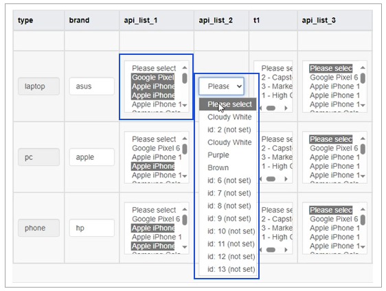
List from API
Allows users to display the list of values (options) received from an external application.
In the Render application, the List from API can be displayed as follows:
for the Edit type section
for the Table type section
Specific parameters:
Type – select the type of API connection that will be set up:
Current Service – used for internal service (currently used for the clients).
AppMill API – used for internal AppMill service.
REST API – this only option can be used for the external resources.
See the detail description of every type below.
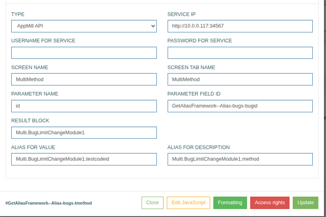
Current Service
Current Service is a subtype of the AppMill API. It always refers to the same service as the Render application.
Define the following parameters:
Username for Service – enter the Username that is defined for the Service.
Password for Service – enter the Password that is defined for the Service.
In case the Pass Thru Guest User is specified on the first Screen Builder page, the Username for Service and Password for Service fields can be empty.
Screen Name – enter the value of the Select existing screen or Add new screen fields from the first Screen Builder page.
Screen Tab Name – enter here the value of the Tab Name field from the first Screen Builder page.
Parameter Name – define here the Primary Key field from the table currently used.
Parameter Field ID – define the ID of the field configured for the Primary Key on the screen. You can check and copy Field ID value displayed in the corresponding Field Settings modal window in the Screen Builder.
Pay attention that for the correct work of the Primary Key field, the Always show field border parameter must be selected.Result Block – define which block of data will be used in the Response.
Alias for Value – enter here the alias for the field value to be used in the response.
Alias for Description – enter here the alias for the field description that will be displayed in the response.
AppMill API
Define the following parameters:
Service IP – define the API of the AppMill service that you will use to request the data. Use the API URL format:
For working with screens via the API (Tab Devices = web) use {{protocol}}://{{service_ip}}:{{service_port}} or {{protocol}}://{{service_ip}}:{{service_port}}/osoc/api/thirdpartycontroller.
For working with the TPC endpoint via the API use {{protocol}}://{{service_ip}}:{{service_port}}/osoc/api/thirdpartycontroller/{{tpc_endpoint_name}}
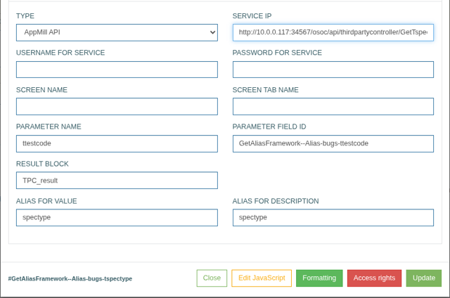
Username for Service – enter the Username that is defined for the Service.
Password for Service – enter the Password that is defined for the Service.
In case the Pass Thru Guest User is specified on the first Screen Builder page, the Username for Service and Password for Service fields can be empty.
Screen Name – enter the value of the Select existing screen or Add new screen fields from the first Screen Builder page.
Screen Tab Name – enter here the value of the Tab Name field from the first Screen Builder page.
Parameter Name – define here the Primary Key field from the table currently used.
Parameter Field ID – define the ID of the field configured for the Primary Key on the screen. You can check and copy Field ID value displayed in the corresponding Field Settings modal window in the Screen Builder.
Pay attention that for the correct work of the Primary Key field, the Always show field border parameter must be selected.Result Block – define which block of data will be used in the Response.
Alias for Value – enter here the alias for the field value to be used in the response.
Alias for Description – enter here the alias for the field description that will be displayed in the response.
REST API Type
For the REST API type, you should define the following parameters:
URL to REST List – enter the URL address to the list to be used.
Parameter Field ID – for the REST API type, it can be empty. The final link will be built according to the template: url_to_rest_list?option_value=parameter_1&option_value=parameter_2
Use for Option Value – define the parameter that will be used as an option value in the Parameter Field ID field value.
Use for Option Description – define which objects from REST API list should be received as well. The data received can consider the nesting levels and to receive the nested data, you can use the “->” symbol as a level depth separator. E.g.: data->color
URL to REST List and Parameter Field ID fields are related to the API REQUEST that is transferred.
Use for Option Value and Use for Option Description fields are related to the API RESPONSE that is received.
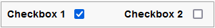
Checkbox
Allows users to select any number of options by clicking check boxes on the screen in the Render. To cancel the option selection, clear the check box.
Specific parameters:
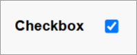
Default Checkbox Value - defines whether the checkbox is selected by default when the screen is edited in the Render application.
Checked - the checkbox is selected by default.
Unchecked - the checkbox is unselected by default.
Group Name - used to group several check boxes into one Checkbox Group. A set of check boxes build one check box group in case they have the same Group Name specified. Note that for the check box group, the selection is restricted to one option only.
In the Render application, the Checkbox can be displayed as follows:

In the Render application, the Checkbox Group can be displayed as follows:
In the Render application, the Checkbox type field whose Default Checkbox Value selected as “checked” can be displayed as follows:
Radio
Allows users to select one option. This field type is often used for absolute simple yes or no answers.
Specific parameters:
Group Name - used to group several Radio buttons into one Radio Group. A set of radio buttons build one radio group in case they have the same Group Name specified. Note that for the radio group, the selection is restricted to one option only.
In the Render application, the Radio button can be displayed as follows:

In the Render application, the Radio Group can be displayed as follows:

Document
Allows users to upload and download documents on the screen in the Render application.
Allowed file format: text, txt, pdf, xbm, tif, jfif, webp, pjp, apng, pjpeg, avif, ico, tiff, jpg, svgz, bmp, jpeg, gif, svg, xlsx, xls, doc, docx, ppt, pptx.
There is a possibility to display the document details directly in the section with the Document type in the Render application. But only documents with the .txt and .pdf formats can be displayed. For more details, refer to the Section Type: Document Type page.Specific parameters:
Document Family - select the document family from the drop-down list.
Document Category - after selection of the document family, the list of related categories will be available.
Specified Document Family and Category values will be saved for the uploaded document and stored in the database.
You can additionally select the Key Parts, if they are set up on the document category level.
In the Render application, perform the following actions to:
Upload the document (the screen in the Render application should be in the editing mode):
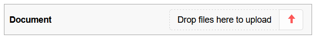
click the arrow or the Drop files to upload button, to select the document from the local computer.
click the arrow to finish the uploading process.
to delete the uploaded document, click the cancel icon.
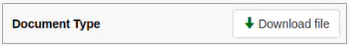
Download the document (the screen in the Render application should be in the read-only mode):
click the Download file button to download the document from the Document field.
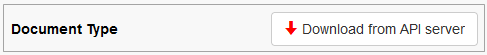
in case there is no uploaded document, the Download from API server button will be shown. If the user clicks this button the default document will be downloaded from the API server.
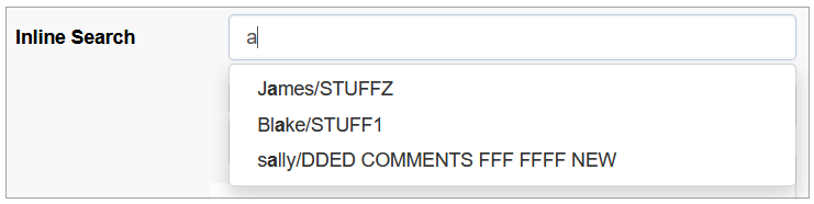
Inline Search
Allows users to see search results without redirecting to a search results page.
Specific parameters:
Field Identifier - the automatically generated ID of a UI element. It is used further in the formatting scripts.
Linked List - allows to set the relation between field options and other fields. The activated Linked List option specifies that the values of the current List field will trigger the filling in the related field. E.g. After selection of the user category, the predefined list of options will be retrieved and displayed in the related field options.
When the Linked List option is activated, the additional parameters to set up are displayed:
Field ID to monitor - this is the field, the value of which will be taken into account and be changed depending on the Data field value.
Query to execute - select the query that will be taken in prior when executing the query on the screen.
Additional field to send - define additional field that can be sent together with the main data
Multi select - activating the check box allows users to select multiple values from the field options in the Render.
In the Render application, the list with the activated Multi select check box can be displayed as follows:
In the Render application, the field with the inline search option can be displayed as follows:
DImage (Dynamic Image)
Allows users to upload any image file.
Specific parameters:
Dynamic Image action - select the action that will be applied to the screen, when the image is activated (clicked on). Find more details about the available actions in the Image action section on the Image Configuration page of the User Manual.
Custom #ID - this is ID of UI element. It can be used in the scripts, to adjust UI element style. The value is generated automatically when you open the image configuration pop-up.
Allow full size modal popup - activate the check box to add the ability to open the image in the modal pop-up window on the screen in the Render.
In the Render application, the dynamic image field can be displayed as follows:
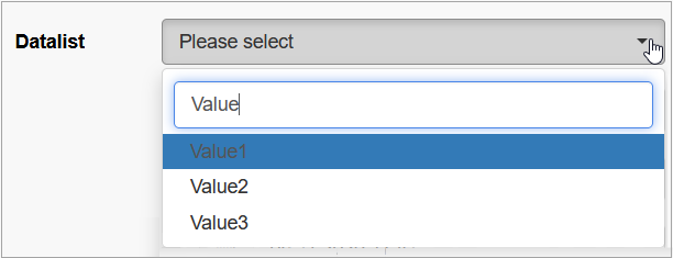
Datalist
Allows users to select options from the list of values on the screen in the Render application. The options for selection are predefined in the Values field in the Field Settings pop-up window.
Specific parameters:
Field Identifier - the automatically generated ID of a UI element. It is used further in the formatting scripts.
Linked List - allows to set the relation between field options and another fields. The activated Linked List option specifies that the values of the current List field will trigger the filling in the related field. E.g. After selection of the user category, the predefined list of options will be retrieved and displayed in the related field options.
When the Linked List option is activated, the additional parameters to set up are displayed:
Field ID to monitor - this is the field, the value of which will be taken into account and be changed depending on the Data field value.
Query to execute - select the query that will be taken in prior when executing the query on the screen.
Additional field to send - define additional field that can be sent together with the main data
Section Refresh - selecting this check box in the Architect application provides the possibility to switch the section display in the Render application when selecting the section name from the list. In case of selecting the check box, the Section to Refresh field appears. Select the section from the Section to Refresh drop-down list to be refreshed in the Render application.
Note that if there are more than two sections in the Section to Refresh list, the Section Refresh check box must be selected to switch among sections from the list. If the Section Refresh check box was not selected, the sections switching in the Render application will be disabled and the default section will be displayed.
Multi select - activating the check box allows users to select multiple values from the field options in the Render.
In the Render application, the list with the activated Multi select check box can be displayed as follows:Values - values specified here will be displayed for the field as options for selection in the Render.
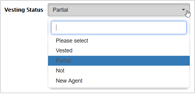
Default Field Value - the field can be pre-populated with a default selection from the dataset in the Render.
In the Render application, the Datalist type field whose selected Value set as “Value2“ can be displayed as follows: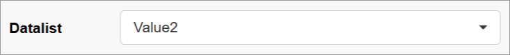
In the Render application, the datalist field can be displayed as follows:
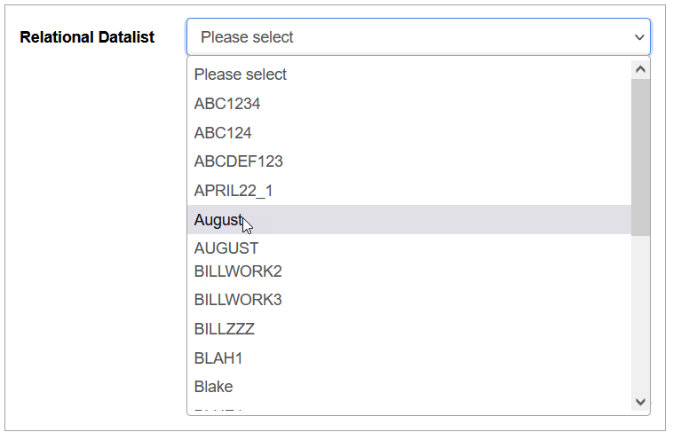
Relation Datalist
Allows users to select options that are defined with custom query.
Specific parameters:
Field Identifier - the automatically generated ID of a UI element. It is used further in the formatting scripts.
Linked List - allows to set the relation between field options and other fields. The activated Linked List option specifies that the values of the current List field will trigger the filling in the related field. E.g. After selection of the user category, the predefined list of options will be retrieved and displayed in the related field options.
When the Linked List option is activated, the additional parameters to set up are displayed:
Field ID to monitor - this is the field, the value of which will be taken into account and be changed depending on the Data field value.
Query to execute - select the query that will be taken in prior when executing the query on the screen.
Additional field to send - define additional field that can be sent together with the main data
Section Refresh - selecting this check box in the Architect application provides the possibility to switch the section display in the Render application when selecting the section name from the list. In case of selecting the check box, the Section to Refresh field appears. Select the section from the Section to Refresh drop-down list to be refreshed in the Render application.
Note that if there are more than two sections in the Section to Refresh list, the Section Refresh check box must be selected to switch among sections from the list. If the Section Refresh check box was not selected, the sections switching in the Render application will be disabled and the default section will be displayed.
Multi select - activating the check box allows users to select multiple values from the field options in the Render.
In the Render application, the list with the activated Multi select check box can be displayed as follows:Execute only OnFocus - select the check box to define that the query for receiving the options for the field will be executed on hovering the field. If the check box unselected, the query will be executed immediately by loading the page.
Custom Query - select the query from the drop-down list. This feature helps users to get the values from the database table. As a rule, the custom query is used in the main search field, but it can be additionally used for other fields on the screens. For more details about the Custom Query functionality, refer to the Custom Query page (Features > Custom Query) of the User Manual.
In the Render application, the fields with the relation datalist can be displayed as follows:
With dependent field
Allows users to define the conditions for the case when value of one date field should be calculated based on the values of other fields (dependent fields). The dependent fields can be a date/time field or other field types values. E.g. in this manner, the system will calculate the Due Date value based on other specific date value on the screen in the Render.
In the Render application, the visual display of the fields with the With dependent field type may vary depending on the Time format and Date format defined on the Regional tab of the Create User page (Account Settings > Users). For example, the Time format and Date format parameters for users are defined “T1: hh:mm:ss” and “D1: dd.MM.yyyy”, accordingly. In this case, in the Render application, the fields with the With dependent field type will have the following visual display: 21.05.2023 13:26:41.
It is recommended to use the Date/Time field format type for the fields with the With dependent field type. This field should display the detailed date and time depending on the other fields' conditions.
If the Date field format is still selected for the fields with the With dependent field type, to display the data in the Render, the dependent field format type should also be the same Date field format type, and the Lead Time should contain only days without hours and minutes.
Specific parameters:
The value of main date field with dependent field can be calculated in two ways: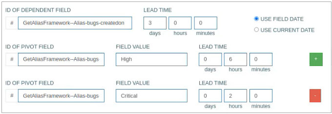
based on the value of the dependent date field and the Lead Time value that will be added to the dependent field value. The result of this calculation will be the value of the main (pivot) field. For this variant, fill in the following fields:
ID of dependent field - select the field, the value of which will be used as dependent field. The field ID can be found at the bottom left corner of the Field Settings pop-up window.
It is recommended to use the Date/Time format type for the dependent field format type. I.e., in case users define some field as the dependent field, the format type of that field should be Date/Time.Lead time (in days, hours, minutes) - define the date/time that will be added to the dependent field to calculate the value of the main date field.
You can select one of the following options:Use field date - select this option to use the specified dependent date.
Use current date - select this option to use the current date for calculation.
based on the connection with the additional dependent field of other types. In this case, you can define the connection between the dependent date field, a specific value of an additional dependent field of any type and the Lead Time that will be added to the dependent date field to calculate the result value for the main field.
ID of pivot field - select the field, the value of which will be used as pivot field and add the priority. The field ID can be found at the bottom left corner of the Field Settings pop-up window.
Field value - select the priority of the field: Critical, High, Medium, or Low. Depending on this field value the system will calculate the value of the main field.
Lead time (in days, hours, minutes) - define the date/time that will be added to the dependent field to calculate the value of the main date field.
Click the plus icon to add a new row to define new criteria for the pivot field.
Click the minus icon to delete the row with the added criteria of the pivot field.
For instance, you need to calculate the Due Date of Delivery. The Delivery date/time can be calculated based on the Purchase Order Creation date/time and the Lead Time value that will be added.
Or the additional parameter, e.g. Urgency, can be included. Then if Urgency is high, the other value of Lead Time will be added to the Creation date/time. And the Due Date of Delivery will be recalculated.
Set value from source field
Allows automatic value assignment based on another field, referred to as the source field.
The field can be configured to reference any other field, either within the same section, in the header, or even hidden fields, as its source.
On insert or update operations, the field's value will be automatically set to match the current value of the specified source field.
This behavior applies both during initial record creation and when records are updated.
This functionality also extends to fields inside tables.
If configured within a table, the source field's value will be populated to all entries (rows) in the table for the corresponding field.
Use Cases:
Useful for keeping fields synchronized automatically without requiring manual input.
Ideal for scenarios where a common value needs to be replicated across multiple places (e.g., document number, user ID, date, etc.).
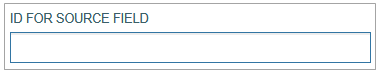
When the Set value from source field type is selected, the additional parameters to set up are displayed:
ID for Source Field - specifies the field whose value will be used to automatically populate or update this field.
Checkboxes:
Use the Current User ID on Insert Mode - automatically sets the field value to the ID of the currently selected user when a new record is created.
In the Render application, it can be displayed as follows: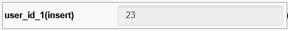
Use the Current User ID on Edit Mode - automatically updates the field value to the ID of the currently logged-in user when an existing record is modified.
In the Render application, it can be displayed as follows: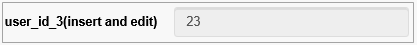
Read Only - this checkbox is automatically selected for the Set value from source field type, as such fields cannot be edited manually from the Render.
In the Render application, the field with this type can be displayed as follows:

Field type and Depth tabs
Please note that it is not recommended to use fields of the same type on the screen in different depth tabs. This may lead to the field not functioning correctly on all screens on different depth tabs, except for the first screen. For example, the field will work only on the first tab for the following field types without any additional conditions:
Inline Search
DImage
Checkbox
Radio
With dependent field
The following field types will work incorrectly, in case of additional conditions described below:
Text - in case of using custom query parameters, also the field with a Data/Time format type will work only on the first tab.
List - in case the Linked List parameter is selected.
Textarea - in case the custom query parameter is used.
Document - in case the upload button is used.
Datalist - in case the Linked List parameter is selected.
Relation Datalist - in case the Linked List parameter is selected.
Field Layout in Render application
Depending on the combination of Field and Format Types, the visual display of data in the Render application will be different. The possible layouts as well as the relation between Field type and Format types are represented in the table view:
Field Type | Format Type | Layout Example |
|---|---|---|
Text |  | |
Date |  | |
Date/Time | | |
Phone |  | |
Custom | ||
Textarea | | |
Numeric | Decimal - Static | |
Currency - Static | | |
List With Extension Function | | |
List | | |
Multi-select list | | |
Checkbox | Checkbox | 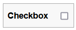 |
Checkbox Group | 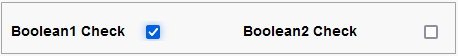 | |
Radio | Radio button | 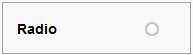 |
Radio Group | 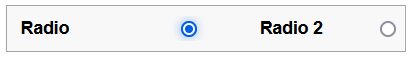 | |
Document | Upload document | |
Download document | | |
Inline Search | | |
DImage | | |
Datalist | | |
Relation Datalist | | |
With dependent field | Date | |
Date/time | | |
Set value from the source field | |