Access
Click Account Settings > Users to have an overview of all users’ accounts existing in the system and manage them.
Table of Contents
Overview
User Management provides an ability to create and manage Users' accounts in the system. This allows you to control the application and data access level for every user in the system.
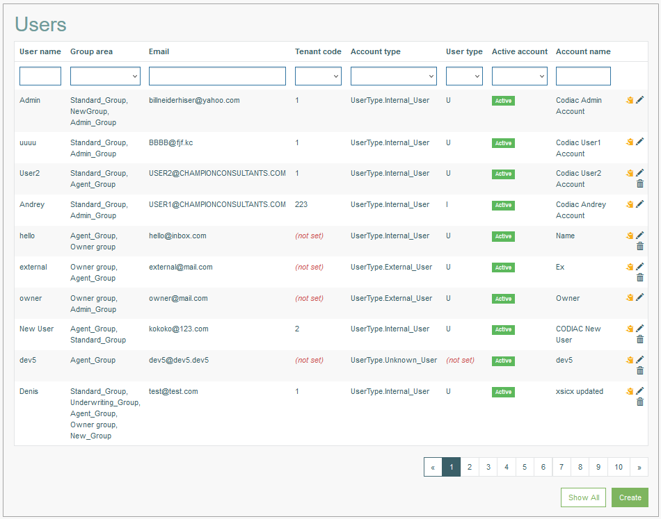
The Users Overview page looks as follows:
For every user, you can set up the data and time format based on the used locale. You can also specify the UI style and theme according to customer brand style or individual preferences. All settings will be applied across the Render application User Interface and will help you to create a feel of home in the application for every application user.
Search
The Overview or Search Results page can be used to view and manage the existing user accounts.
To search for a user or filter the search results, use the following search filter fields:
User Name
Group Area
Email
Tenant Code
Account Type
User Type
Active Account
Account Name
After filling in the search filters, click the Enter key or any screen place. The screen displays search results if found. Please note, that letters or part of the word entered in the search filter fields will be taken into account while searching as well.
Navigate
Use the navigation bar at the bottom of the Search Result page to navigate through the pages. Click the appropriate page number to open it. Use the Arrow icons to go to the next page or the previous page of the search results list accordingly.
Click the Show All button to display all the results on one page.
Create User
Click the Create button at the bottom of the Search Result page to start a User creation process. This opens the Create User editor page on the Personal tab:
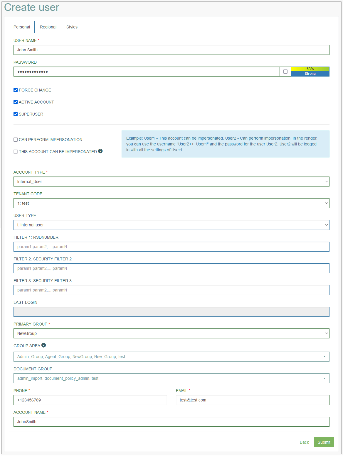
Personal tab
Fill in the following fields:
User Name – enter a user name. User name is a Login name, a string (sequence of characters) that uniquely identifies a User. Login name (or User name) can be the same as or related to the real name of User, or it can be completely arbitrary. This field is required.
Password - enter a password for the login. It is used to determine that a user requesting access to a system is exactly the particular user registered in the system. A password is a sequence of characters without spaces known only to the User. Password must contain at least 8 characters, at least one upper case character and one numeric/digit character.
You can select the check box on the left of the Password input field to show the password and check that what you are entering is correct. Deselect the check box to hide the password.
There is an indicator of password complexity and system protection. It helps you to check how strong the password is.
In the case of a Guest User, the login and password are not checked when logging in to the Render application. A Guest User can use the Guest Login option on the Render Login page and access only the predefined screens.
Force Change - select the check box to force the User to change password for the next login. When the Force Change is enabled, the access to all functionality except the Change Password page and Logout option is blocked when entering the Render application.
After the password is changed, a Logout countdown timer will appear for the user to log in using the new password.Active Account – select the check box to set the user account as active. Otherwise, it will be indicated as inactive. Inactive accounts are not allowed to login into the Render application.
Superuser – select the check box to define the user as a super user. The user with the superuser rights will be able to remove any user without the superuser rights. Also, the superuser can assign or remove a superuser assignment.
The selection of the Superuser option controls whether the User is added to the Admin Group.
If you select the Superuser option, the Admin Group will be automatically added to the Group Area field. If you deselect the Superuser option, the Admin Group will also be automatically deleted from the Group Area field.
But it does not work the other way: the selection/deselection of the Admin Group does not activate/deactivate the Superuser option.
Can Perform Impersonation - select the check box to specify that this user can perform the impersonation. That means that the user can log in to other user’s account (that is allowed to be impersonated) in the Render application to perform required operations. This will be a special mode login. In the Render, a special indicator will be displayed informing that the user is logged in the application in the Impersonation mode. In order to log in to other user’s account, use a special combination as Login Name: <Login Name of other user>+++<Your Login Name>.
This account can be impersonated - select the check box to specify that this account can be logged in by another user.
Let’s have a look at an example:
User1: This account can be impersonated.
User2: Can perform impersonation.
In the Render, User2 can use the username "User2+++User1" and the password for the user User2. User2 will be logged in with all the settings of User1.
Please note that it is not allowed to impersonate a user with the Superuser or Admin_Group privileges.
Account Type – select an Account Type from the drop-down list.
Tenant Code - enter a Tenant Code (Tenant ID). For more information about Tenants refer to the Tenant page (Account Settings > Tenant) of the User Manual.
User Type - select a user type from the drop-down list. The user types can be created and managed in the Lists editor. For more information about Lists refer to the Lists page (System Data > Lists) of the User Manual.
Filters - in the Filter 1, Filter 2, Filter 3 fields, you can define the values that will be saved into the filters configured on the Security Filters page (Account Settings > Security Filters). To get more information about Security Filters, refer to the Create Security Filter section of the Security Filters page of the User Manual.
If the filters fields are empty, that means that the filters are not used.
If the filters contain a value, that means that the security filter will limit the results to only those that match the filter values here (e.g. for SQL, it could be something similar to <query without filter>+"IN ['param1','param2']"). Several commas separated values are possibles, the placeholder contains a hint.
Note that multiple values in the filter fields should be separated with “,” characters without any spaces. For example, “param1,param2,param3”.Last Login - indicates the date and time of the last login. The value is available in the Update User mode.
Primary Group - select a user group from the drop-down list to set it as primary. The screen of this group will be shown as the start screen in the Render application. Only one value can be selected as a Primary Group. For more information on how to define the start screen for the user group see the Create Group section on the Groups page (Account Settings > Groups) of the User Manual. This field is required.
Group Area - select the groups from the drop-down list. The selected groups define the screens that will be available for the user in the Render application.
Clicking on the Group Area field will open a drop-down list with groups. Here, users can search for a specific group by typing a group name in the search area at the top of the drop-down list. Also, users can select multiple groups in the drop-down list. The selected groups will be marked with the check mark to the right from the group name.
For more information about group screens refer to the Create Group Screen section on the Group Screens page (Screen Configurations > Group Screens) of the User Manual. This field is required.
The group selected in the Primary Group field, will automatically be added to the Group Area field as well.
If the user main group is Admin_Group or the user is a Superuser, then the Admin_Group value will be added to the Group Area field automatically when saving. Even if the Admin_Group is not selected in the Group Area field.
Admin Group Rights - this field is shown only in case the Admin Group is selected in the Group Area field. In the Admin Group Rights drop-down list, the rules created on the Architect Screen Access page (System Data > Architect Screen Access) are displayed. Here, the screen access rule can be selected and assigned to the users. For more details about the screen access rules, refer to the Create Architect Screen Access Rule section on the Architect Screen Access page of the User Manual.
Document Group - define the group of documents that will be available for the user.
Clicking on the Document Group field will open a drop-down list with document groups. Here, users can search for a specific document group by typing a document group name in the search area at the top of the drop-down list. Also, users can select multiple document groups in the drop-down list. The selected document groups will be marked with the check mark to the right from the document group name.
The actions that will be available for the user are managed via Access Rights defined in the Document Group functionality. For more information about the Document Groups refer to the Create Document Group section on the Document Groups page (Document Access > Document Groups) of the User Manual.Phone - enter a contact phone number of the user.
Email - enter an email address. It will be used for notifications.
Account Name - enter a user name. This name will be displayed in the user menu in the Render application.
Regional tab
On the Regional tab you can set up the parameters and settings according to the user’s locale.
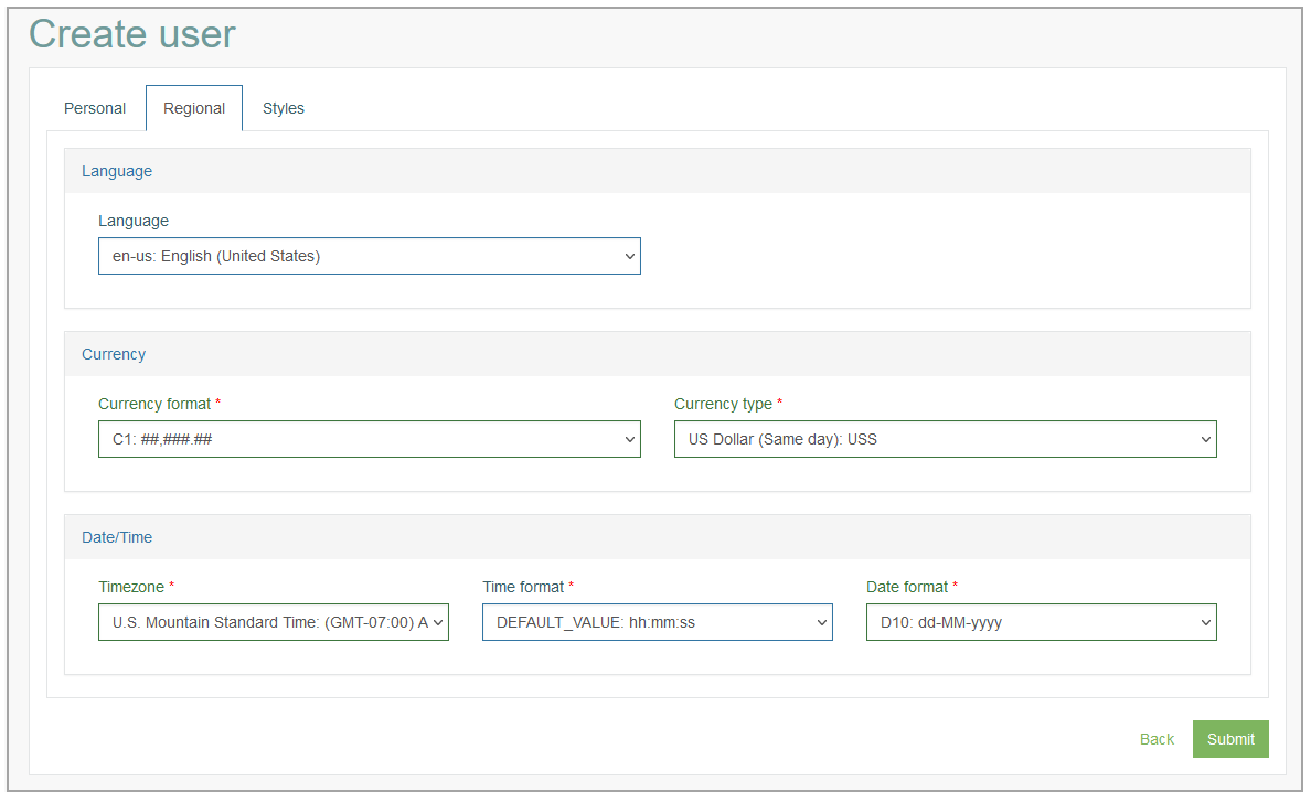
This tab consists of 3 sections where you can enter the following information:
Language:
Language - select the language that will be used in the application.
When you select the language, ensure that the translations for this language exist in the system.
In case there are no translations for the selected language, the default language will be used. Currently, the default language is English.
Please note that the selected language will not be applied to the email notifications. They are configured separately.
Currency:
Currency Format - select the format, in which the currency will be displayed in the Render application.
Currency Type - select the currency type from the drop-down list.
Date/Time:
Timezone - select the time zone to apply user’s local time.
In the Render application, the Timezone parameter will be applied to fields with Date and Date/Time format type. The time in these fields will be recalculated based on the user's timezone after saving the record. I.e., each user will see the time for their timezone, and the database will store the time in GMT.
The system supports two timezone standards:static - the time difference is always the same, regardless of winter or summer time. For this type, the time should have the following form: (GMT< + or - >< number_of_hours >:00). For example, (GMT-05:00:00) Eastern Time (US and Canada).
dynamic (php standard) - the change to summer and winter time is automatic, depending on the date. For example, the time description can be as follows: America/New_York.
For example, there are the following records stored in the database: "2024-01-22 17:55:12" and "2024-04-22 17:55:12".
For the user that uses the "(GMT-05:00:00) Eastern Time (US and Canada)" static time standard, the time will be displayed as follows: "22.01.2024 12:55:12" and "22.04.2024 12:55:12".
For the user that uses the "America/New_York" dynamic time standard, the time will be displayed as follows: "22.01.2024 12:55:12" and "22.04.2024 13:55:12".
Time Format - select the format, in which the time will be displayed in the Render application.
Date Format - select the format, in which the date will be displayed in the Render application.
The values of Language, Currency and Date/Time are available for the selection from the drop-down lists.
You can manage (create, update, delete) Language, Currency and Date/Time in the Lists functionality (System Data > Lists). For more information on how to manage the above-mentioned parameters, refer to the Create List section on the Lists page of the User Manual.
Styles tab
On the Styles tab, you can specify how the UI “look and feel” will look like in the Render application.
You can customize the application UI to apply the branding and styles according to your requirements and preferences.
You can add your logos, avatar, customize colors, font size for menu, actions, buttons, sections and other UI properties that will help you to create your custom style and and feel of home in the Render application.
The common Styles are set up in the Tenant settings as well. But they will be overridden by the user-specific parameters.
Please specify the following parameters to customize the look and feel for the user’s UI:
Main Format
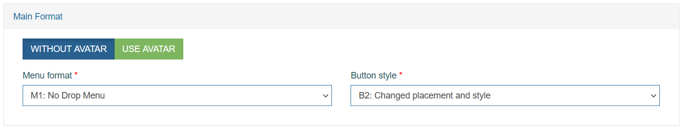
Avatar
Note that the Avatar can be used only in the M5: Menu with left navigation bar menu format.Without Avatar
Use Avatar
Menu format
M1: No Drop Menu – all menu items and sub-items are displayed as equals sections at the top of the page, except the My Account section. The My Account section will be displayed as a drop-down menu with sub-items.
M2: One Level Drop Menu – all menu items are displayed as drop-down menu with one level of sub-items at the top of the page.
M3: Two Level Drop Menu – all menu items are displayed as drop-down menu with two level of sub-items at the top of the page.
M4: One level main menu, two level tab menu – all menu items are displayed as drop-down menu with one main sub-item and two levels of sub-items at the top of the page.
M5: Menu with left navigation bar – all menu items are displayed as the list with drop-down menu on the left of the page, except the My Account section. The My Account section will be placed at the top of the menu list. In this section the Username will appear. The sub-items such as Settings, Change Password and Logout will be shown as the corresponding icons.
M6: No Menu – all menu items will not be displayed on the screen in the Render.
M7: No Menu – keep account button – all menu items will be disabled on the screen in the Render, except the My Account section. The My Account section will be displayed as its sub-items such as Settings, Change Password and Logout and will be placed at the top left corner of the page.
At the moment, the functionality for M3: Two Level Drop Menu and M4: One level main menu, two level tab menu is not released. In the Render application, these menu formats will be displayed as the M2: One Level Drop Menu menu format.
Button style
Menu
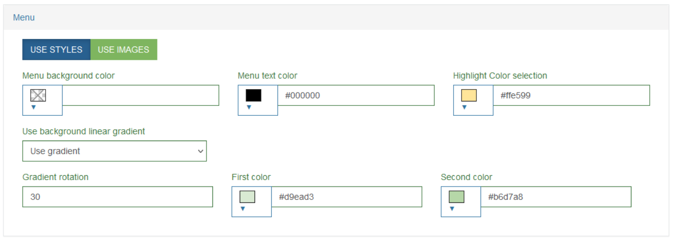
Menu background color
Menu text color
Highlight Color selection
Use background linear gradient
Gradient rotation
First color
Second color
Body
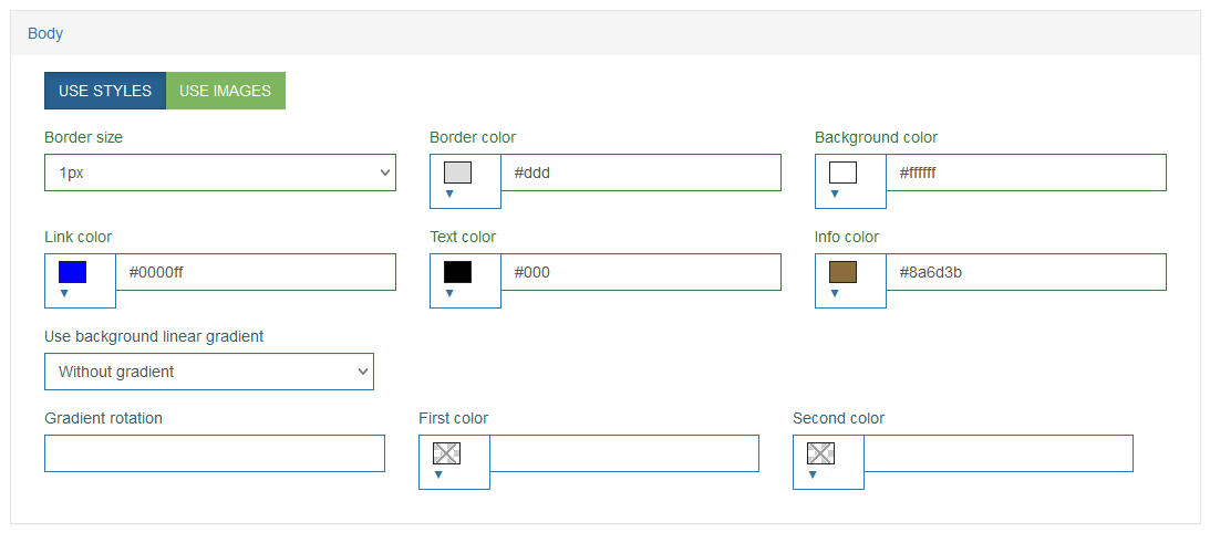
Border size
Border color
Background color
Link color
Text color
Info color
Use background linear gradient
Gradient rotation
First color
Second color
Section for Login Screen
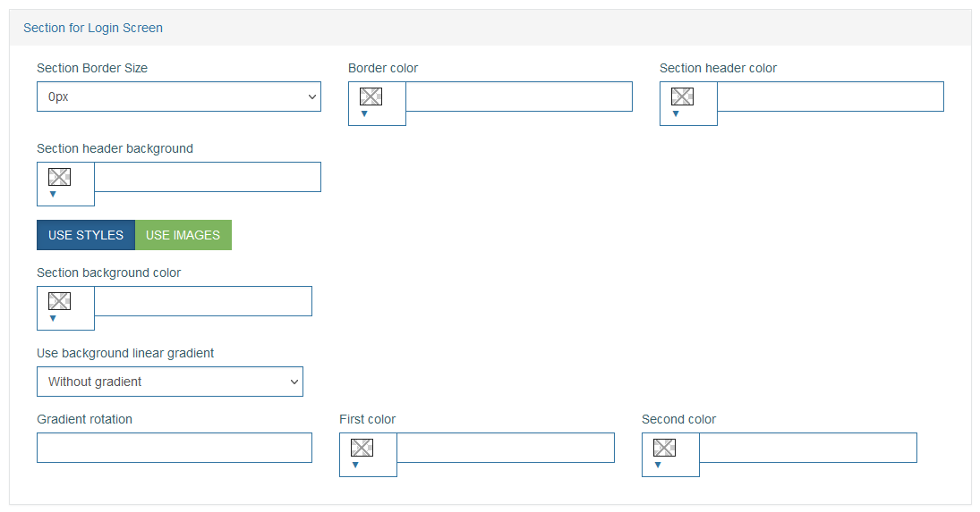
Section Border size
Border color
Section header color
Section header background
Section background color
Use background linear gradient
Gradient rotation
First color
Second color
Section
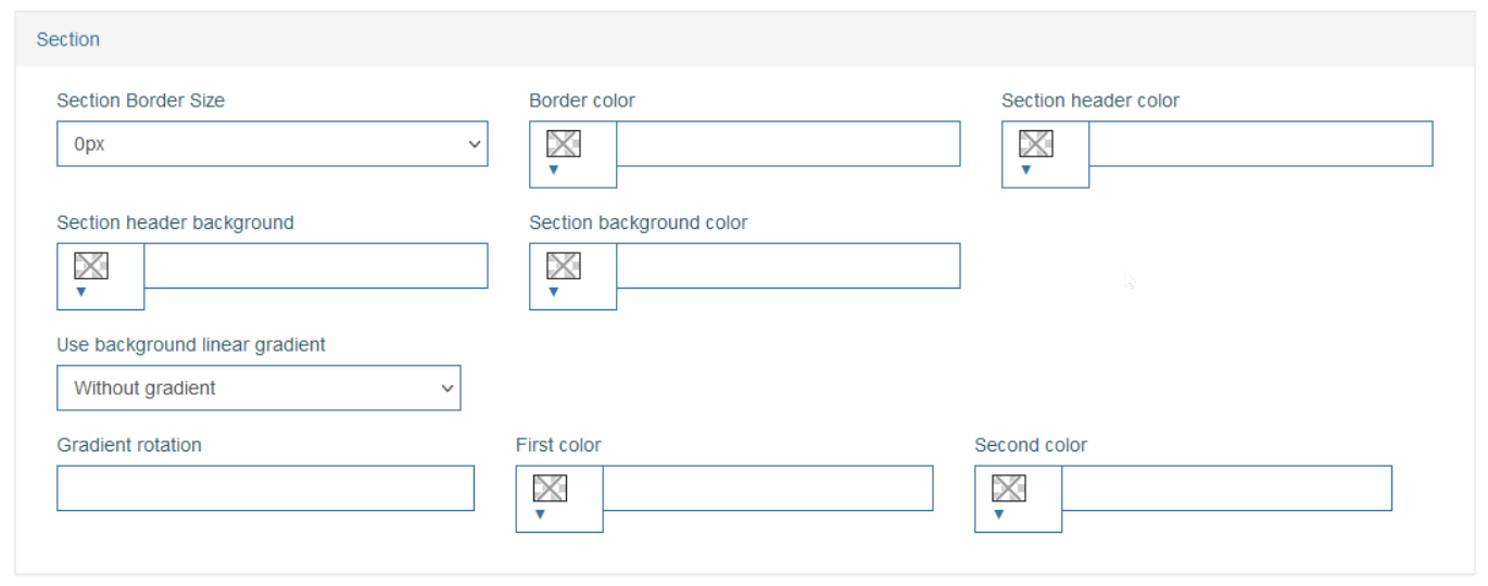
Section Border size
Border color
Section header color
Section header background
Section background color
Use background linear gradient
Gradient rotation
First color
Second color
Header
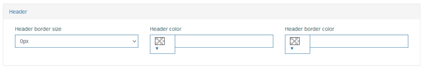
Header border size
Header color
Header border color
Screen Presentation
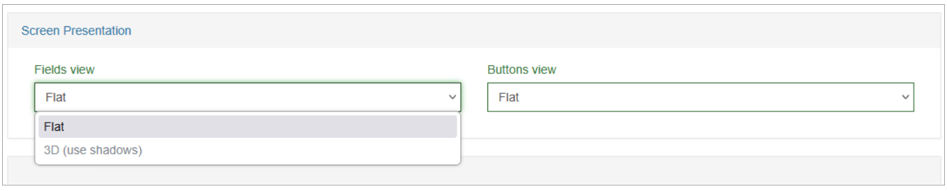
Screen Presentation - define the appearance of the screen UI elements:
Fields View - define the visual style of input fields.
Available options:Flat - a flat style without shadows.
3D (with shadow) - a three-dimensional style with shadow
Buttons View - define the visual style of buttons.
Available options:Flat - flat buttons without shadows.
3D (with shadow) - buttons with a three-dimensional effect and shadow.
Search Field
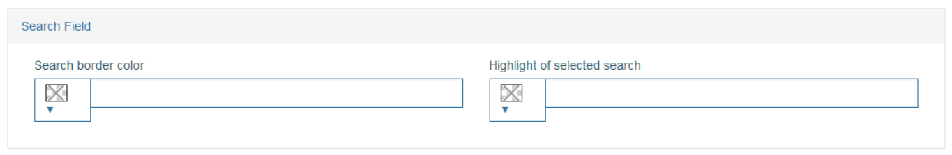
Search border color
Highlight of selected search
Fields
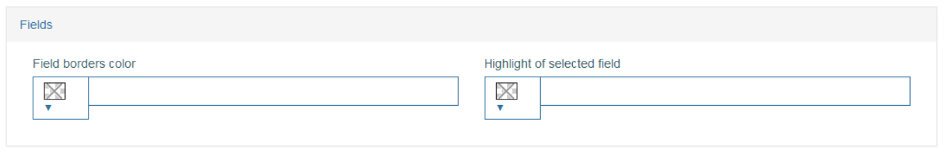
Field borders color
Highlight of selected search
Tab
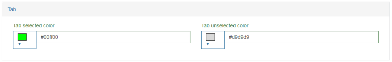
Tab selected color
Tab unselected color
Message Line
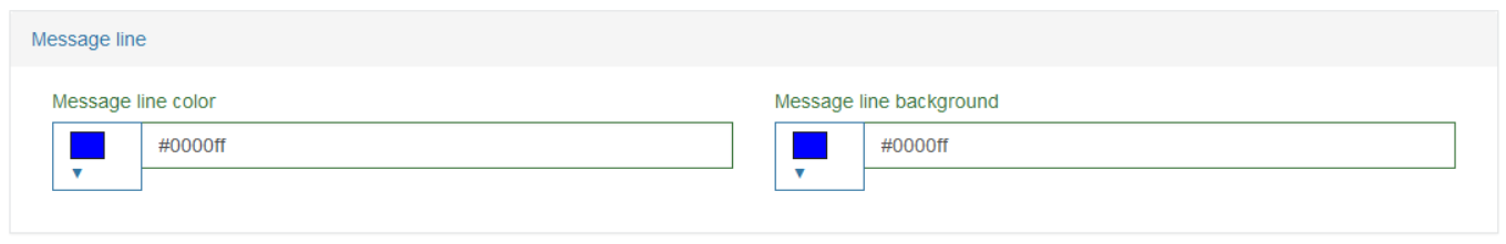
Message line color
Message line background
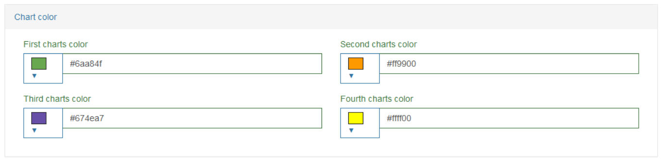
Chart Color
First charts color
Second charts color
Third charts color
Fourth charts color
Update User
To edit a User, click the Edit (pencil) icon for the selected User entry in the search results table. The Update User - <User name> page opens for editing.
After making the necessary changes, click the Submit button. To return to the Users search page, click the Back link.
Copy User
To make a copy of existing user account details and create a new User based on the copied fields, click the Copy User icon for the selected User entry in the search results table. The Create User page is opened, all fields except User Name, Password and Account Name are copied from the selected user.
Edit the data, enter the missing information and click the Submit button to save the changes.
Delete User
To delete a User from the list of users and from the system, click the Delete icon on the Overview page for the selected User. The confirmation pop-up will appear where you can confirm or cancel the action.