Table of Contents
Overview
The Table type of section provides the possibility to represent the data in table view on the screens in the Render application.
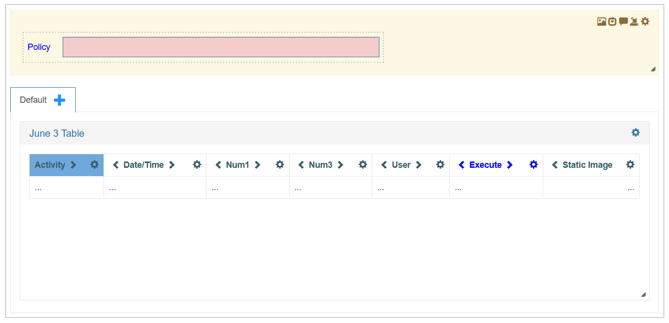
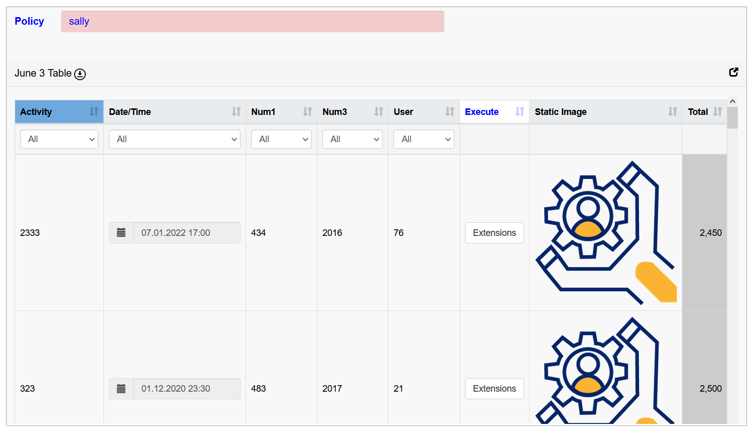
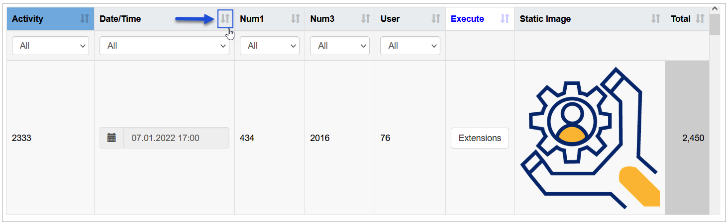
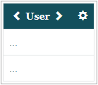
For example, the section configured, as displayed on the screenshot above, will look in the Render as follows:
Section Settings
To configure the section settings as well as some part of table configurations, click the gear icon in the right upper corner of the section.
The Section Settings pop-up window opens:
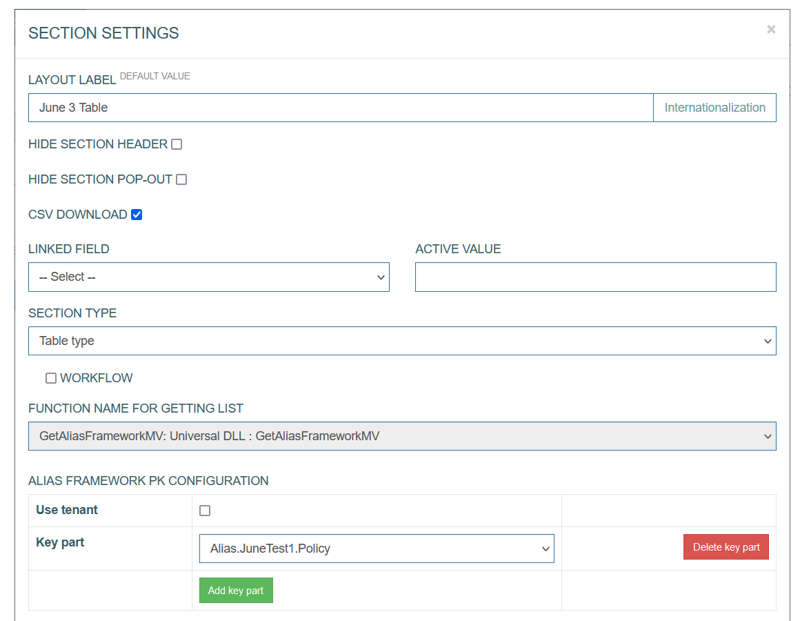
Here you can configure the general settings connected to the section and the settings related to the table displayed on the screen further.
The general section settings are described on the Screens page of the User Manual.
Table Configuration
Below you can explore the instructions on how to set up the section parameters exactly for the Table type of section:
CSV download - select the check box to enable the possibility to download the table in CSV format from the Render screen.
Alias Framework PK Configuration - this feature is used in special cases when the tables are connected via a composite key.
Select the Key parts to define the fields taken from the tables of different levels (to fill in values from parent to child tables).
The next part of the parameters that can be set up in the Section Settings pop-up window is connected to the general table settings.
The following parameters can be set:
Multi-level Table - select the check box to enable the possibility to display multi-level tables. This option is actual for the case when some tables can contain sub-tables that can be opened layer by layer.
Sub-table Filling Type - this select box is displayed in case the Multi-level Table is selected. You can select one of the following options:
all at once - the main table will be the query table, and the sub-table will have Multi dependencies on the parent table. That means that all values of all related tables will be retrieved at once.
on request - the parent table will be the request table and the sub-table will have Single dependencies from the parent table. That means that only displayed values will be retrieved. The performance is better in this case as a rule.
Total for the column - select the check box to enable the additional row displaying the Total count for the whole column.
Total for the row - select the check box to enable the additional column showing the Total count for the whole row.
Ad-hoc table loading - enables table view with pagination. The table data will be loaded for every page. It can be useful for tables with large bulk of data or dImages to improve the responsiveness of an application.
Note that the Total for the column and Total for the row options cannot be selected at the same time with the Ad-hoc table loading option. As for the Total for the column and Total for the row options, the full table should be displayed.
Readonly - select the check box to make the table read-only. This option is used for the tables that should be displayed in View mode only. In case this check box is selected, the table will not be editable even in the Edit and Insert modes on the screen in the Render application.
Update Only - this option allows changing the data in the table only but not editing or adding new rows.
Include Column Filter - select this check box to use Filters in the columns for filtering values. The added filters will automatically contain the list of possible values. Filters can be applied to the column with the data of Field type.
Include Extended Search - select this check box to add a separate search field that allows searching for any value of the table fields.
Label orientation - this option defines the layout of the table header. Select the available options:
Top - to display the table header at the top row.
Left - to display the table header as the first left column of the table.
Show type - this option defines how to display the table content on the page - using pagination or infinite scroll.
Scroll - select this option to scroll on the page.
Without scroll - select this option to use pagination.
Count - defines the number of table rows on the page in case of pagination.
Pixel Height - define the size of the window in case of scroll usage. The default value is 580px.
Sort Fields - define the field(s), by which the table value should be sorted in alphabetical order. You can use aliases to define the field(s) to sort the values. If the field is empty, the default sort by primary key is used.
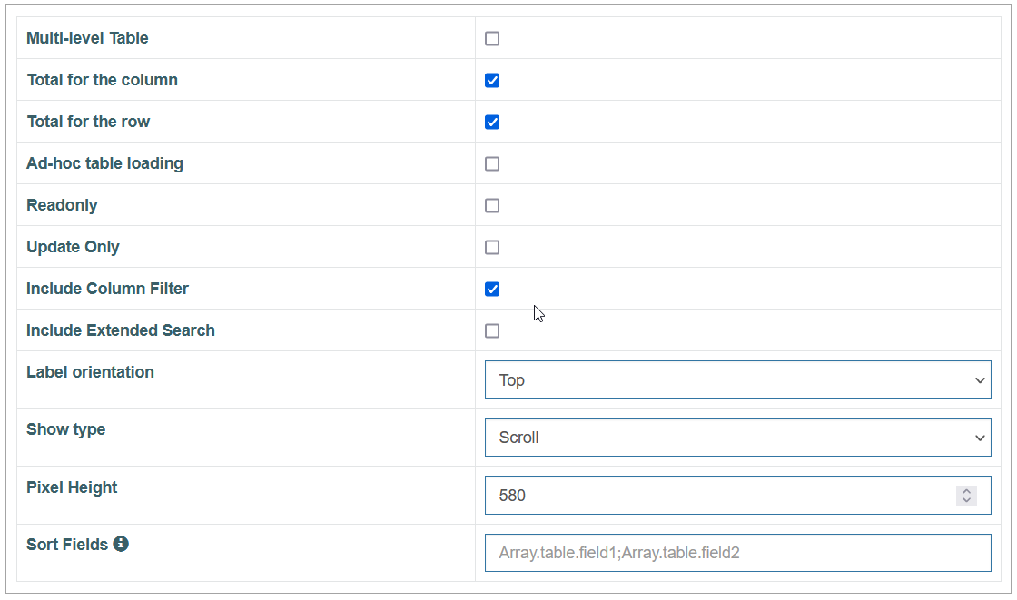
Table Columns Configuration
The next part of parameters in the pop-up window refers directly to the table layout. In comparison to the Edit type of section where we make all configurations that are necessary for fields in the Section Settings pop-up window, the configuration of the table should be done in two places: first in the pop-up window and then directly on the table in the section.
Please note that when configuring the search screen, users are limited to using data from only one table to populate it. Data will only be returned for the first group of aliases listed. For example, if users include aliases like “Array.table1.field1”, “Array.table2.field1”, “Array.table2.field2”, and “Array.table2.field3” in the table, data will be returned only for “Array.table1.field1” (as it is mentioned first), but not for the others.
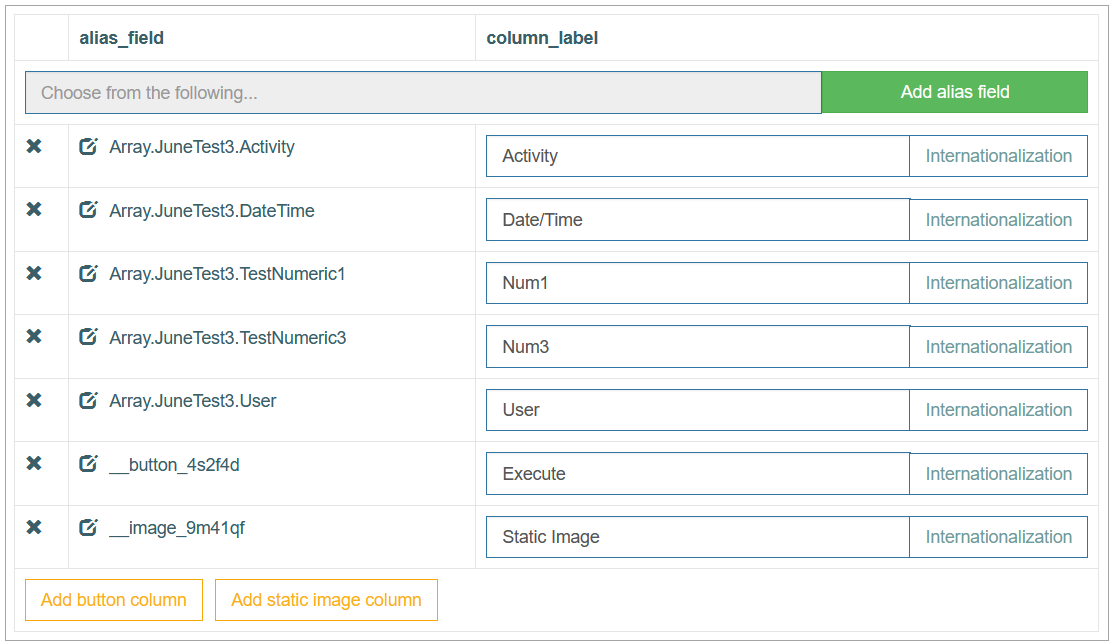
So, from the Section Settings pop-up you can configure the columns of the table, their labels and the aliases that should be used to receive the values:
Alias Field (alias_field) - in the input field, start typing the alias that should be used to retrieve the field values. The autocomplete feature helps you to find the needed alias.
Click the Add alias field button to add the selected alias to the table as a column field.
Column Label (column_label) - enter a label text that will be displayed as a column title for the corresponding alias entry.
Internationalization - click the button to add translations for other supported languages, if needed.
Add button column - click this button to add a column that will contain the buttons. The behavior of the added buttons will be set up directly in the table column.
Add static image column - click this button to add a column with the static images.
Common Operations
You can perform basic operations by clicking the buttons at the bottom of the Section Settings pop-up window. These actions are listed below:
Save - click the Save button to confirm and save the entered data. After saving the table configuration, a newly created table appears in the section area.
Close - click the Close button to close the pop-up window without saving the data.
Formatting section fields - click the Formatting section fields button to customize the formatting and ‘look and feel’ of labels and fields in the table. But please note that the formatting made directly on the table in the section is considered as a first order formatting and will be applied primarily.
Column-specific Settings
The column-specific settings, including column order, can be configured directly in the table.
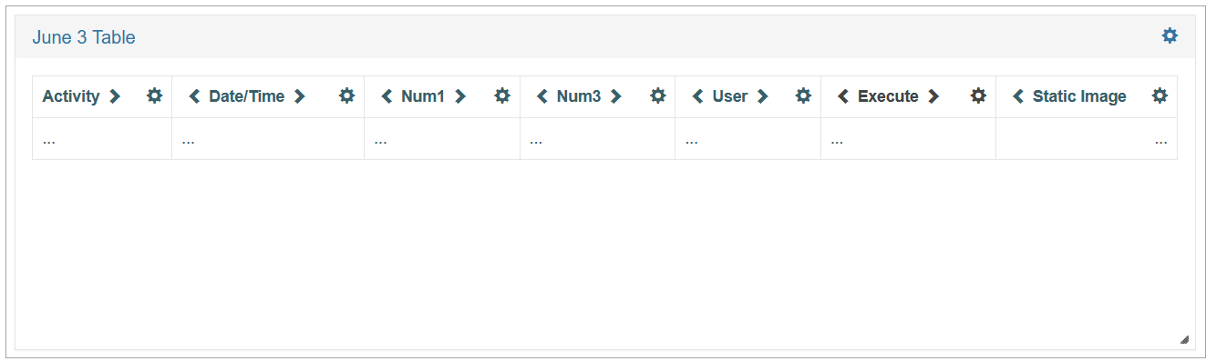
After creating the table, adding columns and saving the configured section settings, the created table appears in the section area:
To change the sequence of columns in the table, use the Move Left or Move Right icons next to the Column titles.
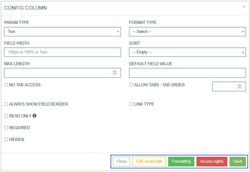
To open a column-specific setting, click the Gear icon next to the column title. The Config Column pop-up appears:
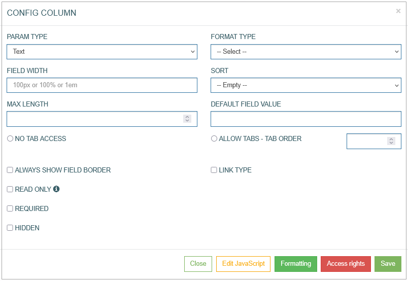
You can set up the parameters of the data that will be processed in every column:
Param Type - select the data type from the drop-down list. As a rule, the data type is defined by the table field that should be processed. But the Param Type value should be specified manually by the user.
By default, the Param type is set to the Text type, in case the value is not defined by user. And if the field value has another type, it can cause a problem in the Render application.
Based on the selected Param Type in the Architect application, in the Render application the column can be as follow types:
Text - single-line text input field.
Numeric - input restricted to numeric values.
Textarea - multi-line text input for longer content or descriptions.
List - drop-down list allowing selection of a single option from predefined values.
Multi-select list - drop-down list allowing multiple selections.
Set value from source field - sets the value dynamically based on another field (source field).
Datalist - text input with autosuggest capabilities, backed by a predefined list of options.
Relation datalist - similar to datalist, but the options are based on values from a related table.
List from API - display the list of values (options) received from an external application.
Checkbox - displays a binary toggle (checked/unchecked).
Radio - a group of radio buttons for selecting a single option.
Button - a clickable button that can trigger an action or event.
Inline search - allows users to see search results without redirecting to a search results page.
Image - allows image selection or upload.
DImage - allows users to upload any image file.
Format Type - select the Format Type from the drop-down list. The list of available options is restricted by the values related to the selected Param Type.
Email – to add the email address, e.g., name@domain.com.
Date – to add the information about date in the Date format.
Date/Time – to add the information about date and time in the format of Date and Time.
Phone – to add the phone number.
Custom – to add the information in the custom format. In case of selecting the custom format field type, the additional Format Template field will appear. Set the custom field format in the appeared Format Template field, using the x, n, -, + characters, where:
x – any English text and numeric character can be added,
n – numeric character input only,
- / + – separator types. The separators will be added automatically on the screen in the Render.
For example:in case of the xxx--nnn++xn-n template, the entered data might be abc--123++q2-1, or
in case of the nn-xx+xn-nx template, the entered data might be 35-pt+a3-4t, etc.
The field format will be shown as a placeholder of the field on the screen in the Render application. In case users enter the data in the format that does not meet the format template set, the warning tip will appear
Field Width - define the width of the field. The width must be specified in %, px, or em. For example, 10%, 20px, or 30em.
It is mandatory to specify units of measurement (%, px, or em), as values entered without them will be ignored in the browser.
It is recommended to use fixed units (px or em) for the columns with buttons and images.
Please note that the field width can automatically be adjusted according to the content.
Sort - define the ascending or descending sort for the column content. The defined sort will be used by default when displaying the data in table view in the Render application.
Max Length - define the maximum number of characters allowed to be entered in the field.
No Tab Access - specifies whether it is allowed to use the Tab key from the keyboard. If the option is selected, that means that usage of Tab key is disabled for this column.
Allow Tabs - Tab order - enables the usage of the Tab key from the keyboard. In the input field next to the radio button, you can define the order when the column appears in the tabulation.
Read-only - select this check box to define the column as not editable. Additional parameter that defines the column as read-only, is the alias: if the alias contains the ‘-' character, then it is considered as read-only.
Required - select this check box to mark the field value in the table as required in the Render.
Hidden - select the check box in case the whole column should be hidden.
Always show field border - defined whether the column borders should be shown.
Use Current Date/Time on Insert Mode - specifies that when user opens the screen/field in the Insert mode, the current Date and Time will be always taken to save the value (even in case user filled in the field with another value). Available only for columns of the Text type, and Date or Date/Time format types.
Use Current Date/Time on Edit Mode - specifies that when user opens the screen/field in the Edit mode, the current Date and Time will be always taken to save the value (even in case user filled in the field with another value). Available only for columns of the Text type, and Date or Date/Time format types.
Type Link - select the value from the drop-down list:
Blank - to open a linked page in a new tab.
Self - to open a linked page in the current tab.
Modal - to open a link in a modal window. Define Modal Size in the connected field.
Blank Bypass - to open a link in a new tab and to pass the additional parameter specified in the Pass Through Parameter field.
Modal Bypass - to open a link in a modal window and to pass the additional parameter specified in the Pass Through Parameter field.
Define the following Type Link parameters:
Menu - to select the menu that the required screen is assigned to.
Group screen - to select the group screen that the required screen is assigned to.
Screen - to select the required screen that will be opened by link.
Parameter - to specify the required parameter that will be used for searching on the screen.
Pass Through Parameter - this parameter will be passed by link to the defined screen.
Note that depending on the selected Parameter Type, additional parameters can be displayed:
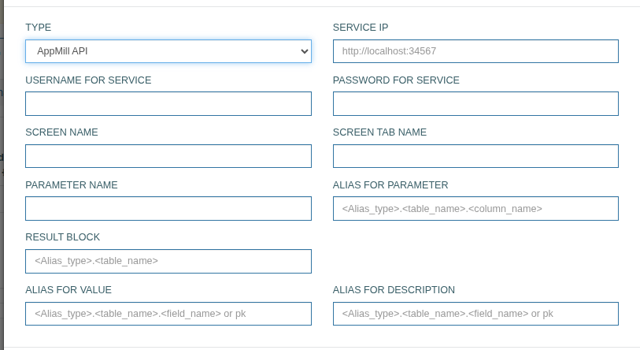
Service IP – define the API of the AppMill service that you will use to request the data.
Username for Service – enter the Username that is defined for the Service.
Password for Service – enter the Password that is defined for the Service.
In case the Pass Thru Guest User is specified on the first Screen Builder page, the Username for Service and Password for Service fields can be empty.
Screen Name – enter the value of the Select existing screen or Add new screen fields from the first Screen Builder page.
Screen Tab Name – enter here the value of the Tab Name field from the first Screen Builder page.
Parameter Name – define here the Primary Key field from the table currently used.
Parameter Field ID – define the ID of the field configured for the Primary Key on the screen. You can check and copy Field ID value displayed in the corresponding Field Settings modal window in the Screen Builder.
Result Block – define which block of data will be used in the Response.
Alias for Value – enter here the alias for the field value to be used in the response.
Alias for Description – enter here the alias for the field description that will be displayed in the response.
Pay attention that for the correct work of the Primary Key field, the Always show field border parameter must be selected.
Let’s proceed with other parameters:
Numeric
Use to calculate totals - define whether the values of the data column should be used for calculating the Total count.
The Use to calculate totals parameter appears only if, in the Table Section configuration step, at least one of the following parameters, Total for the column or Total for the row, is defined. Also, the Scroll option should be selected for the Show type parameter to provide the correct work of the Use to calculate totals functionality in the Render application.
In the table settings, you can choose whether the amount will be calculated by columns (Total for the column) or by rows (Total for the row), or by both (Total for the column and Total for the row). When calculating the amount, the number of decimal places will be taken as the largest value of the summed ones (for currencies - 2 decimal places).
Button
Button action - define the action that should be applied to the screen when clicking the button. Select the button action from the available drop-down list.
Inline Search
Custom Query - select the query that helps users to get the needed values from the database table in case. The custom query is usually used in the search field but can successfully be used for other fields on the screens.
Image
Custom #ID - the ID of a UI element. It can be used in the scripts, to adjust UI element style. The value is generated automatically.
Image Action - select the action from the drop-down list to apply it to the screen when the image is activated (clicked on).
Upload Image - click the File select button to upload the image from your local machine.
Allow full size modal popup - select the check box to allow opening the image in a separate modal pop-up window.
Dimage
Custom #ID - the ID of the image. It can be used in the scripts, to adjust UI element style. The value is generated automatically.
Image action - select the action from the drop-down list to apply it to the screen when the image is activated (clicked on).
Datalist
Values - enter the values that will be displayed as field options for selection in the Render application. Use the delimiter ";".
Relation Datalist
Execute only OnFocus
Custom query - select the query from the drop-down list. This feature helps users to get the values from the database table.
Set value from source field
Use the Current User ID on Insert Mode - automatically sets the field value to the ID of the currently selected user when a new record is created.
Use the Current User ID on Edit Mode - automatically updates the field value to the ID of the currently logged-in user when an existing record is modified.
Common Operations
At the bottom of the Config Column pop-up window, there is a block with common operations.
The following operations can be performed while updating information in the pop-up window:
Save
Click the Save button to confirm and save the entered data. After saving the table configuration, a newly created table appears in the section area.
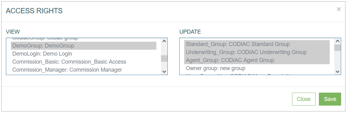
Access Rights
Click the Access Rights to open the corresponding pop-up window where you can define the View and Update access rights for user groups.
Formatting
In sections with Table Type, the Formatting functionality is used to customize the column header and cells formatting:
the Label parameters are set for a column header.
the Field parameters are set for the column cells.
Note that the Field parameters can only be used if the Always show field border parameter has been selected in the Config Column pop-up window.
Click the Formatting button to customize the “look and feel” of the column fields and labels in the table. The formatting customized here will be applied primarily.
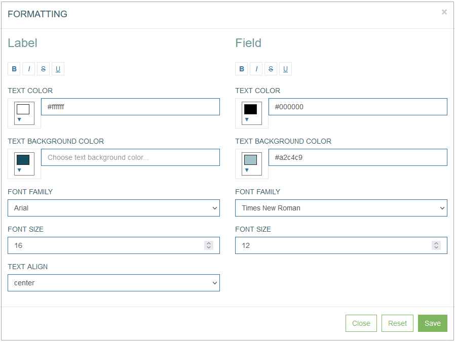
In the opened Formatting pop-up window users can define the Label (column header) and Field (column cells) style and format parameters such as:
Font style:
bold
italic
crossed out
underlined
Text color
Text background color
Font family
Font size
Text align - cannot be used for the table column formatting.
For example, the formatted column can be displayed as follows:
In the Render application, the formatted column can be displayed as follows:
Click the Save button to confirm column formatting changes.
Click the Reset button to clear column parameters.
Click the Close button to cancel the formatting changes without saving and return to the Config Column pop-up window.
Edit JavaScript
Click the Edit JavaScript button to open the editor and set up the behavior and CSS styles for UI elements on the screen.
The Edit JavaScript functionality is available for the following column parameter types:
Text
Numeric
Textarea
List
Multi-selected list
Set value from source field
Datalist
Relation datalist
List from API
Checkbox
Radio
Inline search
DImage
Note that the JavaScript validation for values entered to the table is performed separately from the JavaScript validation for the regular fields on the screen.
For example, there are 2 sections on the screen. The first one has a Table section type, and the second one has an Edit section type. In this case, the JavaScript validation for values entered to the table is performed when users work directly with the table (add new values to cells, edit values, etc.) before saving the changes on the screen. While the JavaScript validation for the regular fields on the screen is performed when users save the changes on the screen.
Custom JavaScript tab - on the Custom JavaScript tab, you can set up and customize the behavior and CSS styles for UI elements on the screen.
You can set up the OnEdit, OnInsert, onFocusOut and onFocus actions on the correspondent tabs.
To simplify the code writing on the Custom JavaScript tab, the jQuery library can be used. The jQuery library provides the possibility to use less symbols to write the Custom JavaScript. For more information about the jQuery library, visit the jQuery website.
It is recommended to define additional checks when the Custom JavaScript performs validation successfully and when the validation is failed.
For the positive case, when the check is passed, it is necessary to remove the class "not-valid-data" from the element: "$(this).removeClass('not-valid-data');".
For the negative case, when check is not passed, an error with auxiliary text: "throw new Error('error message');" should be displayed.
For example:
the Custom JavaScript validation of the field is set up for the onFocusOut action.
the Custom JavaScript of the field restricts the maximal numeric value entered in the field to 100.
In this scenario, if the user entered a value greater than 100 in the field within the Render application, the following outcome would occur:
the further execution of the script should be stopped;
the error message is displayed;
and the Save action should not be allowed.
Common JavaScript tab - on the Common JavaScript tab, you can set up and define as common the behavior and CSS styles for UI elements on the screen.
You can set up the OnEdit, OnInsert, onFocusOut actions on the correspondent tabs.
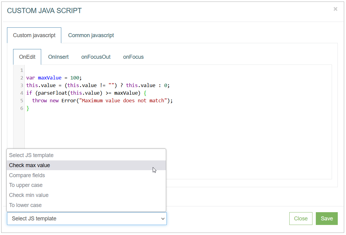
Select JS template - click on the drop-down list to add the existing JavaScript template to the editor. The following templates are available by default:
Check max value
Compare fields
To upper case
Check min value
To lower case
The JavaScript templates with examples are described below:
Check max value
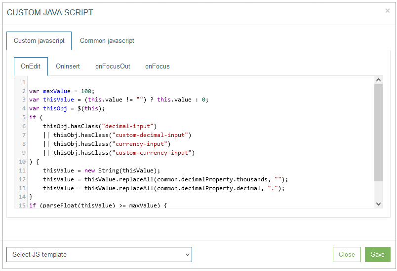
This template provides the possibility to restrict the maximal numeric value entered in the column cell.
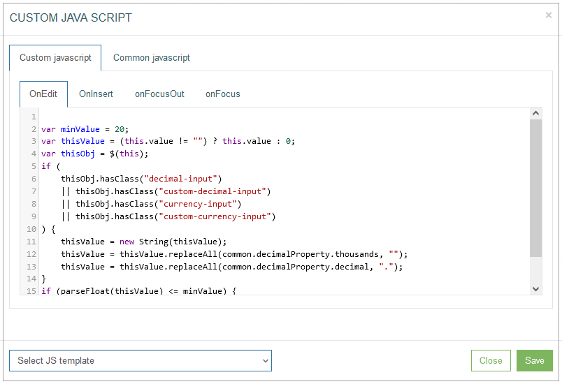
On the Custom JavaScript tab, the template can be displayed as follows:
On the Common JavaScript tab, the settings are displayed as follows:
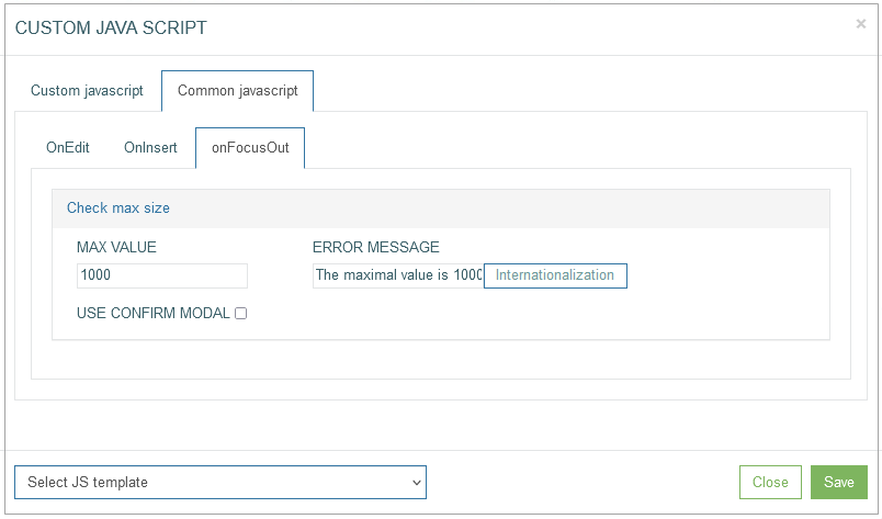
Enter the maximal value to the Max value field and the text that will be shown as a warning message to the Error Message field. The warning message will appear and can be displayed in the Render application as:
a pop-up window,
a tooltip,
ora confirmation pop-up window with actions. This warning message type will appear in case of selecting the Use confirm modal check box.
Note that the warning message in the confirmation pop-up window is available only for the onFocusOut action.
For example, on the Common JavaScript tab, the Check max value operation was set up and defined as “1000” as the common behavior for the onFocusOut action for the “Num1” column.
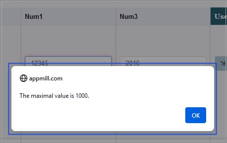
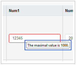
In case the entered data in the Render application does not match the defined parameters, the warning message will appear and can be displayed as a pop-up window or a tooltip.
In the Render application, the warning message can be displayed as a pop-up as follows:
Or as a tooltip as follows:
In case the Check max value operation was set up as the common behavior for the onFocusOut action for the field, the additional confirmation will be available. Select the Use confirm modal check box, to display the warning message as a confirmation pop-up window with actions in the Render application.
For example, the entered value in the Num1 column is more than the defined maximal value. The warning message will appear as a confirmation pop-up window.
In the Render application, it can be displayed as follows:
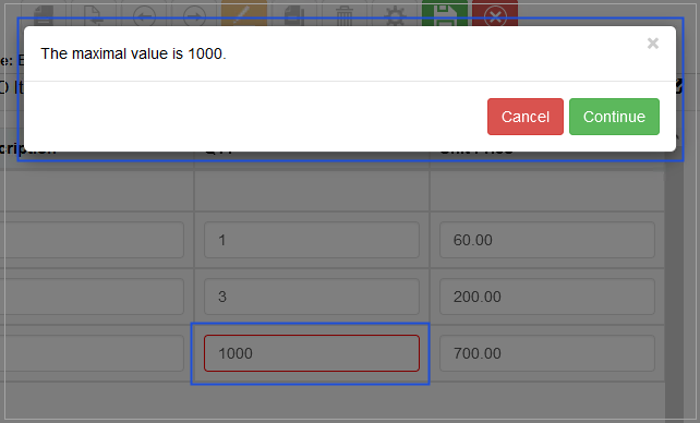
Click the Continue button, to confirm the entered value is correct.
Click the Cancel button, to deny the confirmation and return to the value editing.
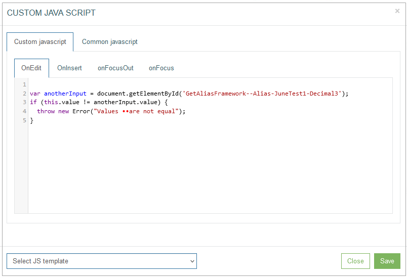
Compare fields
This template provides the possibility to set the field value comparison. The entered data in this column must match the entered data of the field defined in the template.
On the Custom JavaScript tab, the template can be displayed as follows:
On the Common JavaScript tab, the settings are displayed as follows:
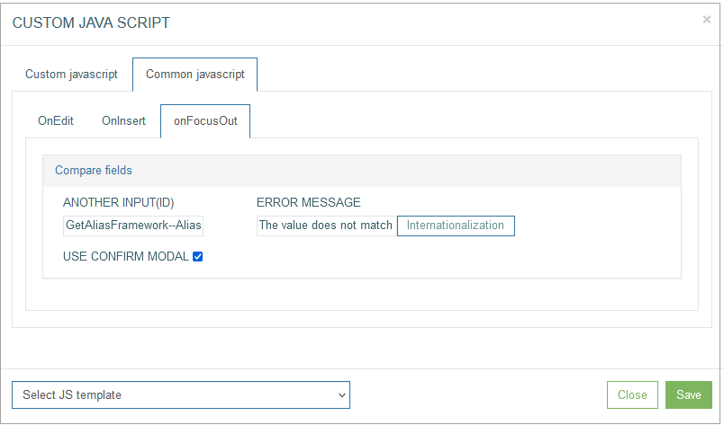
Enter the field ID with value of which the entered value will be compared to the Another input (ID) field.
The field ID can be found at the bottom left corner of the Field Settings pop-up window.
Enter the text that will be shown as a warning message to the Error Message field. The warning message will appear and can be displayed in the Render application as:
a pop-up window,
a tooltip,
ora confirmation pop-up window with actions. This warning message type will appear in case of selecting the Use confirm modal check box.
Note that the warning message in the confirmation pop-up window is available only for the onFocusOut action.
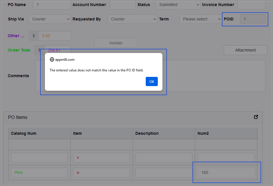
For example, on the Common JavaScript tab, the Compare fields operation was set up as the common behavior to the onFocusOut action for the “Num2” column. I.e. the entered value of the “Num2” column will be compared with the value of the “PO ID” field defined in the Another input (ID) field.
In case the entered data in the “Num2” column in the Render application does not match the value of the “PO ID” field, the warning message will appear and can be displayed as a pop-up, a tooltip or a confirmation pop-up window with actions.
In the Render application, the warning message can be displayed as follows:
a pop-up window
a tooltip
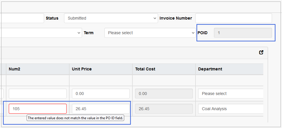
or a confirmation pop-up window
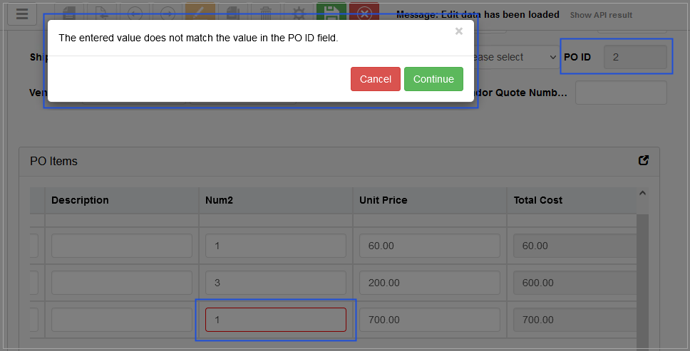
Click the Continue button, to confirm the entered value is correct.
Click the Cancel button, to deny the confirmation and return to the value editing.
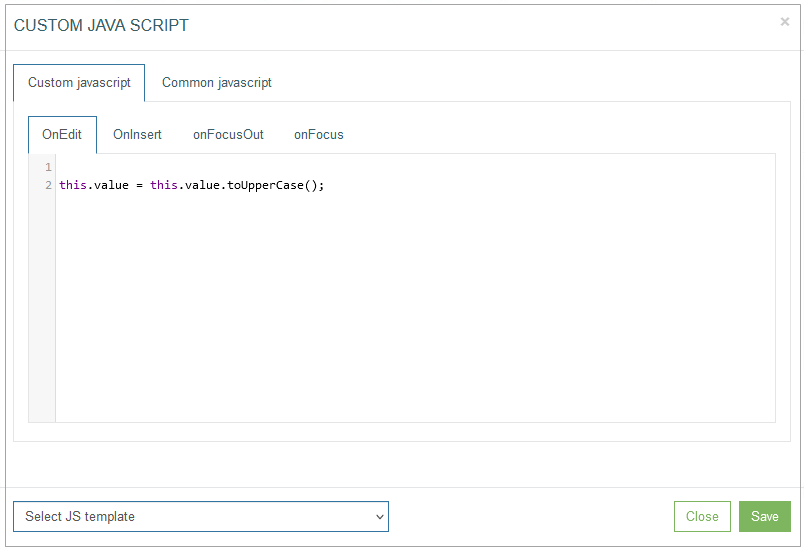
To upper case
This template provides the possibility to define that the entered data in the column cell must be written in capital letters.
On the Custom JavaScript tab, the template can be displayed as follows:
On the Common JavaScript tab, the settings are displayed as follows:
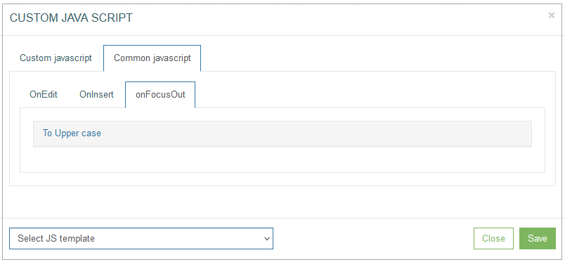
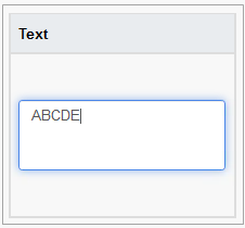
For example, on the Common JavaScript tab, the To Upper case operation was set up as the common behavior for the onFocusOut action for the “Text” column with the Textarea parameter type.
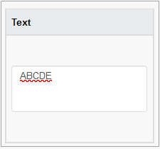
In case the entered data in the Render application is written in small letters, such letters will be replaced with capital letters and can be displayed as follows:
The entered text written in small letters, when the field is on focus.
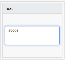
The entered text replaced with capital letters, when the field is not on focus.
Check min value
This template provides the possibility to restrict the minimal numeric value entered in the column cell.
On the Custom JavaScript tab, the template can be displayed as follows:
On the Common JavaScript tab, the settings are displayed as follows:

Enter the minimal value to the Min value field and the text that will be shown as a warning message to the Error Message field.
The warning message will appear and can be displayed in the Render application as:
a pop-up window,
a tooltip,
ora confirmation pop-up window with actions. This warning message type will appear in case of selecting the Use confirm modal check box.
Note that the warning message in the confirmation pop-up window is available only for the onFocusOut action.
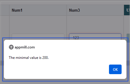
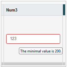
For example, on the Common JavaScript tab, the Check min value operation was set up and defined as “200” as the common behavior for the onFocusOut action for the “Num3” column.
In case the entered data in the Render application is less than the defined value, the warning message will appear and can be displayed as a pop-up or a tooltip.
In the Render application, the warning message can be displayed as a pop-up window as follows:
Or as a tooltip as follows:
In case the Check min value operation was set up as the common behavior for the onFocusOut action for the field, the additional confirmation will be available. Select the Use confirm modal check box, to display the warning message as a confirmation pop-up window with actions in the Render application.
For example, the entered value to the Num2 column is less than the defined minimal value. The warning message will appear as a confirmation pop-up window.
In the Render application, it can be displayed as follows:
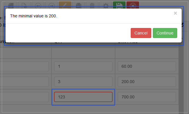
Click the Continue button, to confirm the entered value is correct.
Click the Cancel button, to deny the confirmation and return to the value editing.
To lower case
This template provides the possibility to define that the entered data in the column cell must be written in small letters.
On the Custom JavaScript tab, the template can be displayed as follows:

On the Common JavaScript tab, the settings are displayed as follows:

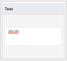
For example, on the Common JavaScript tab, the To Lower case operation was set up as the common behavior for the onFocusOut action for the “Text” column with the Textarea parameter type.
In case the entered data in the Render application is written in capital letters, such letters will be replaced with small letters and can be displayed as follows:
The entered text written in small letters, when the field is on focus.
The entered text replaced with capital letters, when the field is not on focus.
For the Check max value, Compare fields, and Check min value templates users can define the translation for the Error Message.
To add the translations for the Error Message, click the Internationalization button. In the opened pop-up window, select and add the language, enter the translation for the selected language. Click the Apply button to save the changes. In case the user changes the display language in the Render application, the translated Error Message will be shown. For more details about language changing, refer to the Language page of the User Manual.
Click the Save button to save the changes and close the Custom JavaScript pop-up window. Click the Close button to close the pop-up without saving the changes.
Close
Click the Close button to close the pop-up window without saving the data.