Table of Contents
Overview
The Architect application provides the possibility for users to create the search screens that will be used in the Render.
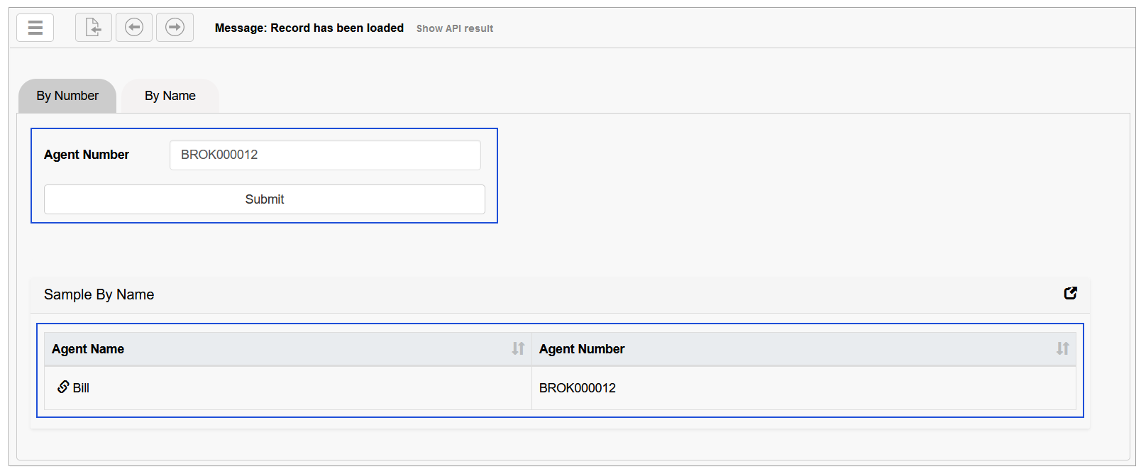
The search screen is designed to allow users searching for the required data in database tables and displaying the search results that are found on the screen in the Render application.
As a rule, the Search screen contains a standard set of parameters and blocks:
Search input field, where user can enter search parameter,
Submit Search button that initiates the search when user clicks the button.
Found Search Results.
Search Screen Configuration
The configuration of the Search screen differs from the configuration of regular screens.
To build a search screen, pay your attention to the settings and the parameters that are specific for the search screen.
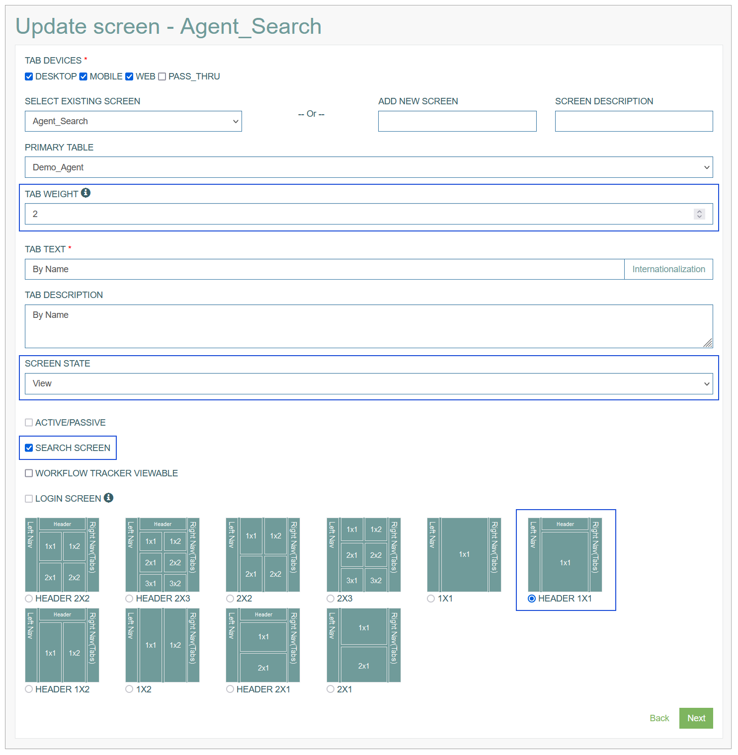
On the first page of Screen builder, you can specify the following parameters:
Tab Weight - the value of this field must not be equal to “0“ or “99“.
Use a tab weight of:
”0” - to fully customize the screen and configure search field, audit fields, select extension functions, etc.
”99” - to create screen in pop-up window, otherwise the screen will not be displayed.Screen State - select the View value.
Other Screen States are available for selection but they are not actual for the Search screen.
To avoid unexpected behavior or failure, it is recommended to select the View value for the Screen State.Search Screen - select the check box to define the type of the screen.
Other check boxes for screen type are disabled.Screen Layout - the only one option is allowed and automatically predefined for the Search screen.
The Search parameters and Extension functions sections are missing on the first Screen Configuration page as there is no sense to use them on the Search screen.
However, other fields are also important and should be filled in:
Tab Devices - defines, which devices are allowed to render the screen content.
Screen - defines the screen to which the tab will be assigned to.
You can select an existing screen or create a new one.Primary Table - specifies the database table with the related data.
Tab Text - specifies the title displayed for the screen tab.
Tab Description - explains the purpose of the tab.
On the second page of Screen builder, you can set up the UI elements and configure the functional part of the Search screen.
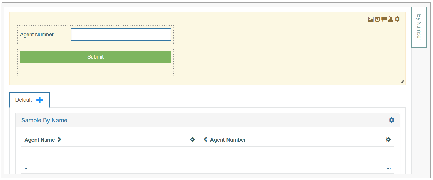
Screen Header
On the Header level, you can configure the search input field and the submit search button.
Search Input Button
The search input field settings differ from the regular fields' settings. Add a field to the header, this will open the Field Settings pop-up window:
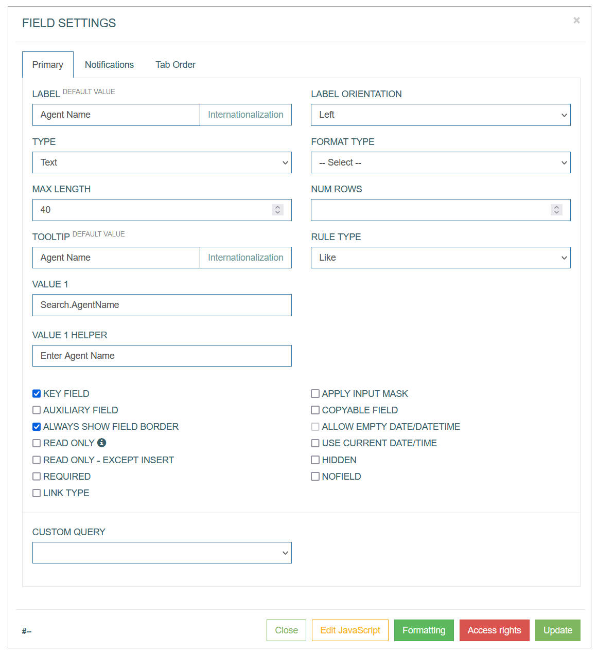
The main characteristic of the search field and the difference from the regular field is that the Data Field to select the alias is missing in the search field settings and the Key Field check box is activated.
In the Field Settings pop-up window, specify the following parameters:
Label - enter the label text that will be displayed as a field name on UI screen in the Render.
Label orientation - select the label orientation that defines the direction of label display relative to the input field.
Type - specifies the data type allowed for the field.
The layout of the field in the Render application, validation of the entered data, supported data format will differ depending on the selected Field Type.
When you select a field type value, additional field type-specific parameters appear.Format type - depends on the selected Field type. It defines what type of data can be specified in the field. The relation between Field and Format types is represented in the table below.
Max Length - specifies the maximal allowed field length. The length depends on the values stored in the database. You can specify specific field length limitation here, if you need to set specific restriction for the value.
Num Rows - specify the quantity of rows displayed for the field.
Tooltip - enter the text here that displays information about field when hovering over it on the screen in the Render.
Rule Type - should specify the rule applied to the search.
Value 1 - defines the alias used for the alias arrays and custom multi aliases.
Value 1 Helper - enter the text that is displayed as a field placeholder.
Key field - the selected check box specifies that the field can be editable in read-only mode (for the Header section only) and the request to receive the data is sent to the service.
Search Submit Button
Add the button to the Header section. This opens the Button Settings pop-up window:
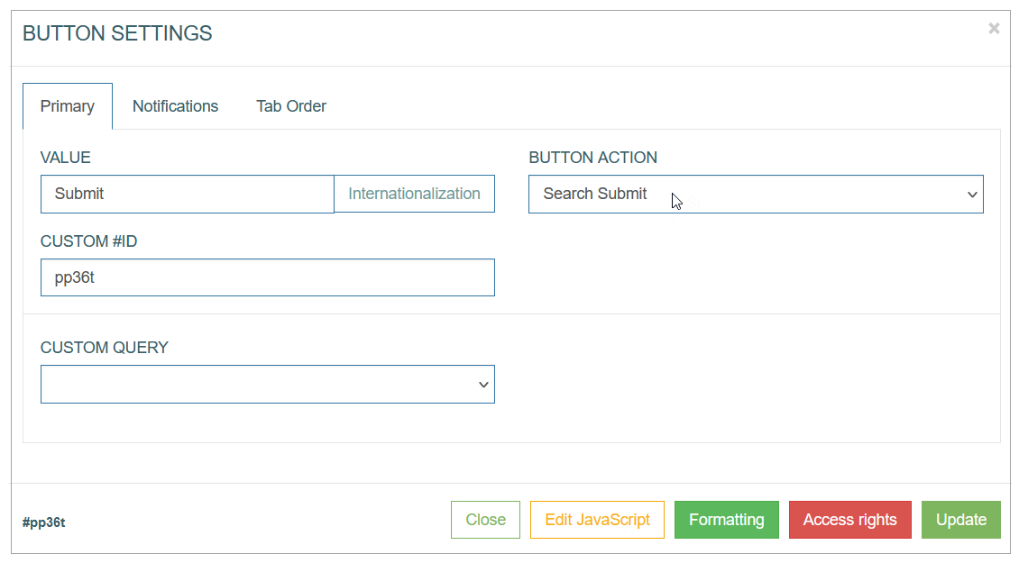
The main characteristic and difference of the button configuration for the Search screen is the Button Action value. Select the Search Submit button action that will initiate the search based on the entered value in the search input field.
Screen Sections
On the Section level, you can configure the search result table. The table column details should consider the data specified for the search input field in the Header to display the correct search results on the screen in the Render.
Search Results Table Configuration
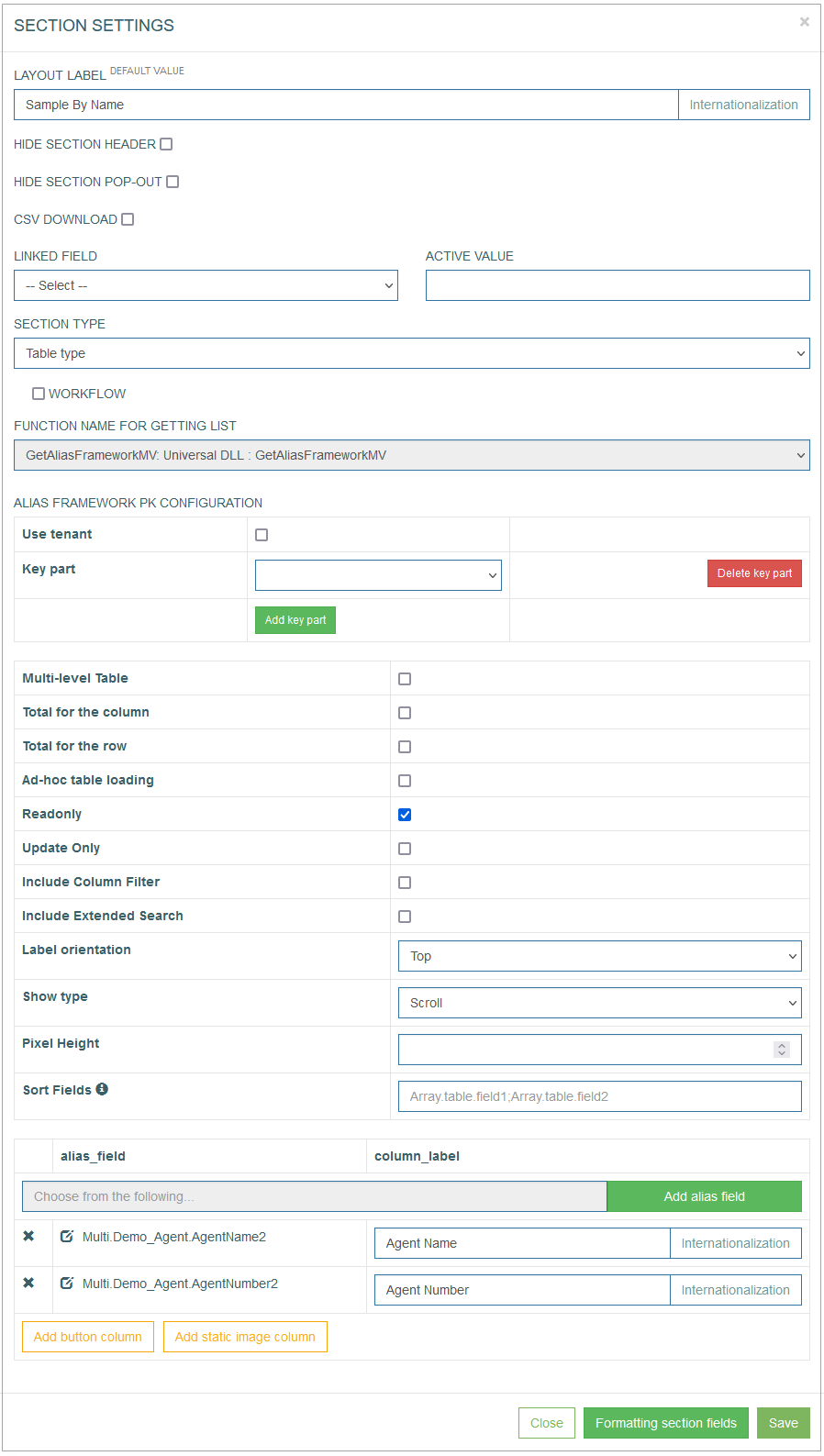
To set the search results table to be displayed in the Render application, fill in the Section fields below:
Layout Label - enter a title for the section.
To add the translations for new labels, click the Internationalization button. In the opened pop-up window, select and add the language, enter the translation for the selected language. Click the Apply button to save the changes.Hide section header - you can decide whether to display the Header section on the screen in the Render or not. Select the check box to hide the Header section on the screen.
Hide section pop-out - the section can be opened as a pop-up window.
CSV download - select the check box to enable the possibility to download the table in CSV format from the Render screen.
Linked Field - there is a possibility to link the specific section body state to a field value from the header.
Active Value - specify the value that will be linked with the section.
Section Type - select the Table Type from the drop-down list. The additional parameters will appear.
The next part of the parameters that can be set up in the Section Settings pop-up window is connected to the general table settings.
Alias Framework PK Configuration - this feature is used in special cases when the tables are connected via a composite key.
Select the Key parts to define the fields taken from the tables of different levels (to fill in values from parent to child tables).Multi-level Table - this option cannot be added to the Search Screen as the possibility to display multi-level tables in the Search Screen is unavailable. For more information about the option, refer to the Table Configuration section on the Section Type: Table Type page of the User Manual.
Total for the column - select the check box to enable the additional row displaying the Total count for the whole column.
Total for the row - select the check box to enable the additional column showing the Total count for the whole row.
Ad-hoc table loading - enables table view with pagination. The table data will be loaded for every page. It can be useful for tables with large bulk of data or dImages to improve the responsiveness of an application.
Note that the Total for column and Total for row options cannot be selected at the same time with the Ad-hoc table loading option. As for the Total for column and Total for row options, the full table should be displayed.
Readonly - select the check box to make the table read-only.
Note that the Search Screen is designed to work with the Custom generated and Custom Multi aliases. These aliases are not directly linked to database fields, meaning they cannot be edited and are not suitable for extension functions. It is recommended to enable the Readonly option, as editing the Custom generated and Custom Multi aliases is not possible.
Update Only - this option cannot be added to the Search Screen as the search results table cannot be edited. For more information about the option, refer to the Table Configuration section on the Section Type: Table Type page of the User Manual.
Include Column Filter - select this check box to use Filters in the columns for filtering values. The added filters will automatically contain the list of downloaded values from the database table. Filters can be applied to the column with the data of Field type.
Include Extended Search - select this check box to add a separate search field that allows searching for any value of the table fields.
Label orientation - this option defines the layout of the table header. Select the available options:
Top - to display the table header at the top row.
Left - to display the table header as the first left column of the table.
Show type - this option defines how to display the table content on the page - using pagination or infinite scroll.
Scroll - select this option to scroll on the page.
Pixel Height - define the size of the window in case of scroll usage. The default value is 580px.
Without scroll - select this option to use pagination.
Count - defines the number of table rows on the page in case of pagination.
Sort Fields - define the field(s), by which the table value should be sorted in alphabetical order. You can use aliases to define the field(s) to sort the values. If the field is empty, the default sort by primary key is used.
From the Section Settings pop-up you can configure the columns of the table, their labels and the aliases that should be used to receive the values:
Alias Field (alias_field) - in the input field, start typing the alias that should be used to retrieve the field values. The autocomplete feature helps you to find the needed alias.
Click the Add alias field button to add the selected alias to the table as a column field.
Column Label (column_label) - enter a label text that will be displayed as a column title for the corresponding alias entry.
Internationalization - click the button to add translations for other supported languages, if needed.
Add button column - click this button to add a column that will contain the buttons. The behavior of the added buttons will be set up directly in the table column.
Add static image column - click this button to add a column with the static images.
The column-specific settings, including column order, can be configured directly in the table. More information about the Table column configuration find on the Section Type: Table Type page.
Common Operations
You can perform basic operations by clicking the buttons at the bottom of the Section Settings pop-up window. These actions are listed below:
Save - click the Save button to confirm and save the entered data. After saving the table configuration, a newly created table appears in the section area.
Close - click the Close button to close the pop-up window without saving the data.
Formatting section fields - click the Formatting section fields button to customize the formatting and ‘look and feel’ of labels and fields in the table. But please note that the formatting made directly on the table in the section is considered as a first order formatting and will be applied primarily.
Key Points
On the Screen Header level, the special search query alias should be created in the Value 1 field. This special search query alias should have the name started with the “Search.” word and contain the parameter name. For example, “Search.AgentName”. It is a special search query alias that will be added to the list of processed aliases. After that, it will be used in the SQL query in the SQL Statement (:Search.AgentName) for custom multi aliases.
The custom multi alias should be created on the Custom Multi page before it will be added to the table as a column. For more details about custom multi aliases, refer to the Custom Multi page of the User Manual.
Every custom multi alias in the search results table should have the same SQL query to return the right data from the database. The SQL query can be edited in the Evaluation section in the SQL Statement field on the Custom Multi page. Such SQL query must contain the special search query alias name (:Search.AgentName) according to the rules for writing SQL queries.
If the SQL query for custom multi aliases is not defined and some module is used to fill in the search values, users need to create an additional custom multi alias activator. In this additional custom multi alias activator the special search query alias (:Search.AgentName) should be added manually in the SQL query. After that, the newly created additional custom multi alias activator should be added to the search result table. It is necessary to do so to avoid a search failure, for example, while using the Search Screen, or in the case of screen transfer. More details about screen transfer, refer to the Screen Transfer page of the User Manual.
Also, the additional custom multi alias activator should not be placed in the first position in the custom multi aliases list as the first column of the search results table. As the search should be enabled by the table and column names in the custom multi alias name, users should place custom multi aliases first.