Table of Contents
Overview
The Edit type of the Section provides the possibility to add and manage fields that will be displayed and used on the screen in the Render application.
The action to configure fields as well as images, labels and buttons is displayed next to the Settings icon in the upper right corner of the section.
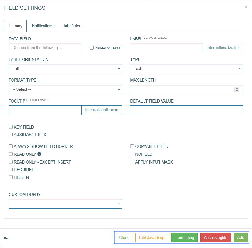
To add a field and configure its display on the screen in the Render application, click the Field icon in the right corner of the Header section. The Field Settings pop-up window opens to configure the field:
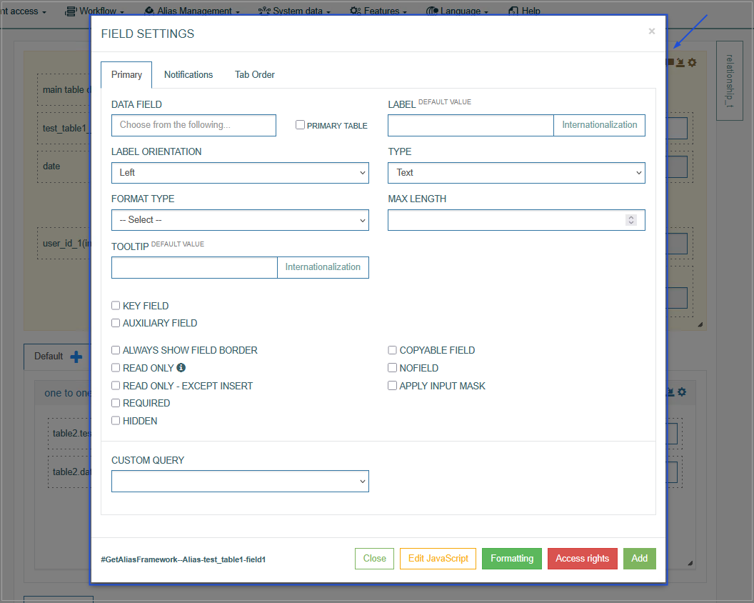
In the Field Settings pop-up window, you can edit the related parameters by switching across the following available tabs:
Primary
Notifications
Tab Order
See the Common Operations section for the description of the buttons available at the bottom of the pop-up window.
Primary
On the Primary tab, configure the main parameters. The parameters currently supported are described below.
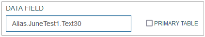
Data Field
In the Data Field, you can define the Alias field that will be used on the screen. Start typing in the Data Field input field to display the list of existing aliases. Select the required alias to link the data from the database table with the current field. More details about Aliases can be found on the Alias Management Overview page of the User Manual.
It is not recommended to use fields with the same alias on the screen several times, even if fields are placed on different depth tabs. This may lead to incorrect work of the field or the field value from another tab can be used instead of the needed one.
Select the Primary Table check box to open the list of data fields of the Primary table that you have selected on the first Screen Builder Configuration step.
Label
Enter the label text that will be displayed as a field name on the screen UI in the Render.
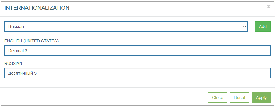
To add the translations for a new label, perform the following operations:
Click the Internationalization button next to the Label field. The Internationalization pop-up window will be opened.
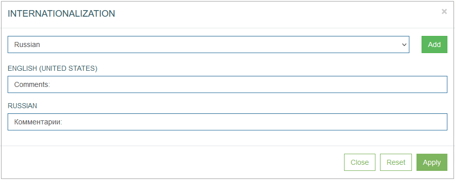
In the opened pop-up window, select the language from the drop-down list and click the Add button. The field with added language will be displayed.
Enter the translation for the selected language.
Click the Apply button to save the changes.
Click the Reset button to delete all changes without closing the pop-up window.
Click the Close button to return to the Field Settings without saving changes.
In case there is the translation for the label, move the cursor over a field and the translation will be displayed.
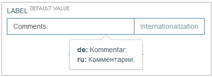
In case the user changes the display language in the Render application, the translated label will be shown. For more details about language changing, refer to the Language page of the User Manual.
In the Render application the label can be placed different. It depends on the label orientation. For more details, see the Label Orientation section.
Label Orientation
Select the label orientation that defines the direction of label display relative to the input field.
Depending on the selected orientation, the label can be displayed as follows:
Label Orientation | Example |
|---|---|
Left | 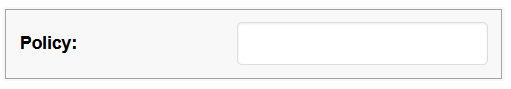 |
Top | 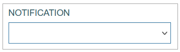 |
Inside | 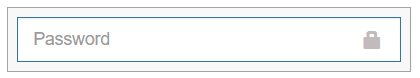 |
Field Type
The Field Type specifies the data allowed for the field. The layout of the field in the Render application, validation of the entered data, supported data format will differ depending on the selected Field Type. When you select a field type value, additional field type-specific parameters appear.
For more details about field types, their format types and specific parameters refer to the Field Types and Layouts page of the Architect User Manual.
The description of the supported Field types, related Format types and their additional specific parameters is provided below:
Text - allows users to enter a single line of text on the screen in the Render application. Depending on the Format Type the visual display of data in the Render application will be different. For more details refer to the Format Type section.
In the Render application, the Text type field can be displayed as follows: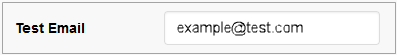
Numeric - allows users to enter numeric values in the fields. Depending on the Format Type the visual display of data in the Render application will be different. For more details refer to the Format Type section.
In the Render application, the Numeric type field can be displayed as follows:
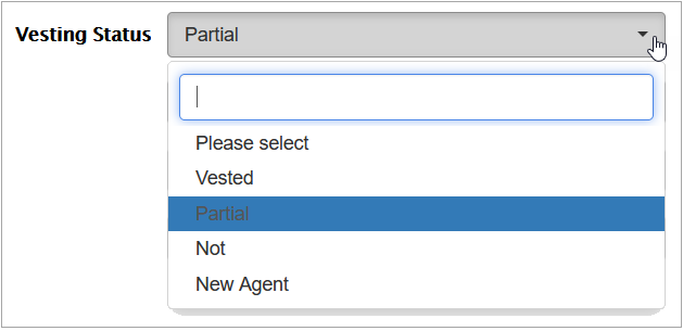
List - allows users to select values containing the extension functions from the drop-down list.
In the Render application, the drop-down list can be displayed as follows:
List With Extension Function - allows users to select values containing the extension functions from the drop-down list.
The list with extension function in the Render application can be displayed as follows: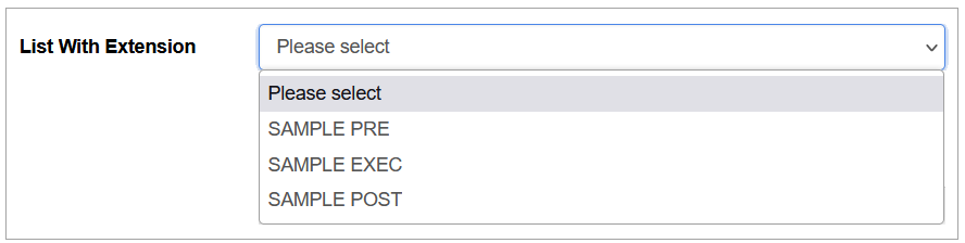
Textarea - allows users to enter multiple lines of text on the screen in the Render application.
In the Render application, the textarea field can be displayed as follows: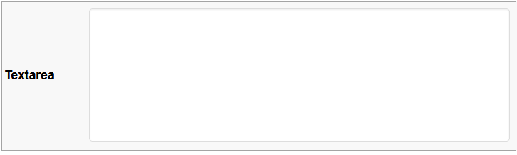
Multi-select list - allows users to select multiple values from a drop-down list of field options in the Render application.
In the Render application, the multi-select list can be displayed as follows: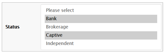
List from API - allows users to display the list of values (options) received from an external application.
In the Render application, the List from API can be displayed as follows: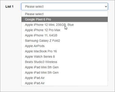
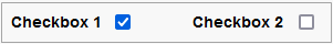
Checkbox - allows users to select any option by clicking the check box or to select one option from the group by clicking the check box from the check box group on the screen in the Render application.
In the Render application, the Checkbox can be displayed as follows: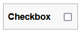
In the Render application, the Checkbox Group can be displayed as follows:
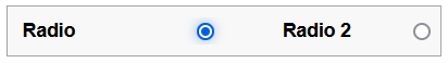
Radio - allows users to select one option by clicking the radio button or to select one option from the group by clicking the radio button from the radio group. This field type is often used for absolute simple yes or no answers.
In the Render application, the Radio button can be displayed as follows: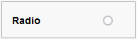
In the Render application, the Radio Group can be displayed as follows:
Document - allows users to upload and download documents on the screen in the Render application.
In the Render application, the field with the possibility to upload documents can be displayed as follows: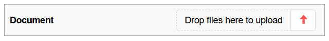
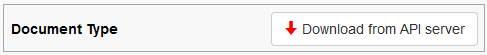
In the Render application, the field with the possibility to download documents can be displayed as follows:
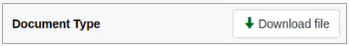
In case there is no uploaded document, the Download from API server button will be shown. If the user clicks this button the default document will be downloaded from the server.
Inline Search - allows users to see search results without redirecting to a search results page.
In the Render application, the field with the inline search option can be displayed as follows: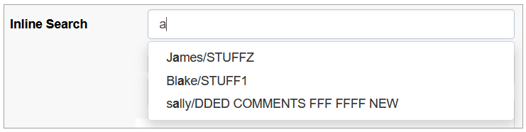
DImage (Dynamic Image) - allows users to upload any image file.
In the Render application, the dynamic image field can be displayed as follows: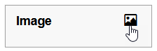
Datalist - allows users to select options from the list of values on the screen in the Render application.
In the Render application, the datalist field can be displayed as follows: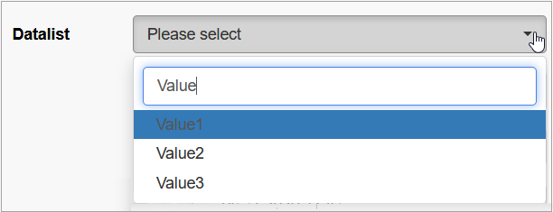
Relation Datalist - allows users to select options that are defined with custom query.
In the Render application, the fields with the relation datalist can be displayed as follows: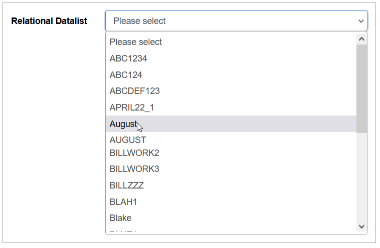
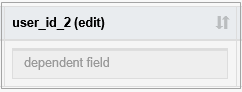
With dependent field - allows users to define the conditions for the case when value of one date field should be calculated based on the values of other fields (dependent fields). The dependent fields can be a date field or other field types values. E.g. in this manner, the system will calculate the Due Date value based on other specific date value on the screen in the Render application.
In the Render application, the visual display of the fields with the With dependent field type may vary depending on the Time format and Date format defined on the Regional tab of the Create User page (Account Settings > Users). For example, the Time format and Date format parameters for users are defined “T1: hh:mm:ss” and “D1: dd.MM.yyyy”, accordingly. In the Render application, for such users the fields with the With dependent field type will have the following visual display: 21.05.2023 13:26:41.Set value from source field - allows automatic value assignment based on another field, referred to as the source field.
The field can be configured to reference any other field, either within the same section, in the header, or even hidden fields, as its source.
On insert or update operations, the field's value will be automatically set to match the current value of the specified source field.
This behavior applies both during initial record creation and when records are updated.
In the Render application, the dependent field can be displayed as follows:
This functionality also extends to fields inside tables. If configured within a table, the source field's value will be populated to all entries (rows) in the table for the corresponding field.
In the Render application, the dependent field in tables can be displayed as follows:
Please note that it is not recommended to use fields with the same type on the screen in different depth tabs. This may lead to incorrect work of the field on all screens on different depth tabs, except for the first screen. For example, the field will only work on the first tab for the following field types without any additional conditions:
Inline Search
DImage
Checkbox
Radio
With dependent field
The following field types will work incorrectly, in case of additional conditions described below:
Text - in case of using custom query parameters, also the field with a Data/Time format type will work only on the first tab.
List - in case the Linked List parameter is selected.
Textarea - in case the custom query parameter is used.
Document - in case the upload button is used.
Datalist - in case the Linked List parameter is selected.
Relation Datalist - in case the Linked List parameter is selected.
For more details about field types, their format types and specific parameters refer to the Field Types and Layouts page of the User Manual.
Format Type
The Format type depends on the selected Field type. It defines what type of data can be specified in the field.
The Format type can be defined only for the field with the following types:
Text
Number
With dependent field
The relation between Field and Format types is represented in the table on the Field Types and Layouts page of the User Manual.
Currently, the following format types are supported:
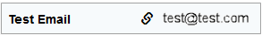
Email - email address that must conform to the pattern, e.g. name@domain.com.
In the Render application, the field with email format can be displayed as follows:Date - Date format is set up in the User Account (Account Settings > Users > Regional).
In the Render application, the field with data format can be displayed as follows: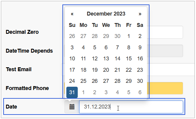
Date/Time - the format of Date and Time is set up in the User Account (Account Settings > Users > Regional).
In the Render application, the field with data/time format can be displayed as follows: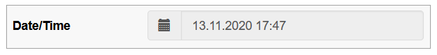
Phone - used for phone number.
In the Render application, the field with phone format can be displayed as follows: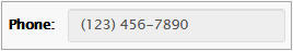
Custom – the custom data that must conform to the format template, which was set in the Architect, using the x, n, -, + characters, where:
x – any English text and numeric character can be added,
n – numeric character input only,
- / + – separator types. The separators will be added automatically on the screen in the Render.
For example:in case of the xxx--nnn++xn-n template, the entered data might be abc--123++q2-1, or
in case of the nn-xx+xn-nx template, the entered data might be 35-pt+a3-4t, etc.
The field format will be shown as a placeholder of the field on the screen in the Render application. In case users enter the data in the format that does not meet the format template set, the warning tip will appear.
In the Render application, such field can be displayed as follows:
Decimal - represents a number that consists of a whole and a fractional part.
In the Render application, the fields with the decimal static or dynamic numeric format types can be displayed as follows:Currency - used for the currency.
In the Render application, the fields with the currency static or dynamic numeric format types can be displayed as follows: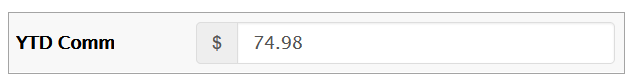
Max Length
The maximal allowed field length. The length depends on the values stored in the database. You can specify specific field length limitations here, if you need to set specific restrictions for the value.
The Max Length parameter can be configured only for the following field types:
Text - limits the number of characters that users can enter.
Numeric - restricts the number of digits allowed.
Textarea - controls the total number of characters across all lines.
List from API - defines the character limit for the external API value.
Inline search - limits the number of characters that users can type in the search field.
With dependent field - limits the value of the current field, regardless of the dependency logic applied from another field.
Set value from source field - restricts the copied from another field value length.
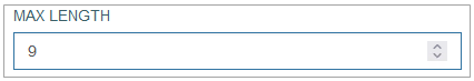
In the Render application, the field length can be displayed as follows:
Note that for fields of the Numeric type and the Decimal format type, the required parameter is Precision (number of decimal characters). For the Currency format type, it is not editable and the value “2” is used by default.
Num Rows
You can specify the quantity of rows displayed for the field.
Although this parameter is displayed for most of the format types, it is relevant for the Textarea and Multi-select list types.
Tooltip
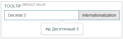
You can enter the text here that displays information about the field when hovering over it on the screen in the Render.
In the Render application, the Tooltip can be displayed as follows:
To add the translations for a new tooltip, perform the following operations:
Click the Internationalization button next to the Tooltip field. The Internationalization pop-up window will be opened.
In the opened pop-up window, select the language from the drop-down list and click the Add button. The field with added language will be displayed.
Enter the translation for the selected language.
Click the Apply button to save the changes.
Click the Reset button to delete all changes without closing the pop-up window.
Click the Close button to return to the Field Settings without saving changes.
In case there is the translation for the tooltip, move the cursor over a field and the translation will be displayed.
In case the user changes the display language in the Render application, the translated tooltip will be shown. For more details about language changing, refer to the Language page of the User Manual.
Default Field Value
The Default Field Value parameter allows pre-filling a field with a defined value when the screen is loaded in the Render application.
The default value is applied based on the Field Type, ensuring that the assigned value aligns with the data format of the field.
To set a Default Field Value, select a Field Type while configuring the field. If the selected field type supports default values, the Default Field Value option will be displayed.
The Default Field Value parameter is available for the following static field types:
Text – defines a predefined text string.
Numeric – defines a default numeric value.
List & List with Extension Function (fields only) – preselects an option from a drop-down list.
Datalist – populates the field with a preset list value.
Textarea – defines default multi-line text content.
Multiselect List – allows multiple default selections, separated by a semicolon (";").
Example: Option1;Option2;Option3
Checkbox – determines whether the checkbox is checked by default.
If Numeric is selected as the Field Type, the Default Field Value field will be displayed as follow:
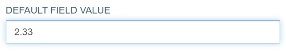
In the Render application, the Numeric type field whose Default Field Value set as 2.33 can be displayed as follows:
Default Field Values do not apply to dynamically populated fields like Relation Datalist, List from API, Inline Search or certain UI elements like Images, Radio with dependent fields.
Default Checkbox Value
The Default Checkbox Value parameter defines whether the checkbox is selected (checked) by default when the screen is loaded in the Render application. Available only for fields with the Checkbox field type.
Checked: The checkbox will appear selected by default.
Unchecked: The checkbox will appear unselected by default.
This setting is typically used to guide users toward a recommended or commonly chosen option but can still be modified by the user before submission.
Additional Options
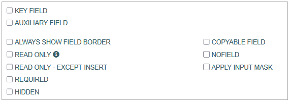
Key field - specifies that the field can be editable in read-only mode (for the Header section only) and the request to the service to receive the value is sent.
In the Render application, the key field can be displayed as follows:
Auxiliary field - specifies that the field can be editable in read-only mode (for the Header section only).
In the Render application, the auxiliary field can be displayed as follows:
Always show field border - specifies that the field borders are displayed both in edit and read-only modes. Pay attention that it should not be used together with the Link type check box.
In the Render application, the field with this option can be displayed as follows:
Read only - specifies that the field is not editable. In case the alias contains the “~” character, the field is read-only as well.
Note: If the Read only parameter is selected, the Read only - Except Insert parameter will be unavailable for selection.
In the Render application, the field with this option can be displayed as follows: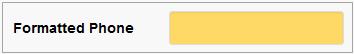
Read only - Except Insert - the field editing is available in the Insert mode only.
Note: If the Read only - Except Insert parameter is selected, the Read only parameter will be unavailable for selection.
In the Render application, the field with this option can be displayed as follows: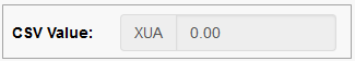
Required - specifies that the field must be filled in.
In the Render application, the blank required field can be displayed as follows:
Apply input mask - used to hide the value of the field on UI. As a rule, it is used for the password field. Available only for fields of the Text and Numeric types with an empty format type.
In the Render application, the field with this option can be displayed as follows: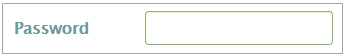
Link Type - used to assign a link to the field. When the check box is selected, new fields to set up the link appear:
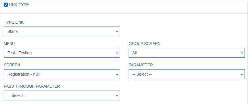
In the Render application, the field with link type can be displayed as follows:
Define the following parameters for the linked page:
Type Link - select the display mode for the linked page from the drop-down list:
Blank - to open a linked page in a new tab.
Self - to open a linked page in the current tab.
Modal - to open a linked page in a modal (pop-up) window.
Blank - Bypass - to open linked page in a new tab and to pass the additional parameter specified in the Pass Through Parameter field.
Modal - Bypass - to open linked page in a modal (pop-up) window and to pass the additional parameter specified in the Pass Through Parameter field
Menu - to select the menu that the required screen assigned to.
Group Screen - to select the group screen that the required screen assigned to.
Screen - to select the required screen that will be opened by link.
Parameter - to specify the required parameter that will be used for searching on the screen.
Pass Through Parameter - this parameter will be passed by link to the defined screen.
Copyable field - specifies that in case the screen is copied in the Render, the value of the field should be copied too. And in the Render application, it can be displayed as follows:
Allow empty Date/DateTime - specifies that the values of the date and date/time fields can be empty. Available only for fields of the Text type, and Date or Date/Time format types.
Note that in insert action mode in the Render application, the field will be empty.
In the Render application, it can be displayed as follows: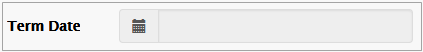
Use Current Date/Time on Insert Mode - specifies that when user opens the screen/field in the Insert mode, the current Date and Time will be always taken to save the value (even in case user filled in the field with another value). Available only for fields of the Text type, and Date or Date/Time format types.
In the Render application, it can be displayed as follows: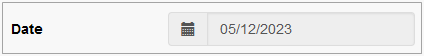
Use Current Date/Time on Edit Mode - specifies that when user opens the screen/field in the Edit mode, the current Date and Time will be always taken to save the value (even in case user filled in the field with another value). Available only for fields of the Text type, and Date or Date/Time format types.
In the Render application, it can be displayed as follows: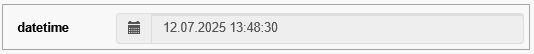
Use the Current User ID on Insert Mode - automatically sets the field value to the ID of the currently selected user when a new record is created. Available only for the Set value from source field type.
In the Render application, it can be displayed as follows: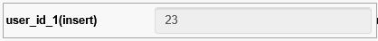
Use the Current User ID on Edit Mode - automatically updates the field value to the ID of the currently logged-in user when an existing record is modified. Available only for the Set value from source field type.
In the Render application, it can be displayed as follows: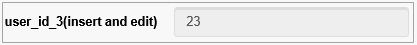
Hidden - specifies that the field will be hidden on the screen in the Render.
NOFIELD - specifies the fields that are used in the extension functions.
Linked List
The Linked List option allows setting the relation between different fields/values.
When selecting this option, you define that this field will define the values of another field. So, depending on the selected value of the current field (with the activated Linked List option), the list of values of the related field will be displayed.
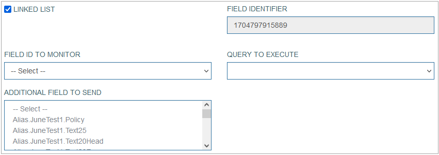
Select the check box to activate this option. The additional fields to set up are displayed:
Field ID to monitor - select the field that will be dependent on the current field.
Query to execute - select the query that will be executed on the field defined in the Field ID to monitor the field.
Additional field to send - select the parameters that will additionally be sent to execute the query and receive the correct values. Multiple parameters can be selected. Pay attention that these parameters should be equal to the parameters specified in the Custom Query (Features > Custom Query). For more details about custom query creation and editing, refer to the Custom Query page of the User Manual.
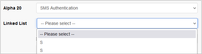
In the Render application, the linked list can be displayed as follows:
Notifications
On the Notifications tab, configure the conditions when users should be notified.
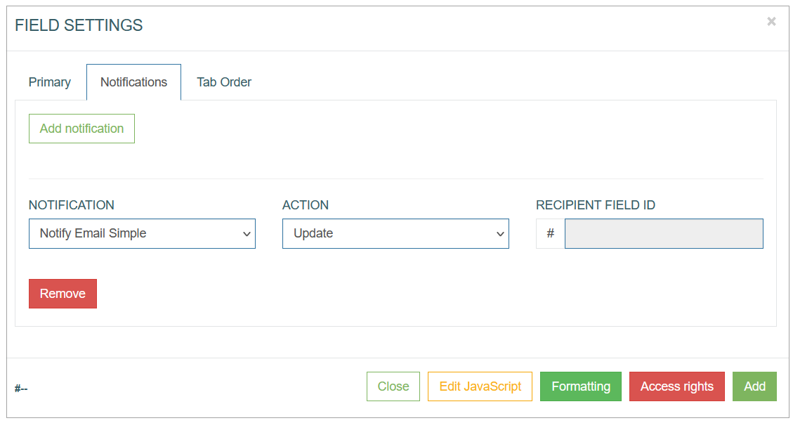
To create a notification action, click the Add Notification button.
After clicking the Add Notification button, an entry for configuring the notification conditions appears. Fill in the required fields:
Notification - select the notification template from the drop-down list of the templates existing in the system. To create a new template or manage existing ones, open the Notifications page (System Data > Notifications). For more details about notification creation and managing, refer to the Create Notification section on the Notifications page of the User Manual.
Currently you can set up Email and SMS notifications. The email address and the phone number for notifications can be set on the Users page. For more details on how to add the email address and the phone number for notifications, refer to the Create User section on the Users page of the user Manual.
Action - select the action that specifies the state of UI element (field) when notification should be sent. There are 2 states of UI elements:
Update - the field value is edited.
Insert - the value is added.
Recipient field ID - add an ID of the field with an Email field format type. The notification will be sent to the email address entered in such a field in the Render application. The field ID can be found at the bottom left corner of the Field Settings pop-up window. The Recipient field ID field is available only for the notification templates with Custom recipient type. For more details about the recipient type, refer to the Create Notification section on the Notifications page (System Data > Notifications) of the User Manual.
In case the notification template contains the variable parameters, the value of these variables can be defined here in the input fields.
Tab Order
On the Tab Order tab, you can set whether the Tab key can be used to move the cursor on the current UI element.
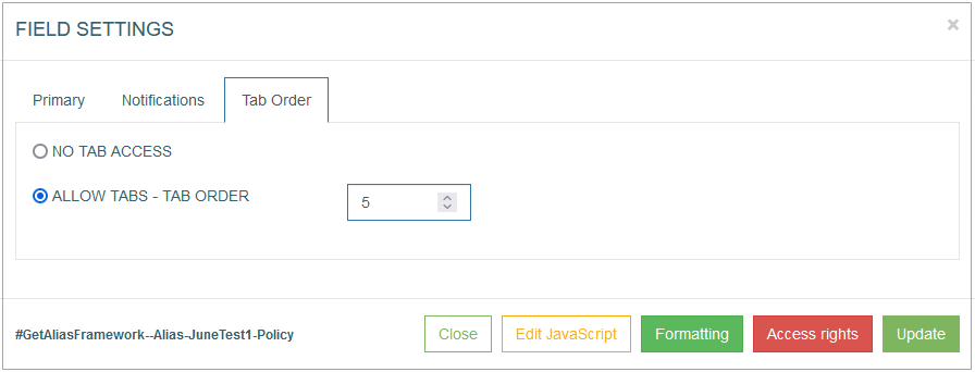
Additionally, you can define the order in which the UI element is selected and allocated with the cursor when using the Tab key.
The following options are available:
No Tab access - select this radio button to restrict the possibility of using the Tab key on the keyboard for the current UI element.
Allow Tabs - Tab Order - select this radio button to allow the usage of the Tab key to navigate to the current UI element. Define the Tab order by filling in the input field next to the Tab Order option.
Common Operations
At the bottom of the Button Settings pop-up window, there is a block with common operations displayed and available on any tab of the pop-up window.
The following operations can be performed while updating information in the pop-up window on the tabs mentioned above:
Add
Click the Add button to confirm and add a field to the screen.
Note that in case of the Edit mode, the Add button is changed to the Update button.
Update
Click the Update button to confirm and save the changes made for the field.
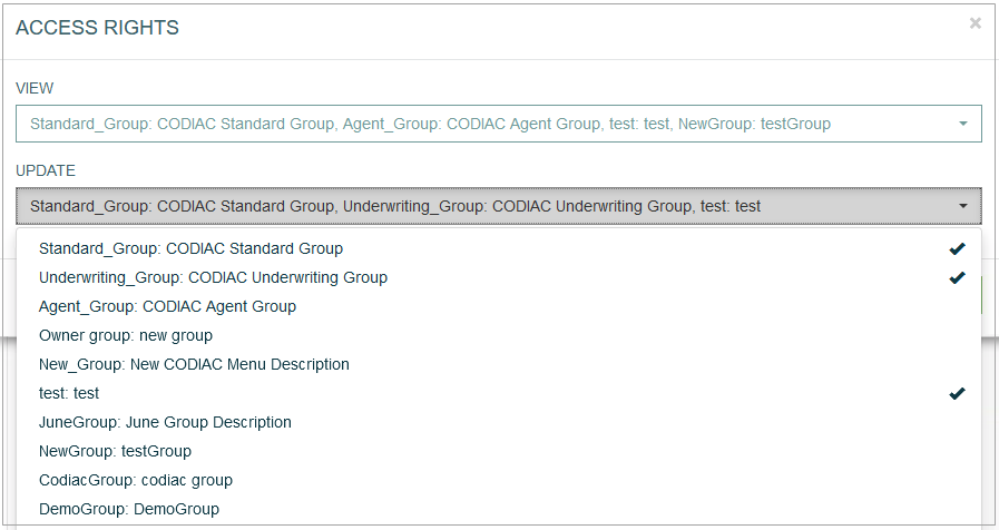
Access Rights
Click the Access Rights button to open the corresponding pop-up window. Here, users can select user groups to set the access right for the View and Update actions for the selected groups:
View - select one or multiple user groups from the drop-down list to provide them with View access rights. The selected user groups will be marked with the check mark to the right from the user group name. In the Render application, the users from the selected user groups can view the field display but cannot update the field value.
Update - select one or multiple user groups from the drop-down list to provide them with Update access rights. The selected user groups will be marked with the check mark to the right from the user group name. In the Render application, the users from the selected user groups can update the field value.
Note that to update the field value in the Render application, the user group should also have the View access rights. I.e., the same user group should be selected in both View and Update drop-down lists.
Formatting
The Formatting functionality is available only for the button, label and field configurations.
In sections with Edit Type, the formatting functionality will work for fields regardless of whether the field is displayed or not.
Click Formatting to customize the “look and feel” of the field.
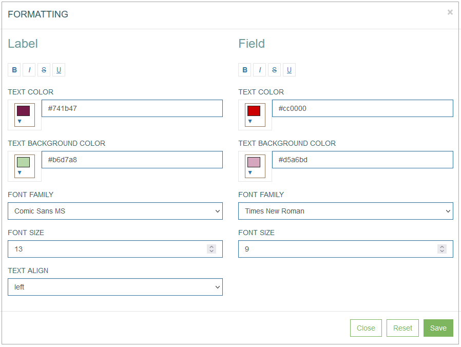
In the opened Formatting pop-up window users can define the Label and Field style and format parameters such as:
Font style:
bold
italic
crossed out
underlined
Text color
Text background color
Font family
Font size
Text align (for Label only):
left
right
center
justify
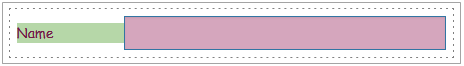
For example, the formatted field can be displayed as follows:
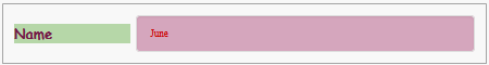
In the Render application, the formatted field can be displayed as follows:
Click the Save button to confirm field formatting changes.
Click the Reset button to clear the field parameters.
Click the Close button to cancel the field formatting changes without saving and return to the Field Settings pop-up window.
Edit JavaScript
Click Edit JavaScript to open the editor and set up the behavior and CSS styles for UI elements on the screen.
Note that the Edit JavaScript functionality is available only for the field configuration.
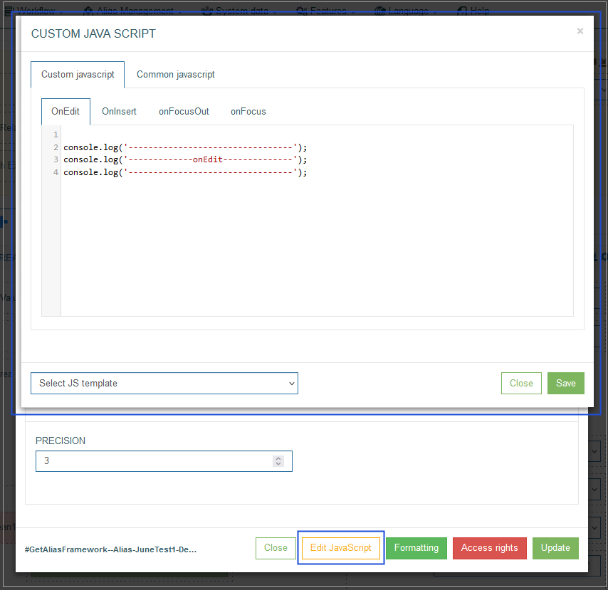
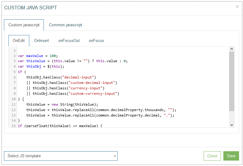
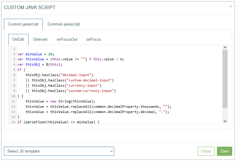
Custom JavaScript tab - on the Custom JavaScript tab, you can set up and customize the behavior and CSS styles for UI elements on the screen.
You can set up the OnEdit, OnInsert, onFocusOut and onFocus actions on the correspondent tabs.
To simplify the code writing on the Custom JavaScript tab, the jQuery library can be used. The jQuery library provides the possibility to use less symbols to write the Custom JavaScript. For more information about the jQuery library, visit the jQuery website.
It is recommended to define additional checks when the Custom JavaScript performs validation successfully and when the validation is failed.
For the positive case, when the check is passed, it is necessary to remove the class "not-valid-data" from the element: "$(this).removeClass('not-valid-data');".
For the negative case, when check is not passed, an error with auxiliary text: "throw new Error('error message');" should be displayed.
For example:
the Custom JavaScript validation of the field is set up for the onFocusOut action.
the Custom JavaScript of the field restricts the maximal numeric value entered in the field to 100.
In this scenario, if the user entered a value greater than 100 in the field within the Render application, the following outcome would occur:
the further execution of the script should be stopped;
the error message is displayed;
and the Save action should not be allowed.
Common JavaScript tab - on the Common JavaScript tab, you can set up and define as the common behavior and CSS styles for UI elements on the screen.
You can set up the OnEdit, OnInsert, onFocusOut actions on the correspondent tabs.
Select JS template - click on the drop-down list to add the existing JavaScript template to the editor. The following templates are available:
Check max value
Compare fields
To upper case
Check min value
To lower case
The JavaScript templates with examples are described below:
Check max value
This template provides the possibility to restrict the maximal numeric value entered in the field.
On the Custom JavaScript tab, the template can be displayed as follows:
On the Common JavaScript tab, the settings are displayed as follows:
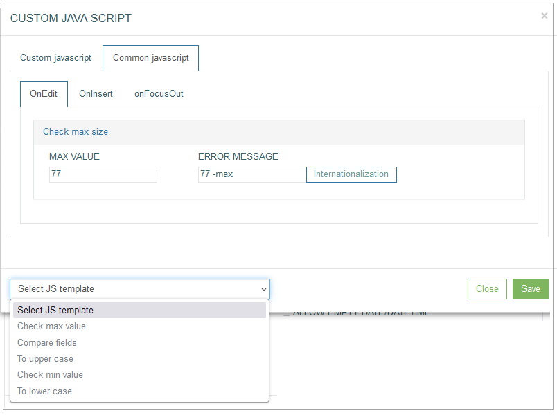
Enter the maximal value to the Max value field and the text that will be shown as a warning message to the Error Message field. The warning message will appear and can be displayed in the Render application as:
a pop-up window,
a tooltip,
ora confirmation pop-up window with actions. This warning message type will appear in case of selecting the Use confirm modal check box.
Note that the warning message in the confirmation pop-up window is available only for the onFocusOut action.
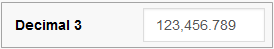
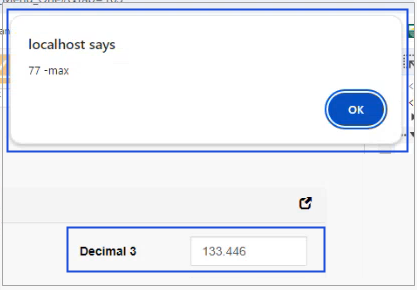
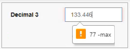
For example, on the Common JavaScript tab, the Check max value operation was set up and defined as “77” as the common behavior for the OnEdit action for the “Decimal 3” field.
In case the entered data in the Render application does not match the defined parameters, the warning message will appear and can be displayed as a pop-up window or a tooltip.
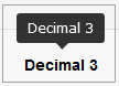
In the Render application, the warning message can be displayed as a pop-up as follows:
Or as a tooltip as follows:
In case the Check max value operation was set up as the common behavior for the onFocusOut action for the field, the additional confirmation will be available. Select the Use confirm modal check box, to display the warning message as a confirmation pop-up window with actions in the Render application.
For example, the entered value to the MVA field is more than the defined maximal value. The warning message will appear as a confirmation pop-up window.
In the Render application, it can be displayed as follows:
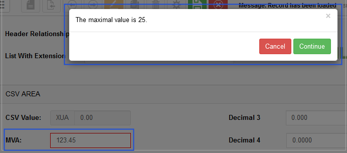
Click the Continue button, to confirm the entered value is correct.
Click the Cancel button, to deny the confirmation and return to the field value editing.
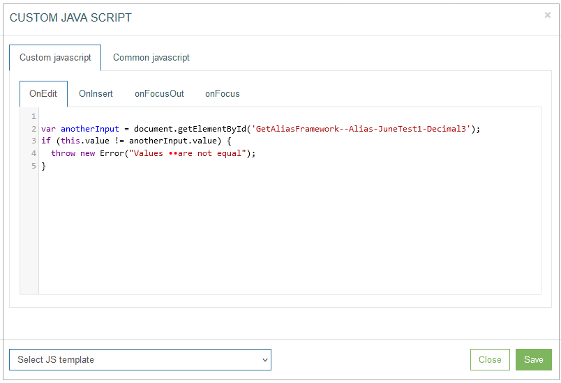
Compare fields
This template provides the possibility to set the field value comparison. The entered data in this field must match the entered data of the field defined in the template.
On the Custom JavaScript tab, the template can be displayed as follows:
On the Common JavaScript tab, the settings are displayed as follows:
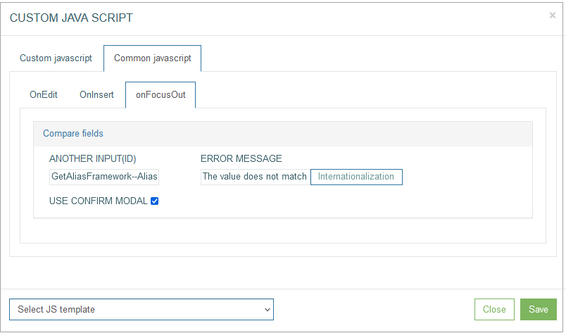
Enter the field ID with value of which the entered value will be compared to the Another input (ID) field.
The field ID can be found at the bottom left corner of the Field Settings pop-up window.
Enter the text that will be shown as a warning message to the Error Message field. The warning message will appear and can be displayed in the Render application as:
a pop-up window,
a tooltip,
ora confirmation pop-up window with actions. This warning message type will appear in case of selecting the Use confirm modal check box.
Note that the warning message in the confirmation pop-up window is available only for the onFocusOut action.
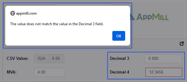
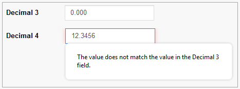
For example, on the Common JavaScript tab, the Compare fields operation was set up as the common behavior to the onFocusOut action for the “Decimal 4” field. I.e. the entered value of the “Decimal 4” field will be compared with the value of the “Decimal 3” field defined in the Another input (ID) field.
In case the entered data in the “Decimal 4” field in the Render application does not match the value of the “Decimal 3” field, the warning message will appear and can be displayed as a pop-up, a tooltip or a confirmation pop-up window with actions.
In the Render application, the warning message can be displayed as follows:
a pop-up window
a tooltip
or a confirmation pop-up window
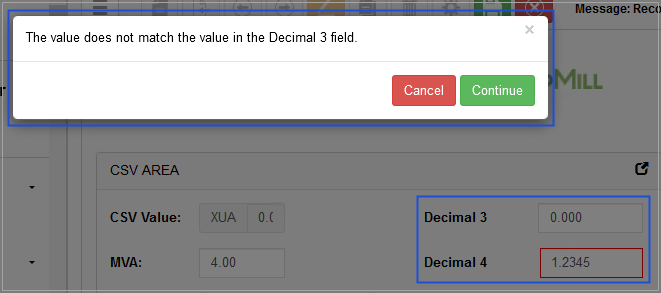
Click the Continue button, to confirm the entered value is correct.
Click the Cancel button, to deny the confirmation and return to the field value editing.
To upper case
This template provides the possibility to define that the entered data in the field must be written in capital letters.
On the Custom JavaScript tab, the template can be displayed as follows:

On the Common JavaScript tab, the settings are displayed as follows:
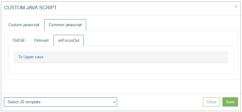
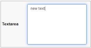
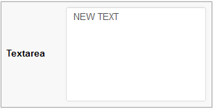
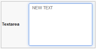
For example, on the Common JavaScript tab, the To Upper case operation was set up as the common behavior for the onFocusOut action for the “Textarea” field.
In case the entered data in the Render application is written in small letters, such letters will be replaced with capital letters and can be displayed as follows:
The entered text written in small letters, when the field is on focus.
The entered text replaced with capital letters, when the field is not on focus.
Check min value
This template provides the possibility to restrict the minimal numeric value entered in the field.
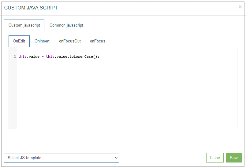
On the Custom JavaScript tab, the template can be displayed as follows:
On the Common JavaScript tab, the settings are displayed as follows:
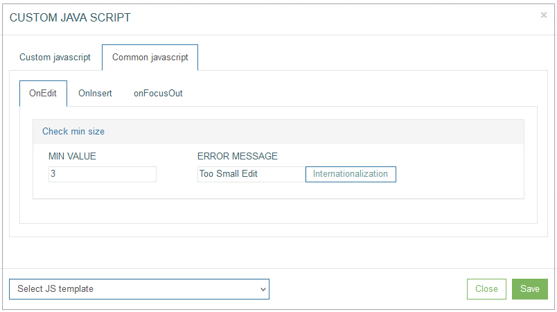
Enter the minimal value to the Min value field and the text that will be shown as a warning message to the Error Message field.
The warning message will appear and can be displayed in the Render application as:
a pop-up window,
a tooltip,
ora confirmation pop-up window with actions. This warning message type will appear in case of selecting the Use confirm modal check box.
Note that the warning message in the confirmation pop-up window is available only for the onFocusOut action.
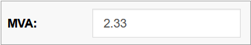
For example, on the Common JavaScript tab, the Check min value operation was set up and defined as “1” as the common behavior for the OnInsert action for the “MVA” field.
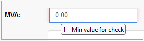
In case the entered data in the Render application is less than the defined value, the warning message will appear and can be displayed as a pop-up or a tooltip.
In the Render application, the warning message can be displayed as a pop-up window as follows:
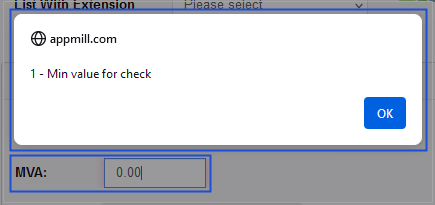
Or as a tooltip as follows:
In case the Check min value operation was set up as the common behavior for the onFocusOut action for the field, the additional confirmation will be available. Select the Use confirm modal check box, to display the warning message as a confirmation pop-up window with actions in the Render application.
For example, the entered value to the MVA field is less than the defined minimal value. The warning message will appear as a confirmation pop-up window.
In the Render application, it can be displayed as follows:
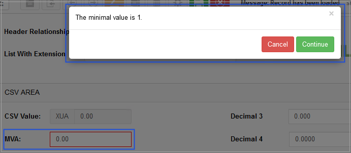
Click the Continue button, to confirm the entered value is correct.
Click the Cancel button, to deny the confirmation and return to the field value editing.
To lower case
This template provides the possibility to define that the entered data in the field must be written in small letters.
On the Custom JavaScript tab, the template can be displayed as follows:
On the Common JavaScript tab, the settings are displayed as follows:

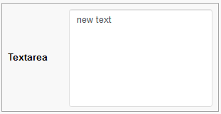
For example, on the Common JavaScript tab, the To Lower case operation was set up as the common behavior for the onFocusOut action for the “Textarea” field.
In case the entered data in the Render application is written in capital letters, such letters will be replaced with small letters and can be displayed as follows:
The entered text written in small letters, when the field is on focus.
The entered text replaced with capital letters, when the field is not on focus.
For the Check max value, Compare fields, and Check min value templates users can define the translation for the Error Message.
To add the translations for the Error Message, click the Internationalization button. In the opened pop-up window, select and add the language, enter the translation for the selected language. Click the Apply button to save the changes. In case the user changes the display language in the Render application, the translated Error Message will be shown. For more details about language changing, refer to the Language page of the User Manual.
Click the Save button to save the changes and close the Custom JavaScript pop-up window. Click the Close button to close the pop-up without saving the changes.
Close
Click the Close button at the bottom of the Field Settings pop-up window to close the pop-up.