Access
To configure the Header and Section of the screen, you first need to complete several steps and define the basic screen data. The configuration of the Screen Header and Section will be available on the second page of the Screen Builder.
Thus, click Screen Configurations > Screens to access the Screens Overview page. Then, you can:
Click the Create with Builder button at the bottom of page to create a new screen from scratch.
Click the Gear wheel (Update with builder) icon for the selected Screen entry from the search results table to edit the existing screen.
Fill in the required fields on the first page of the Screen Builder and, when the basic information is specified, click the Next button. You will be navigated to the next page of the Screen Builder -the Screen Header and Section Configuration.
Table of Contents
Overview
After filling in all the necessary data on the first page of the Screen Builder and clicking the Next button, you will be redirected to the second page where you can proceed with building the screen.
On the second step of setting up your screen, there is a possibility to build the layout of the screen, to define how the header and the section(s) below the header are displayed on the screen, what fields, images, labels and buttons will be available, which actions will be used on the screen in the Render etc.
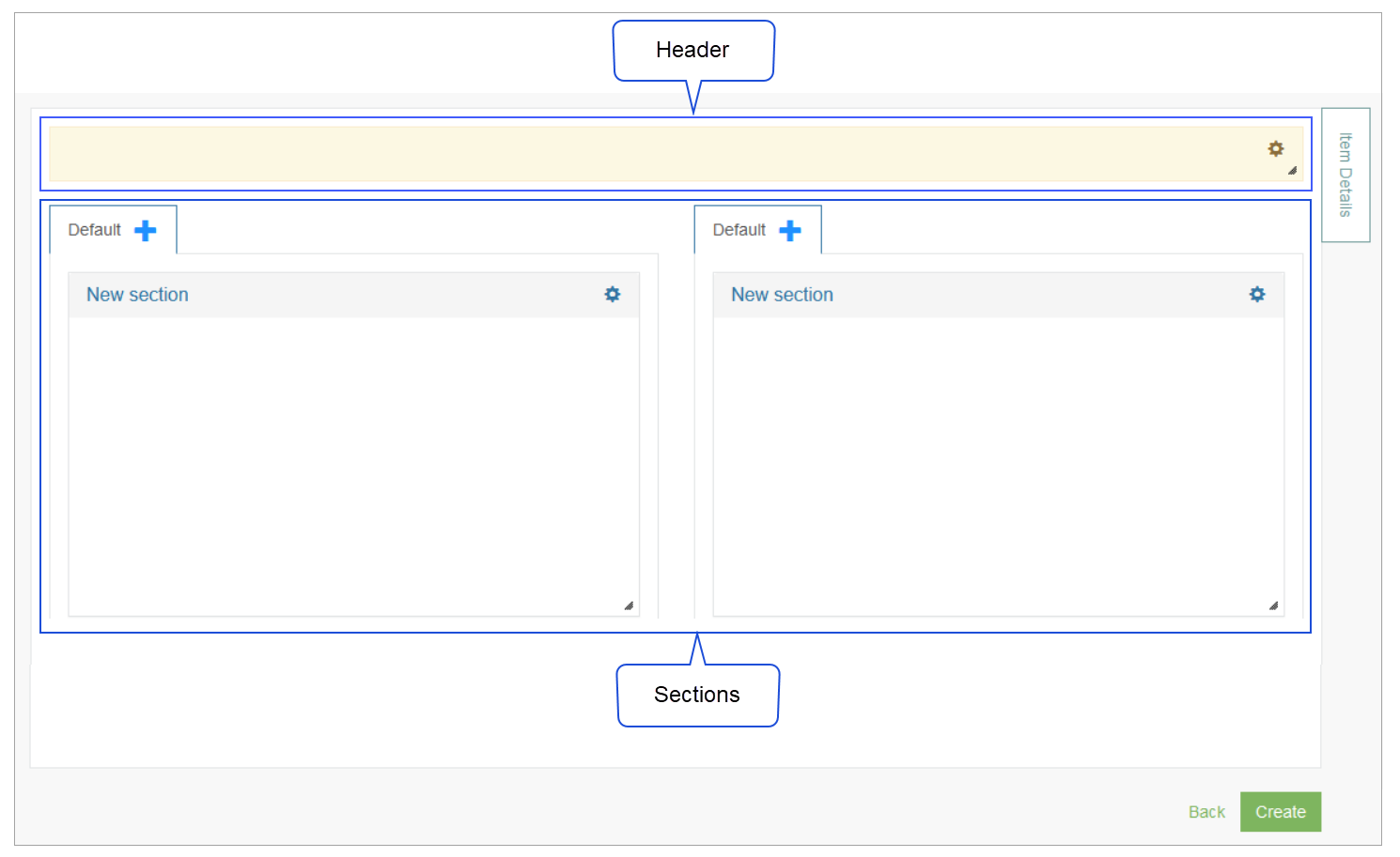
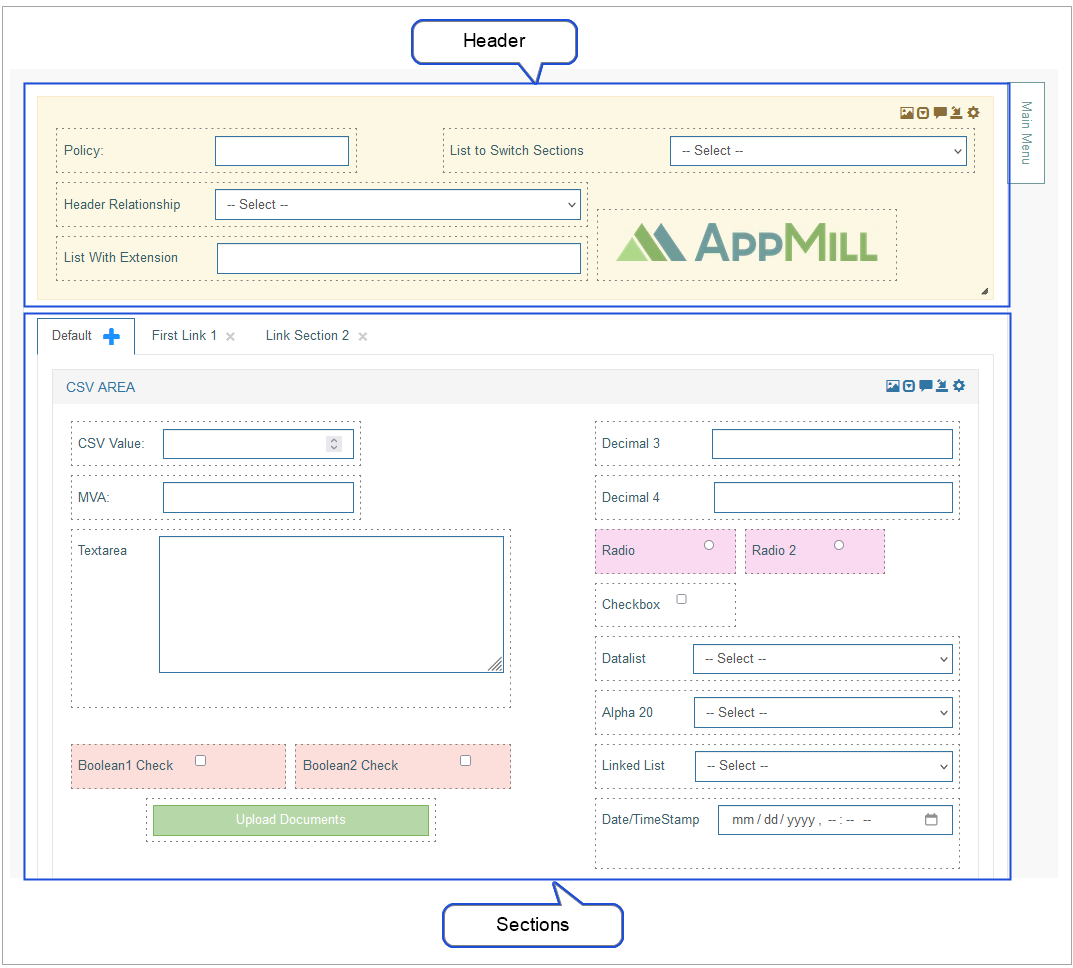
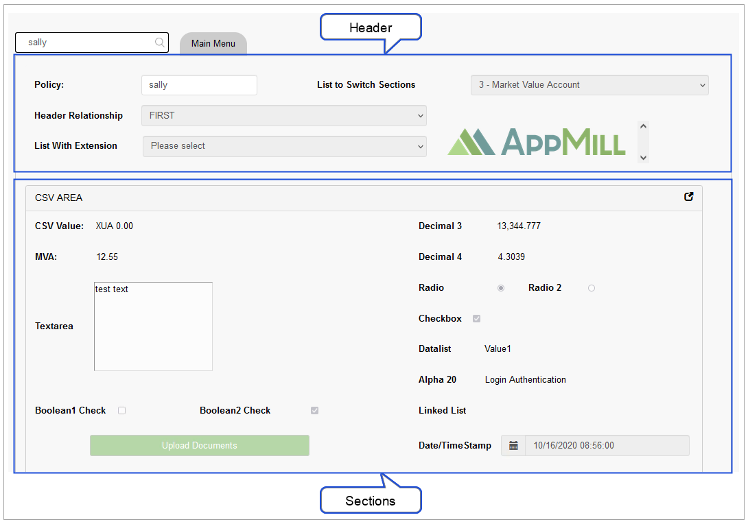
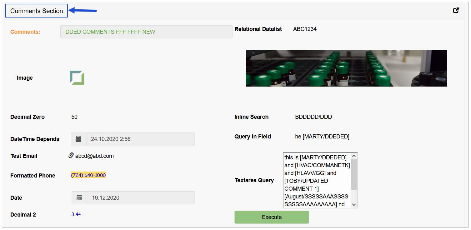
The examples of how the Screen Header and Screen Section(s) can be displayed in the Architect and Render are provided below:
Configured in the Architect:
Displayed in the Render:
The instructions on how to configure both Header and Section levels are very similar, however, they have some differences in the settings and the purpose of usage.
Screen Header
To configure the Screen Header section, click the Settings (gear wheel) icon in the right corner of the header section. The Section Settings pop-up window will be opened.
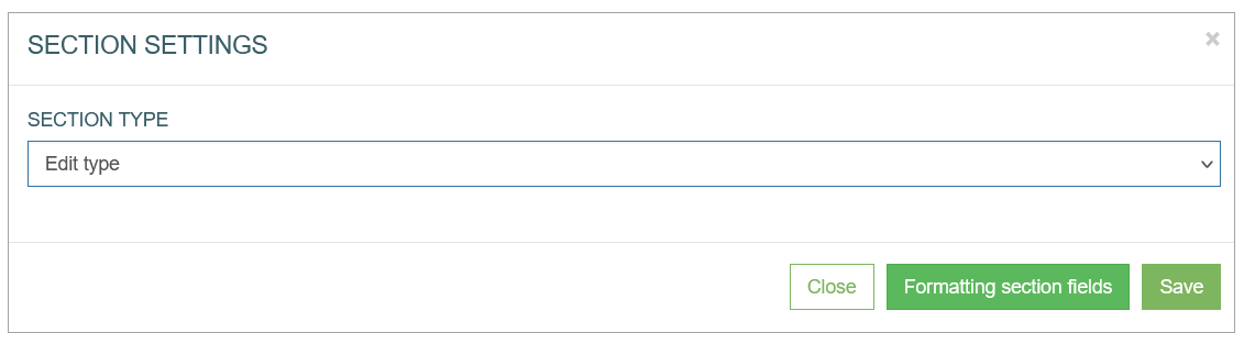
In the opened Section Settings window, select the Section Type. It will define the set of available settings. Fine more information about Section Types in the corresponding section below.
Screen Sections
To configure the Screen Section(s), click the Settings (gear wheel) icon in the right corner of the section that should be set up.
The Section Settings pop-up window will be opened.
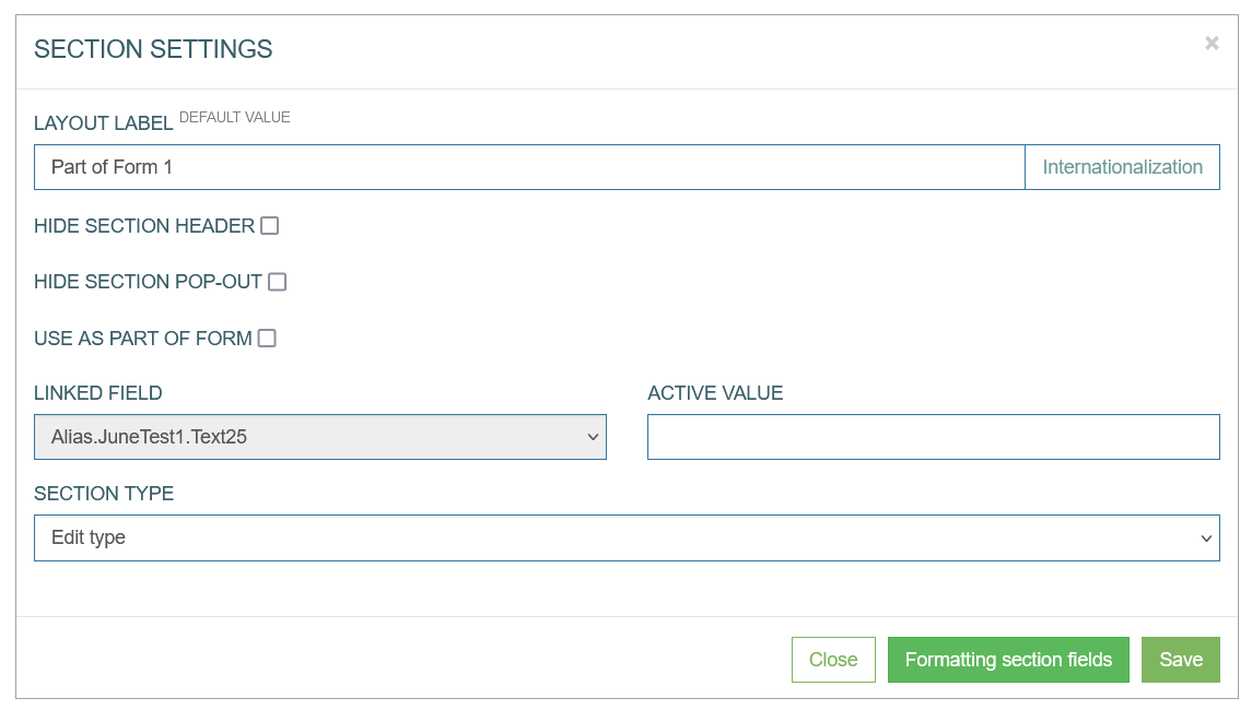
In the opened Section Settings window, you can configure the following parameters:
Layout Label - enter a title for the section. This title will be displayed on the screen in the Render as follows:
Hide section header - you can decide whether to display the Header section on the screen in the Render or not. Select the check box to hide the Header section on the screen.
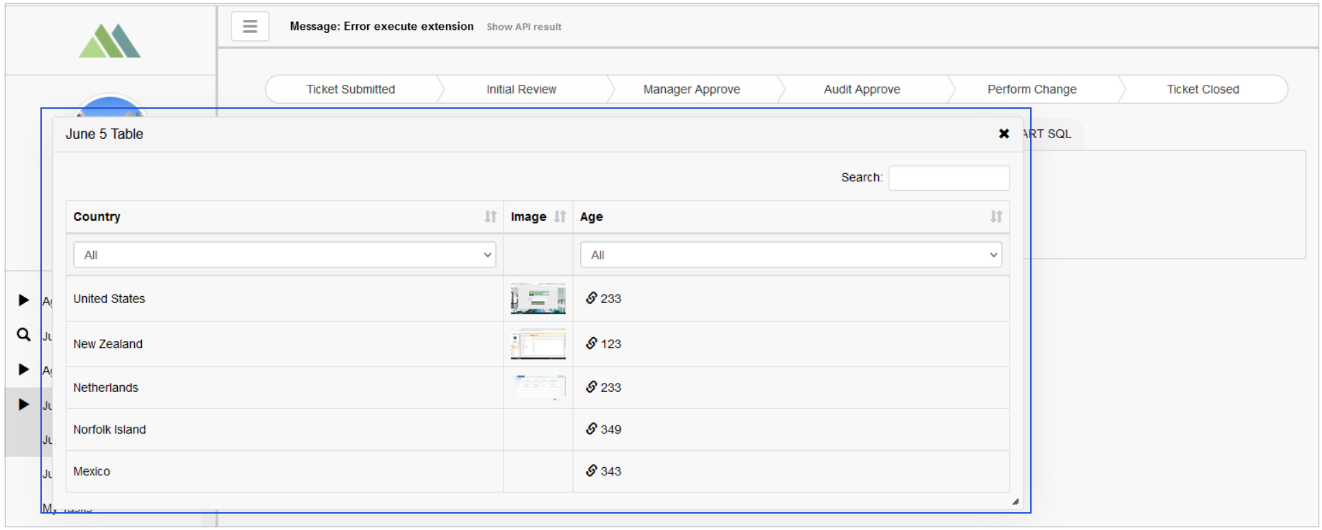
Hide section pop-out - the header section can be opened as a pop-up window. That can be helpful when you a user needs to retain the Header info or actions when scrolling the other sections. Select the check box to deactivate the possibility of opening the section in a pop-up window. In the case of this option being deactivated, the icon to open pop-up windows will be displayed in the right upper corner of the section.
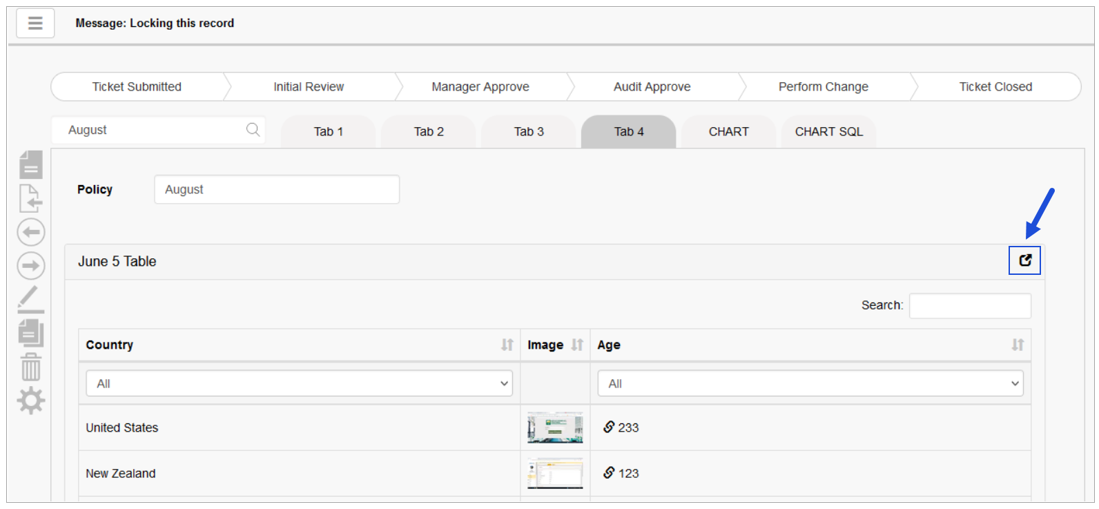
Clicking this icon opens the section in the view of pop-up.
Use as part of form – for the Edit type of section, it is possible to set up a screen section as a modal pop-up window. The opening this modal window can be set up for the Button action only. And it is valid for the Edit section type. The main difference with the usual pop-up window that can be configured is that this modal window is a part on the existing screen in comparison to the usual modal window set up as a separate screen (with separate data and action menu).
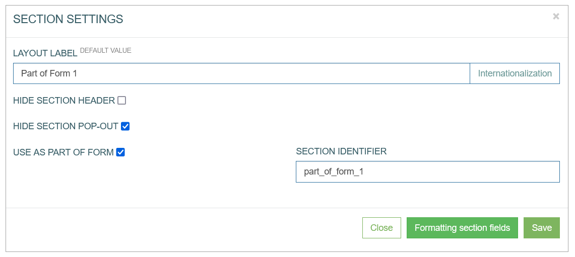
Enter the Section Identifier into the corresponding field. This ID will be used to link the section and the button to open the section as a modal window.
Linked Field - there is a possibility to link the specific section body state to a field value from the header.
Then in the Render, when the user selects the value of the linked field and set it to the active value defined in the settings, the correspondent linked section will be retrieved and displayed on the screen.
To link header field value and the section, follow the steps below:
In the header section, add a new field. Define a field value (specified via alias). This field value will influence the section display and will be used to switch depth tabs on the screen in the Render.
Save the screen.
Then, in the section, you can find the field in the Linked Field list and define the value.
For predictable behavior, please remember, that
the field, which you use to switch depth tabs, should be in the header.
the Refresh Section check box must be selected
the desired section from the Section to Refresh drop-down list should be selected.
Active Value - specify the value that will be linked with the section.
Section Type - select the Section Type from the drop-down list.
Section Type
You can define the type of the section by selecting the type from the drop-down list. The Section Type defines the possible layout of the section, available UI elements displayed, actions and operations that can be used further on the screen in the Render. In the Section Type drop-down, you can select the following currently supported types:
Edit type - find more details about Edit type on the Section Type: Edit Type page.
Table type - find more details about Table type on the Section Type: Table Type page.
Table from API - find more details about Table from API on the
Section Type: Table from API Type page.Chart type - find more details about Chart type on the Section Type: Chart Type page.
Pie chart type
Doughnut chart type
Horizontal bar chart type
Vertical bar chart type
Line chart type
Scatter chart type with linear regression
Time series chart type
Document type - find more details about Document type on the Section Type: Document Type page.
To find more details about every Section Type, refer to the following pages: