Table of Contents
Overview
The Edit type of the Section provides the possibility to add and manage labels that will be displayed and used on the screen in the Render application.
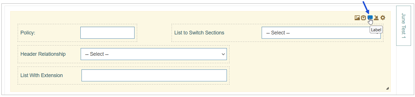
The action to configure labels as well as buttons, images and fields is displayed next to the Settings icon in the upper right corner of the section.
To add a label and configure its display on the screen in the Render application, click the Label icon in the right corner of the Header section.
The Label Settings pop-up opens for configuring a label:
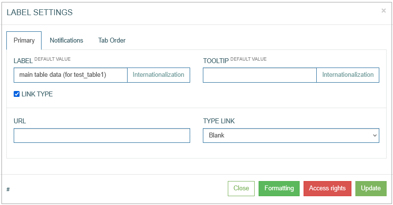
Find and edit the required parameters by switching across the following available tabs:
Primary
Notifications
Tab Order
See the Common Operations section for the description of the buttons available at the bottom of the pop-up window.
Primary
On the Primary tab, configure the main parameters, such as:
Label (default value)
Enter the text that will be displayed on UI as a label.
To add the translations for a new label, perform the following operations:
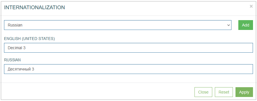
Click the Internationalization button next to the Label field. The Internationalization pop-up window will be opened.
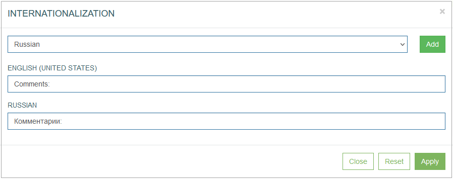
In the opened pop-up window, select the language from the drop-down list and click the Add button. The field with added language will be displayed.
Enter the translation for the selected language.
Click the Apply button to save the changes.
Click the Reset button to delete all changes without closing the pop-up window.
Click the Close button to return to the Field Settings without saving changes.
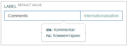
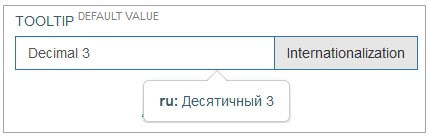
In case there is the translation for the label, move the cursor over a field and the translation will be displayed.
In case the user changes the display language in the Render application, the translated label will be shown. For more details about language changing, refer to the Language page of the User Manual.
In the Render application, the label can be displayed as follows:
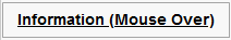
Tooltip (default value)
Enter the text that is displayed as a tooltip for the label.
To add the translations for a new tooltip, perform the following operations:
Click the Internationalization button next to the Tooltip field. The Internationalization pop-up window will be opened.
In the opened pop-up window, select the language from the drop-down list and click the Add button. The field with added language will be displayed.
Enter the translation for the selected language.
Click the Apply button to save the changes.
Click the Reset button to delete all changes without closing the pop-up window.
Click the Close button to return to the Field Settings without saving changes.
In case there is the translation for the tooltip, move the cursor over a field and the translation will be displayed.
In case the user changes the display language in the Render application, the translated tooltip will be shown. For more details about language changing, refer to the Language page of the User Manual.
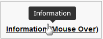
In the Render application, the label tooltip can be displayed as follows:
Link Type
Select the Link Type check box to be able to assign a link to the label. When the check box is selected, new fields to set up the link appear in the pop-up window.
URL
Enter the URL to the page that will be opened when user clicks the label. Note that URL address can be absolute leading to an external webpage and relative leading to the screen tab.
Type Link - Select the value from the drop-down list:
Blank - to open a linked page in a new tab.
Self - to open a linked page in the current tab.
Note that in case the screen in the Render is opened in View mode, the link will be opened in the current tab. In case the screen in the Render is opened in Edit mode, the link will be opened in a new tab like for the Blank type.Iframe - to add a widget to the current screen.
You can personalize your start screen by configuring a diverse array of widgets to cater to your specific preferences and needs. Set up a variety of widgets to create a customized and efficient dashboard that aligns with your workflow and enhances your overall user experience.
The widgets can contain the information from internal and external sources. For example, in case the link is leading to the internal application page, the widget will display the data from such page. In case the link is leading to the external webpage, the information from such webpage will be displayed in the widget.
The asynchronous updates of widgets enable rapid access to current information without requiring a full-page refresh, thereby enhancing operational efficiency and elevating the overall user experience within the system.
To properly configure the widget on the screen, the screen type should be View. Pay attention that you need to set up the height manually in the screen builder moving section border. The width will be automatically defined based on the display setting.
Note that the data in widgets will not be updated automatically, in case of working on the different devices using the same user account. In this situation, the user should update the information in widgets manually by refreshing the page.
In the Render application, the iframe will be displayed as follows:
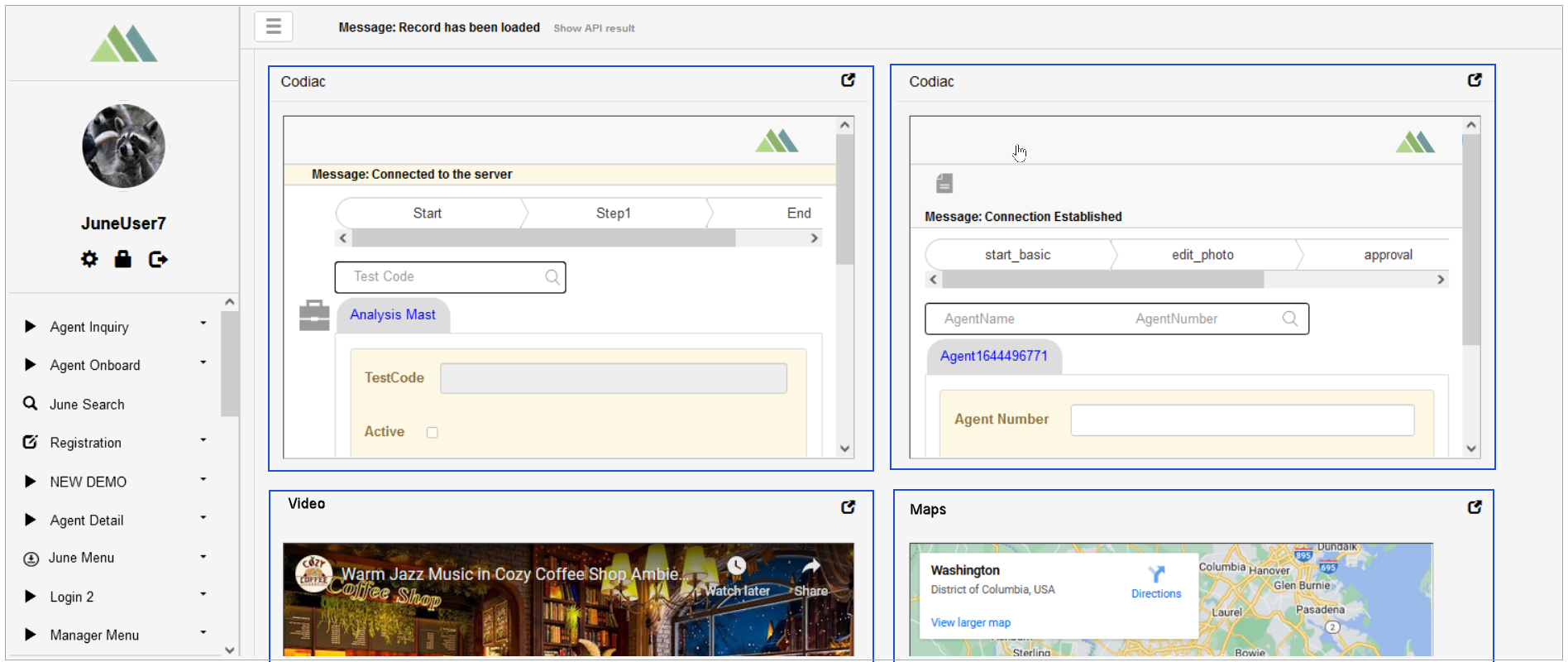
In the Render application, the link type label will be underlined when hovering over it on the screen and can be displayed as follows:
Notifications
On the Notifications tab, configure the conditions when users should be notified.
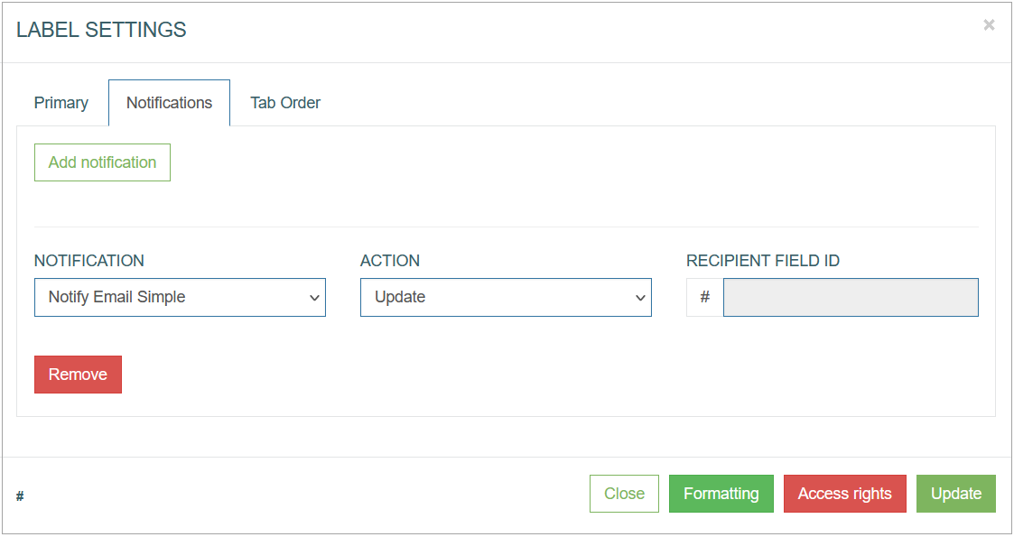
To create a notification action, click the Add Notification button.
After clicking the Add Notification button, an entry for configuring the notification conditions appears. Fill in the required fields:
Notification - select the notification template from the drop-down list of the templates existing in the system. To create a new template or manage existing ones, open the Notifications page (System Data > Notifications). For more details about notification creation and managing, refer to the Create Notification section on the Notifications page of the User Manual.
Currently you can set up Email and SMS notifications. The email address and the phone number for notifications can be set on the Users page. For more details on how to add the email address and the phone number for notifications, refer to the Create User section on the Users page of the user Manual.
Action - select the action that specifies the state of UI element (label) when notification should be sent. There are 2 states of UI elements:
Update - the field value is edited.
Insert - the value is added.
Recipient field ID - here users can add an ID of the image, button or field only as the label does not have ID. For more details about the Recipient field ID, refer to the Notifications section on the Image Configuration, Button Configuration, or Field Configuration pages of the User Manual accordingly.
In case the notification template contains the variable parameters, the value of these variables can be defined here in the input fields.
Tab Order
On the Tab Order tab, you can set whether the Tab key can be used to move the cursor on the current UI element. Additionally, you can define the order in which the UI element is selected and allocated with the cursor when using the Tab key.
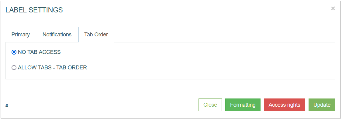
The following options are available:
No Tab access - select this radio button to restrict the possibility use the Tab key on the keyboard for the current UI element.
Allow Tabs - Tab Order - select this radio button to allow the usage of the Tab key to navigate to the current UI element. Define the Tab order by filling in the input field next to the Tab Order option.
Common Operations
At the bottom of the Button Settings pop-up window, there is a block with common operations displayed and available on any tab of the pop-up window.
The following operations can be performed while updating information in the pop-up window on the tabs mentioned above:
Add
Click the Add button to confirm and add a label to the screen.
Note that in case of the Edit mode, the Add button is changed to the Update button.
Update
Click the Update button to confirm and save the changes made for the label.
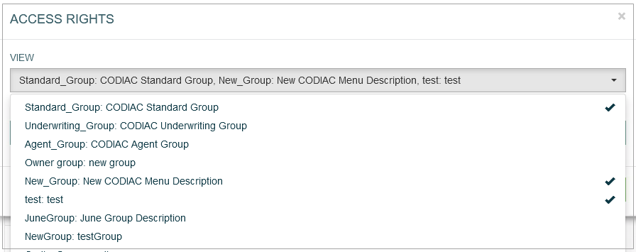
Access Rights
Click the Access Rights button to open the corresponding pop-up window. Here, users can select user groups to set the access right for the View and Update actions for the selected groups:
View - select one or multiple user groups from the drop-down list to provide them with View access rights. The selected user groups will be marked with the check mark to the right from the user group name. In the Render application, the users from the selected user groups can view the label display.
Update - as the labels cannot be updated in the Render application, the selected user groups will not be able to update the labels there.
Formatting
The Formatting functionality is available only for the button, label and field configurations.
Click Formatting to customize the “look and feel” of the label.
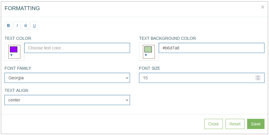
In the opened Formatting pop-up window users can define the label format parameters such as:
Font style:
bold
italic
crossed out
underlined
Text color
Text background color
Font family
Font size
Text alignment:
left
right
center
justify
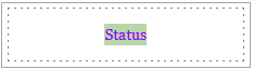
For example, the formatted label can be displayed as follows:
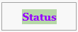
In the Render application, the formatted label can be displayed as follows:
Click the Save button to confirm label formatting changes.
Click the Reset button to clear the label parameters.
Click the Close button to cancel the label formatting changes without saving and return to the Label Settings pop-up window.
Close
Click the Close button at the bottom of the Label Settings pop-up window to close the pop-up window.