Access
Click Screen Configurations > Screens to have an overview of all screens existing in the system, manage them and create new screens.
Table of Contents
Overview
The configuration of Screen Basic Data includes the following parts:
Screen Details
Search Configuration
Extension Functions
Screen Layout
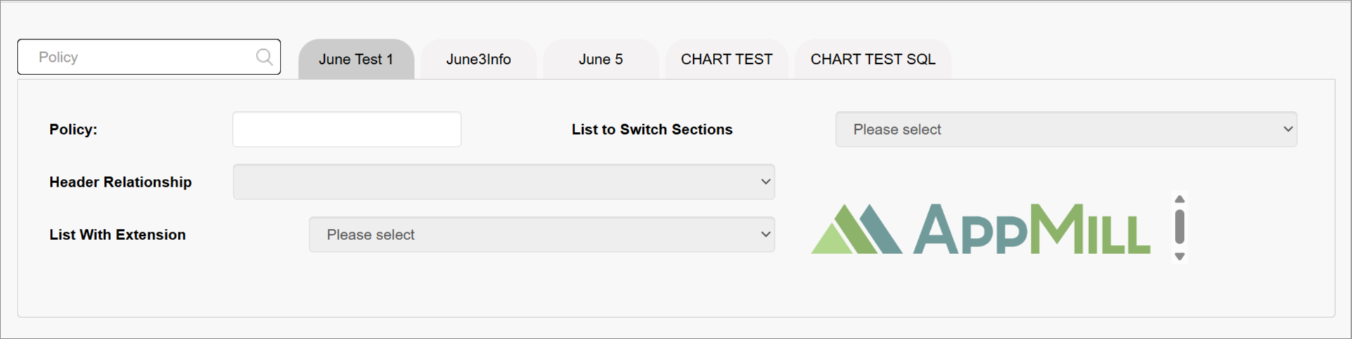
Configure Screen Details
Specify the data describing the screen and configure the screen-related properties:
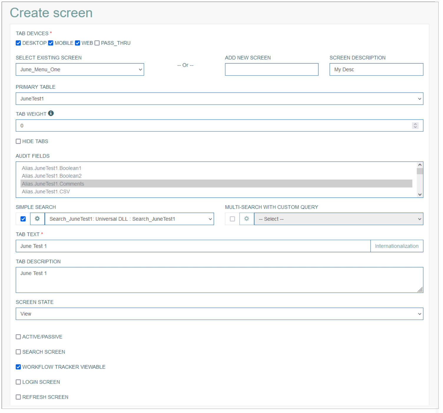
You can fill in the following fields:
Tab Devices - specifies which applications should receive data for this screen. As this feature is still in progress and has not been completed yet, it cannot work as expected. Please wait for a feature completion to fully benefit from it.

Desktop - select the check box to allow users to show this screen and use the data on the desktop version of the application.
Mobile - select the check box to allow users to show this screen and use the data on the mobile version of the application.
WEB - select the check box to allow users to show this screen and use the data on the WEB version of the application.
Pass_Thru - select the check box to allow users to show this screen and use the data on an external application.
Pass Thru Guest User - this check box with the guest user list will appear in case the Pass_Thru check box is selected. Selecting the Pass Thru Guest User check box will activate the guest user list. If you are creating a screen to be used by a guest user, then you can select a guest user profile from the drop-down list for which pass thru will be allowed. By default, the parameter transfer is limited for guest users.
Screen Name
Select the screen on which the tab should be displayed. You can select an existing screen OR create a new screen:

Select existing screen - select the name of an existing screen from the drop-down list. Please note that a new screen will be created with the same already existing screen name. Use an alternative option to create a new screen:
Add new screen - enter a name for a new screen.
Screen description - provide a short informative description for the screen.
Primary Table
This field specifies the database table that will be used as a primary table. The data from this table will be used and displayed on the screens in the render. The list of all tables can be found on the Tables (Features > Tables) page. For more details about Tables, refer to the Tables page of the User Manual.
Note that to display the tables' list at first screen creation, the aliases should be updated. The aliases can be updated on the Management page (Features > Management) by clicking the Reload aliases button. For more details about alias updates, refer to the Reload Aliases section on the Management page of the User Manual.
Tab Weight
Enter the number to determine the placement of the screen within menu in the Render application.
The “0” value allows you to fully customize the screen (search field, audit fields, select extensions). The “99” value - for the screen in the pop-up, otherwise this screen will not be displayed.
The screens with the 0 or 99 weight contain their own search field. For the screens with other weight value, the search of the main screen is used.
In the Render application, according to the tab weight all screens are sorted and placed from the left to the right. The tab with the lowest tab weight will be considered as the first tab in the list of tabs and will be placed from the left to the right on the Render screen. The less tab weight is, the closer to the beginning of the screen list it will be placed.
For example, the screen #1 tab weight is equal to “0“, the screen #2 tab weight is equal to “10“, the screen #3 tab weight is equal to “4“. As a result the screen #1 will be placed first, then the screen #3, and the final is the screen #2.
In the Render application it can be displayed as follows:
Hide Tabs
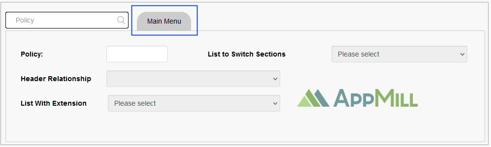
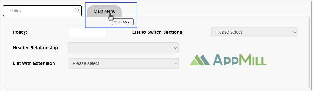
Select the check box to define that this tab should be hidden on UI by default. This can be useful for the tabs that should be displayed only under certain conditions, e.g. during Workflow etc. The Hide Tabs check box is displayed in case the Tab Weight value equals to “0“.
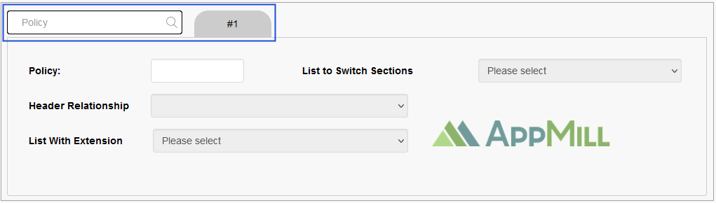
Please note that the Hide Tabs function will hide only the Tab title buttons for activating the corresponding tab and showing the tab content on the screen. If there is only one tab on the screen, the tab title button will be hidden and the content will be displayed by default.
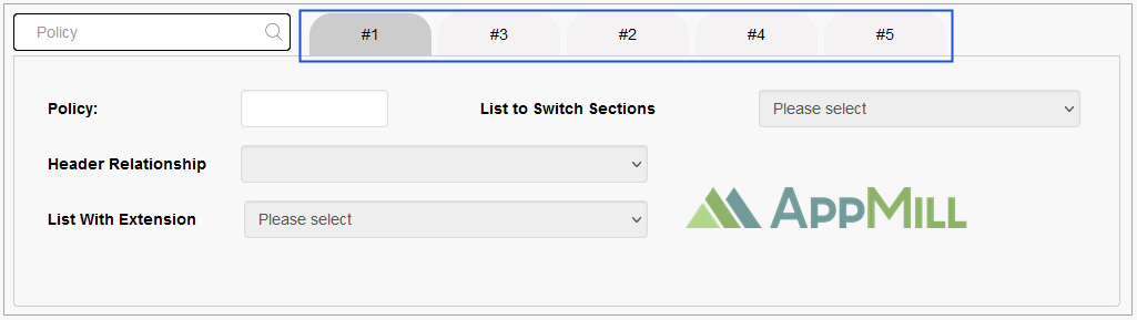
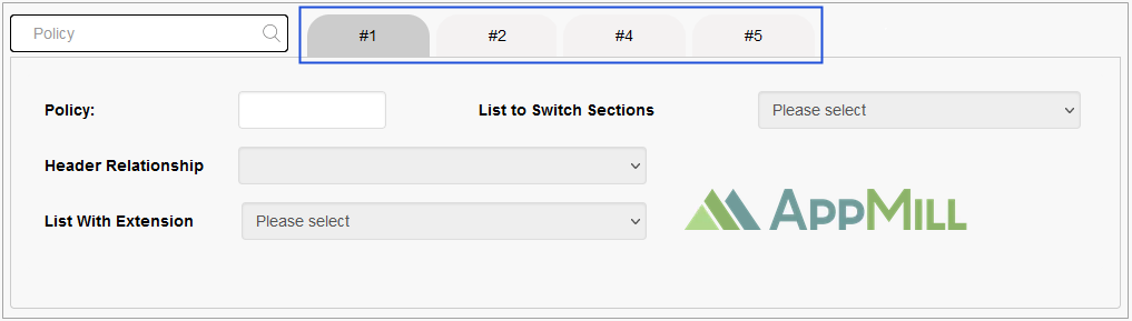
In the Render application, the screen with all tabs can be displayed as follows:

In the Render application, the screen with the hidden tab can be displayed as follows:
Hide Search Bar
Select the check box to define that the search bar should be hidden on UI by default. The Hide Search Bar check box is displayed in case the Tab Weight value equals to “99“.
In case the Tab Weight value equals to “99“, the tab name will not be shown in the Render.
In the Render application, the screen with the displayed search bar and tab name can be displayed as follows:
In the Render application, the screen with the hidden search bar and tab name can be displayed as follows:
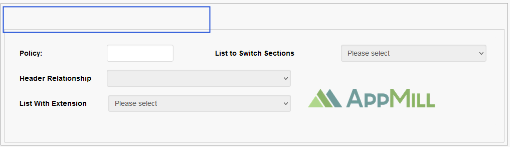
Audit Fields
The list of values is provided automatically based on the aliases created via the Alias Framework. Select the values, the changes of which must be tracked and saved in the Audit History (Features > Audit History). For more details about the field change history, refer to the Audit History page of the User Manual.
Search Configuration
There are 2 options to configure the search:
Simple Search
Multi-search with custom query
The main difference between simple search and multi-search with custom query is that simple search contains the list of queries created automatically based on the Primary Key. The multi-search with custom query is based on custom query that is managed on the Custom Query page (Features > Custom Query). For more details on how to manage (create, update, or delete) custom queries, refer to the Custom Query page of the User Manual.
To start search configuration, first select an appropriate check box to activate the wished option - simple search or multi-search with custom query. One option only can be enabled at the same time.
Select a search query from the drop-down list. The query should be selected for the database table defined in the Primary Table filed.
In case the simple search has no options, you have to re-save the table structure on the Tables page (Features > Tables). After that, the simple search queries appear. For more details about how to re-save the table structure, refer to the Update Table section on the Tables page of the User Manual.
Then click the gear wheel icon to configure the selected search query.
Depending on the selected option, the pop-up window opens for configuration.
Simple Search
In the Simple search configuration pop-up window, fill in the following data:
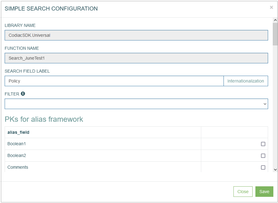
The Library Name and Function Name values are predefined and not editable.
Search Field Label - enter the text that will be displayed as a placeholder in a search field on the screen in the Render.
To add the translations for the label, click the Internationalization button. In the opened pop-up window, select and add the language, enter the translation for the selected language. Click the Apply button to save the changes.
Multiple values should be separated by a semicolon (e.g. policy; agent).
PKs for alias framework - select the check box(es) for the Primary Key(s) of the selected database table.
Parameter for Search - select check boxes for the fields that will be used and shown as search fields on the created screen in the Render.
To save the configuration and close the window, click the Save button at the bottom of the pop-up window.
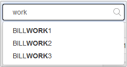
Simple Search Usage Example
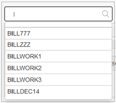
In case the simple search is configured, in the Render application entering the search criteria to the search field provides a possibility to filter the search results or to search for an appropriate result in the database.
For example, the user enters the word “work” into the search field, as a result first 15 found items that contain this word will be shown.
In the Render application, it can be displayed as follows:
Pass Logged User
The Pass Logged User option provides the possibility to automatically show in the Render application the search results based on the current user's parameters, such as ID and user name.
This option will be available only if the parameters below are set as follows:
In the Primary Table field, the c_user_accounts table should be selected.
In the Simple Search section, the Search_c_user_accounts search query should be selected from the drop-down list.
In the Simple search configuration pop-up window, define the ID and user_name for the PKs for alias framework and Parameter for Search parameters, correspondingly.
To avoid the situation when the current user accesses other users' data, it is recommended to hide the search bar in the Render, when using the Pass Logged User option. For this, define the Tab Weight value as “99“ and select the Hide Search Bar check box.
Multi-search with custom query
In the Multi-search with custom query pop-up window, fill in the following data:
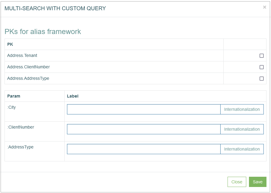
PKs for alias framework - select the check box(es) for the Primary Key(s) of the selected database table.
Param - parameters that will be used and shown as search fields on the created screen in the Render.
In the Render application, in case the label is not defined the Param name will be displayed as a placeholder in a search field: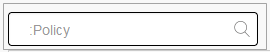
Label - enter the text that will be displayed as a placeholder in a search field and a header of the search results list in the search results list on the screen in the Render.
In the Render application, the label can be displayed as a placeholder as follows: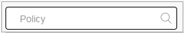
and as a header of the search results list as follows:
To add the translations for the label, click the Internationalization button. In the opened pop-up window, select and add the language, enter the translation for the selected language. Click the Apply button to save the changes.
To save the configuration and close the window, click the Save button at the bottom of the pop-up window.
Multi-search with custom query Usage Example
In case the multi-search with custom query is configured, the search will be restricted by custom query that is managed on the Custom Query page (Features > Custom Query). For more details on how to manage (create, update, or delete) custom queries, refer to the Custom Query page of the User Manual.
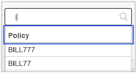
For example, the value in custom query is defined to show only search results that contain two letters “ll“ and/or “LL“.
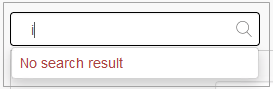
In case the user enters a little letter “i” into the search field and if the search results contain the little letter “i” and two letters “ll“ and/or “LL“ defined values of the custom query, the results will be shown. Otherwise, no results will be displayed.
In case the user enters a capital letter “I” into the search field and the search results contain the capital letter “I” and two letters “ll“ and/or “LL“ defined values of the custom query, the results will be shown in the Render application as follows:
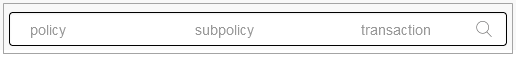
Note that the maximal number of search parameters that can be defined for the search field is 3.
In the Render application, the search field with 3 search parameters is displayed as follows:
Note that the Search functionality must be configured on the first page of the Screen Builder to make the buttons with extension functions work correctly. The work for such buttons is based on the data found from the database.
In case the Search functionality was not configured and the Inquire functionality is used instead of it, the buttons with extension functions will not work correctly.
Please consider this information and use the buttons with extension functions with the set Search functionality only.
Tab Text
Enter the text for the tab that will be displayed as a tab title in the Render.
To add the translations for the tab text, perform the following operations:
Click the Internationalization button next to the Tab Text field. The Internationalization pop-up window will be opened.
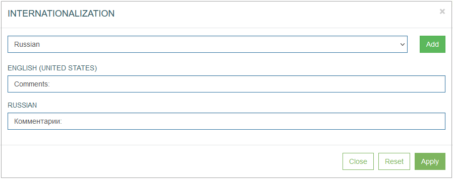
In the opened pop-up window, select the language from the drop-down list and click the Add button. The field with added language will be displayed.
Enter the translation for the selected language.
Click the Apply button to save the changes.
Click the Reset button to delete all changes without closing the pop-up window.
Click the Close button to return to the Create Screen page without saving changes.
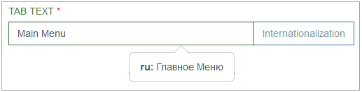
In case there is the translation for the tab text, move the cursor over a field and the translation will be displayed.
In the Render application, the tab text can be displayed as follows:
Tab Description
Provide a short informative tab description that displays when hovering over it on the screen in the Render.
In the Render application, the tab description can be displayed as follows:
Screen State
Select the state of the screen. This parameter defines the operation state applied to the screen data when the screen is loaded and opened.
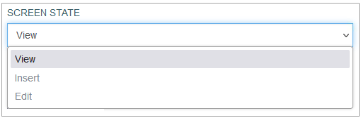
Currently, one of the following values can be selected:
View - This state is applied to all screens by default. Normally, in the View mode, fields are blocked from being changed.
Such screens can be accessed from the menu or via a link from other screens.Insert - Selecting this screen state will enable the creation of new data and the Paste operation. The user will have the possibility to fill in the fields on the screen.
The records are not locked and the user will be able to leave the screen without saving or canceling the "Insert" operation (this is equivalent to canceling the data saving).
Such screens are usually accessed via the menu.Edit - Enabling this option allows you to create the screen that can be edited. This Screen state is possible for the screen containing the search form. That means that the "Edit" operation will be active. Thus, the user will be able to fill in the fields on the screen.
The records with the current primary key will be locked for editing and deletion, and the user will not be able to leave the screen without saving or canceling the Edit operation.
Typically, such screens are accessed via a link from other screens (the link will pass the primary key to look up the screen data).
The Insert or Edit states are frequently used in workflows. E.g. creating an entry (via Insert state), filling in the entry with the value (via Edit state), etc.
Screen Type
Active/Passive
This is a specific type of screen that does not have a basic template. This option is used to display and edit data in related third-level tables.
For example:
On the first level, there is a table used to set up the search field;
On the second level, there is a table of related data obtained as a search result;
After selecting a value in the header, the section displays the data from the third linked table. And this data will be displayed in the body of the section and can be edited.
The screen will be represented with data from the database table of the second level in the header section and data from the table of the third level in the screen content section.
This option restricts the possibility to select any screen layout from the available screen layouts. In case the Active/Passive option is activated, only the 1x1 layout is available.
For the correct work of this screen, the screen state must be selected to "View".
More information about the Active/Passive Screen can be found on the Active/Passive Screen Configuration page of the User Manual.
Search Screen
This is also a specific screen that does not have a basic template, but contains some limitations. For the correct work of this screen, the screen state must be selected to "View" as well.
The header must contain fields with the "KEY FIELD" attribute (this field will be active for editing). This option is used in conjunction with the "Inquire" action, or adding a button with the "Search Submit" action.
This option restricts the possibility to select any screen layout from the available screen layouts. In case the Search Screen option is activated, only the 1x1 layout is available.
More information about the Search Screen Configuration can be found on the Search Screen Configuration page of the User Manual.
Login Screen
This option defines that the created screen will be used as a Login screen. Pay attention that the activation of this check box restricts the possibility to select the screen layouts. In case the Login Screen option is activated, only the 1x1 (Header x Section) layout is available.
As the configuration of the Login screen and its variations is very specific, it is described on a separate page. Please refer to the Configure Login Screen section on the Login Screen Configuration page of the User Manual for more details.
Note that the Active/Passive, Search and Login page options are mutually exclusive and cannot be selected at the same time.
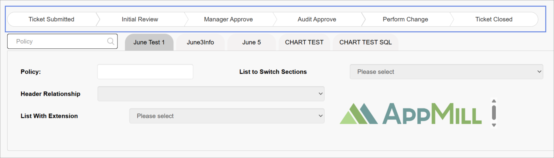
Workflow Tracker Viewable
The Workflow Tracker Viewable checkbox in the Screen Builder controls whether the Workflow Tracker is displayed for a given screen.
When this option is enabled, users will see the Workflow Tracker, allowing them to monitor progress and status updates within the workflow. If this option is disabled, the Workflow Tracker will be hidden for that screen.
In the Render application, the screen with the Workflow Tracker Viewable checked can be displayed as follows:
In the Render application, the screen with the Workflow Tracker Viewable unchecked can be displayed as follows:
For more details about Workflow, refer to the
Refresh Screen
This function is designed to systematically update the screen in the Render. After enabling the check box, you can specify the screen reload interval from 15 to 60 seconds. This function can be useful when displaying graphs, charts or for tracking updates.
Configure Extension Functions
Extension Functions feature allows you to extent the actions available on the created screen in Render.
As a rule, the extension functions are assigned to a particular primary table. That means that the list of available extension functions will be restricted by the Primary Table selected earlier on the Screen Builder page.
The creation of extension functions is supported in different programming languages:
C#
C++
COBOL
JavaScript
PHP
Python
More information on how to manage and assign the extension functions to database table can be found in the Create Extension Function section on the Extension Functions page (System data > Extension Functions) of the User Manual.
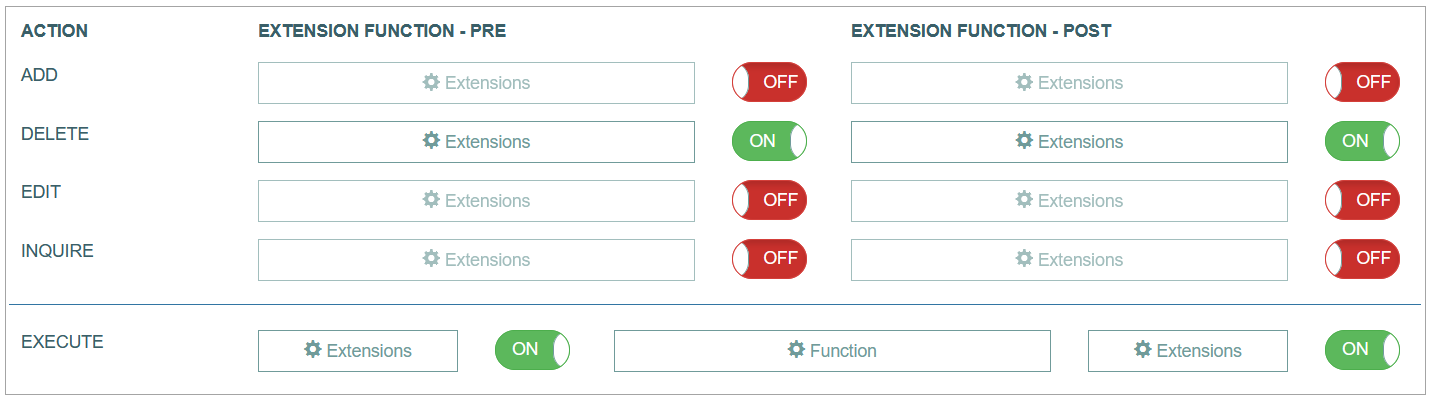
There are 3 function states of the action execution:
Pre - is executed at first.
Main - goes after execution of the Pre function.
Post - is executed as the last step.
Let us have a look at some examples.
Imagine that you need to delete some outdated analysis result entry from the results table. The result entry that needs to be deleted is connected to some other outdated data entries. So the deletion of the analysis result entry alone will not be enough as the connected unnecessary data remain in the tables. This data should be deleted as well. In this case, you need to extend the Delete action with the Pre - extension function “first delete the data connected to the outdated analysis result entry”. And then the main Delete function should be executed.
Or you need to add a new analysis result entry to the results table. And together with this action you also need to enter some data of this analysis result entry as separate values in the table. In this case, you need to use Post - extension function “create a data entry for the result entry ID”. Then the main function will create a new entry with a unique ID, the post function will add data of the created entry using its ID.
The Pre and Post functions are optional and can be switched on/off. The Pre and Post functions are supported for the following actions:
Execute - in the Render application, in case the value with the extension function is selected, the specified function will be executed when the user clicks the Execute button.
The Execute button is displayed in the main actions’ menu on the screen in the Render application as follows:
The Execute action, additionally to the Pre and Post functions, supports the Main function. The Pre and Post functions are optional, while the Main function is mandatory. That means that if you use the Execute action, you must always define the Main function.
Add - in the Render application, clicking this button provides a possibility to add new record to the database.
The Add button is displayed in the main actions' menu on the screen in the Render application as follows:
Edit - in the Render application, clicking this button provides a possibility to open the record in the editing mode and update it in the database.
The Edit button is displayed in the main actions' menu on the screen in the Render application as follows:
Delete - in the Render application, clicking this button deletes the record from the database. The confirmation pop-up will appear where you can confirm or cancel the Delete action.
The Delete button is displayed in the main actions' menu on the screen in the Render application is displayed as follows:
Inquire - is designed to sequentially view multiple sets of data on the screen. The Inquire functionality is similarly to the search functionality, but in case of the Inquire option, the first found item is displayed on the screen. The User can navigate through other found items using the Previous item and Next item buttons. The Inquire function does not use the entire set of search matches (just like a regular search). Only 15 first found options can be accessed and navigated through, even if there are more than 15 search result items.
The Inquire function can be also used without the search fields.
The Inquire button is displayed in the main actions' menu on the screen in the Render application as follows:
The Previous item button is displayed in the main actions' menu on the screen in the Render application as follows:

The Next item button is displayed in the main actions' menu on the screen in the Render application as follows:

In the actions' menu, the Inquire functionality adds three buttons: Load, Previous item and Next item. If there is no field with the "KEY FIELD" attribute in the screen title, then the Load control button will be hidden in the menu on the screen.
Add Extension Function
To add an extension function:
Turn on the function using the toggle switch on the right side of the function input field.
Click the Extensions field in the Extension Function - Pre or Extension Function - Post columns correspondingly.
In the opened Extensions Settings pop-up window, select the required extension function.
Click the Add button. The function will be added and displayed in the list of functions below the Extensions field.
Click the Save button to apply the changes. Click the Close button to close the pop-up window without saving.
Delete Extension Function
To delete a previously added extension function:
Click the Extensions field in the Extension Function - Pre or Extension Function - Post columns correspondingly.
In the opened Extensions Settings pop-up window, you will see the list of the extension functions previously added to the action.
Click the Delete icon to delete the entry.
Configure Screen Layout
You can select the screen layout and define the arranging of screen header and sections. Select the radio button below for the desired layout.
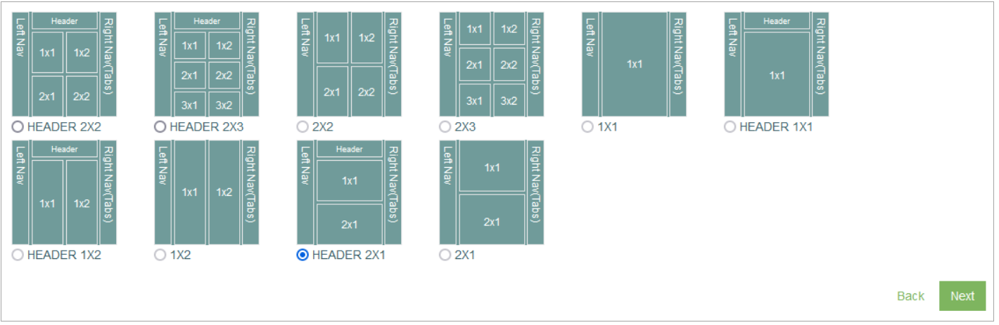
Here are several examples of screen layouts in the Render application:
In case the Header 2x2 is selected:
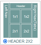
The screen in the Render will be displayed as follows:
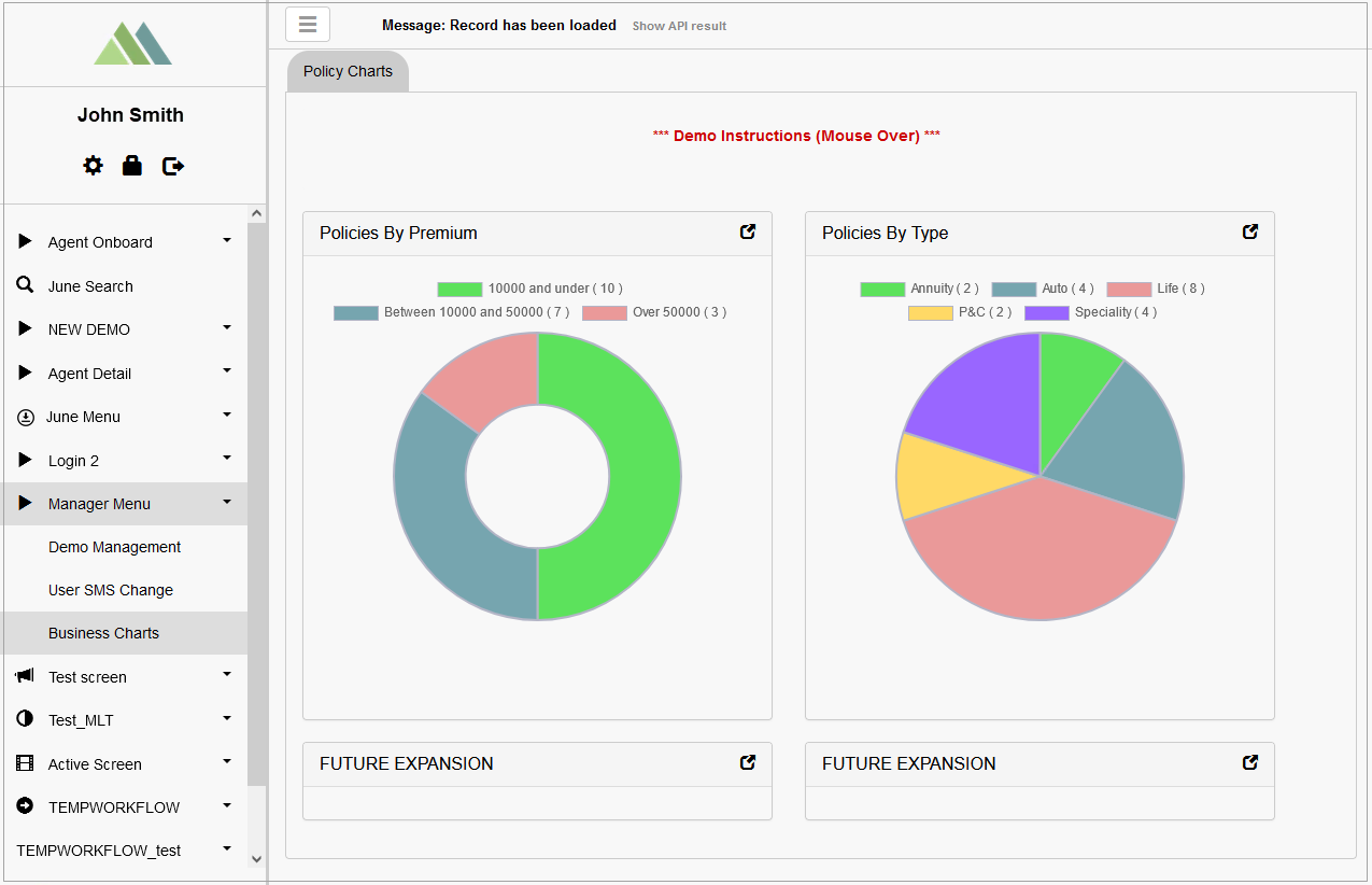
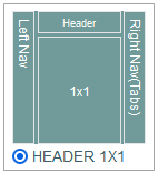
In case the Header 1x1 is selected:
The screen in the Render will be displayed as follows:
In case the Header 2x1 is selected:
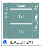
The screen in the Render will be displayed as follows:
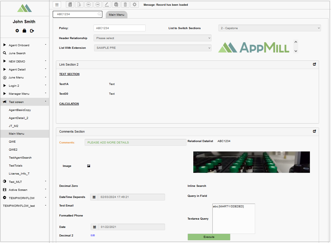
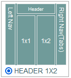
In case the Header 1x2 is selected:
The screen in the Render will be displayed as follows:
After making all the changes at the first stage, click the Next button at the bottom of the page to proceed to the next stage and set up Header and Sections, as well as the related screen UI elements.